这一周R语言学习,记录如下。
01
行去重操作
在一个实际数据项目,获取数据后,发现数据的行(样本)有重复,需要把重复行删除掉。
dplyr包distinct函数,可以做行去重。
# dplyr包
library(dplyr)
data <- data.frame(Column1 = c( 'P1', 'P1', 'P2', 'P3', 'P1', 'P1', 'P3', 'P4', 'P2', 'P4'),
Column2 = c( 5, 5, 3, 5, 2, 3, 4, 7, 10, 14))
dim(data)
# 删除重复的行
# 使用distinct函数
data1 <- data %>% distinct
dim(data1)
02
时间处理操作
想知道,今日是属于这一年第几周,利用lubridate包的week函数。
# 计算今天属于第几周
library(lubridate)
paste0(Sys. Date,
'是',
year(Sys. Date),
'第',
formatC(week(Sys. Date), flag = '0', width = 2),
'周')
03
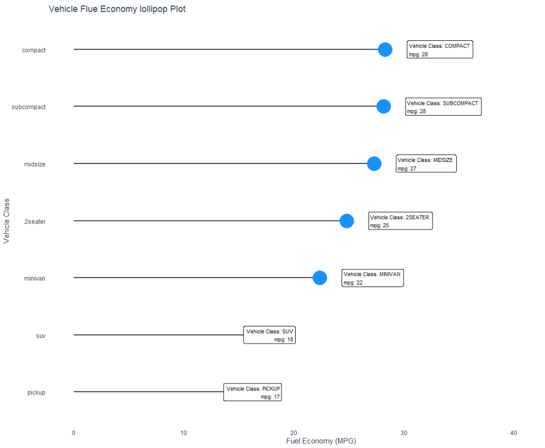
棒棒糖图
小时候,大家都吃过棒棒糖。
利用棒棒糖图,表示类别之间的对比关系,类似条形图,使用了线和点组合而成。
# 加载R包
library(pacman)
p_load(ggalt, tidyverse, tidyquant)
# 数据集
mpg
str(mpg)
# 数据准备
mpg_by_class_tbl <- mpg %>%
group_by(class) %>%
summarise(mean_hwy = mean(hwy, na.rm = TRUE)) %>%
mutate(class = fct_reorder(class, mean_hwy))
mpg_by_class_tbl
# 数据可视化
g1 <- mpg_by_class_tbl %>%
ggplot(aes( x=mean_hwy, y=class)) +
geom_lollipop(
horizontal = TRUE,
point.colour = 'dodgerblue',
point.size = 10,
color = '#2c3e50',
size = 1
)
g1
# 添加Label
g2 <- g1 +
geom_label(
aes(label = str_glue( "Vehicle Class: {toupper(class)}
mpg: {round(mean_hwy)}" )),
size = 3,
hjust = 'outward',
nudge_x = 2
) +
expand_limits( x= 45) +
labs(
title = "Vehicle Flue Economy lollipop Plot",
x= 'Fuel Economy (MPG)',
y= 'Vehicle Class'
) +
theme_t q+
theme(
panel.grid.minor = element_blank,
panel.grid.major.x = element_blank,
panel.grid.major.y = element_blank,
axis.ticks = element_blank,
panel.border = element_blank
)
g2
可视化图形
参考资料:
https://www.r-bloggers.com/2021/08/ggalt-make-a-lollipop-plot-to-compare-categories-in-ggplot2/
04
快捷键
R语言代码常用快捷键
赋值符号 Ctrl+-
管道符号 Ctrl+Shift+M
注释操作 Ctrl+Shift+C
执行选择的 R代码 Ctrl+Enter
05
屏蔽警告信息和不采用科学计数法
写代码之前,用options函数做参数设置。
options( warn= - 1) # 不显示警告信息
options(scipen = 999) # 不采用科学计数法
06
tidyverse包学习
阅读书籍《R For Data Science》,选择性阅读。
依据数据科学工作流,结合实际数据任务和项目,学习和应用所需包和函数,提升数据处理的效率。
在线阅读网址:https://r4ds.had.co.nz/
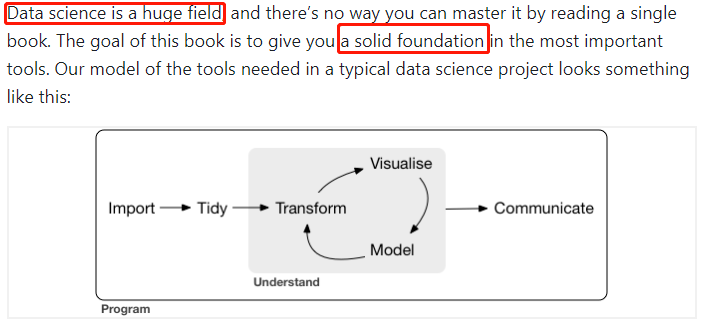
数据可视化,用ggplot2包。
作图模版
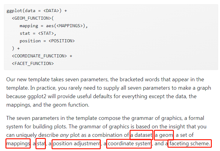
07
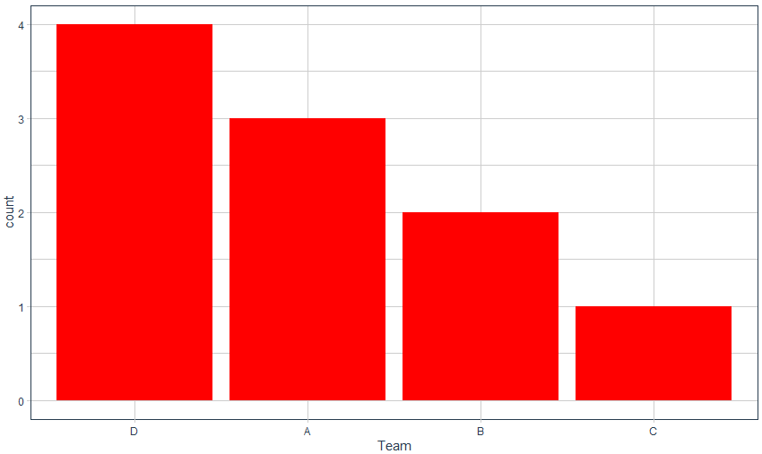
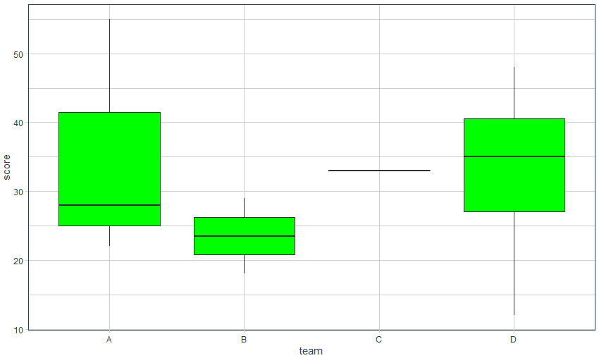
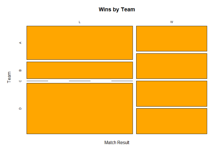
类别型变量数据可视化
1)类别型-数值型
条形图或者盒箱图
2)类别型-类别型
mosaicplot图
# R包
library(ggplot2)
library(tidyquant)
# 数据准备
data <- data.frame(result = c( 'W', 'L', 'L', 'W', 'W', 'L', 'L', 'L', 'W', 'L'),
team = c( 'B', 'D', 'B', 'A', 'D', 'A', 'A', 'D', 'C', 'D'),
score = c( 18, 38, 29, 28, 32, 55, 22, 48, 33, 12),
rebounds = c( 15, 5, 9, 10, 15, 8, 9, 12, 11, 10))
head(data)
# 类别型-数值型
# 条形图
ggplot(data, aes( x=reorder(team, team, function( x)- length( x)))) +
geom_bar(fill= 'red') +
labs( x= 'Team') +
theme_t q
# 盒箱图
ggplot(data, aes( x=team, y=score)) +
geom_boxplot(fill= 'green') +
theme_t q
# 类别型-类别型
# 列联表
counts <- table(data$result, data$team)
counts
mosaicplot(counts,
xlab= 'Match Result',
ylab= 'Team',
main= 'Wins by Team',
col= 'orange')
可视化效果
08
模型的可解释性
实际建模后,业务方或者服务方,很在意模型的可解释性。换而言之,从业务知识,模型是否可以解释。
我所在的金融科技行业,对于模型的解释性,尤为重要。因此我们常用逻辑回归模型和树模型,以及树+集成学习思想而衍生的模型。比如:gbdt,XGBoost, LightGBM,CatBoost等。
lime包对模型的可解释性提供便利。
# 加载R包
library(tidyquant)
library(readxl)
library(h2o)
library(lime)
library(tidyverse)
# 读入数据
hr_data_raw <- read_excel(path = "./raw_data/WA_Fn-UseC_-HR-Employee-Attrition.xlsx")
# 变量类型转换
# 变量要求数值性
# 把字符型变量转换为因子类型
hr_data <- hr_data_raw %>%
dplyr::mutate_if(is.character, as.factor) %>%
dplyr::select(Attrition, everything)
# 数据结构了解
glimpse(hr_data)
# 模型构建和评价
h2o.init
h2o.no_progress # 关闭运行结果的进度条
# 数据集划分
# 训练集-验证集-测试集
hr_data_h2o <- as.h2o(hr_data)
split_h2o <- h2o.splitFrame(hr_data_h2o,
c( 0.7, 0.15),
seed = 1234)
train_h2o <- h2o.assign(split_h2o[[ 1]], 'train')
valid_h2o <- h2o.assign(split_h2o[[ 2]], 'valid')
test_h2o <- h2o.assign(split_h2o[[ 3]], 'test')
# 设置x和y
y <- "Attrition"
x <- setdiff(names(train_h2o), y)
# 运行自动化机器学习
automl_models_h2o <- h2o.automl(
x = x,
y = y,
training_frame = train_h2o,
leaderboard_frame = valid_h2o,
max_runtime_secs = 30
)
automl_leader <- automl_models_h2o@leader
# 预测
pred_h2o <- h2o.predict(object = automl_leader, newdata = test_h2o)
# 模型性能分析
test_performance <- test_h2o %>%
tibble::as_tibble %>%
select(Attrition) %>%
add_column(pred = as.vector(pred_h2o$predict)) %>%
mutate_if(is.character, as.factor)
test_performance
# 混淆矩阵
confusion_matrix <- test_performance %>%
table
confusion_matrix
# 性能指标
# Performance analysis
tn <- confusion_matrix[ 1]
tp <- confusion_matrix[ 4]
fp <- confusion_matrix[ 3]
fn <- confusion_matrix[ 2]
accuracy <- (tp + tn) / (tp + tn + fp + fn)
misclassification_rate <- 1- accuracy
recall <- tp / (tp + fn)
precision <- tp / (tp + fp)
null_error_rate <- tn / (tp + tn + fp + fn)
tibble(
accuracy,
misclassification_rate,
recall,
precision,
null_error_rate
) %>%
transpose
# 模型的可解释性
# 归因分析
# 模型效果很好,如何分析其中的原因
predict_model(x = automl_leader, newdata = as.data.frame(test_h2o[, -1]), type = 'raw') %>%
tibble::as_tibble
# 模型解释
explainer <- lime::lime(
as.data.frame(train_h2o[, -1]),
model = automl_leader,
bin_continuous = FALSE)
explanation <- lime::explain(
as.data.frame(test_h2o[ 1: 10, -1]),
explainer = explainer,
n_labels = 1,
n_features = 4,
kernel_width = 0.5)
plot_features(explanation) +
labs(title = "HR Predictive Analytics: LIME Feature Importance Visualization",
subtitle = "Hold Out (Test) Set, First 10 Cases Shown")
模型解释性可视化
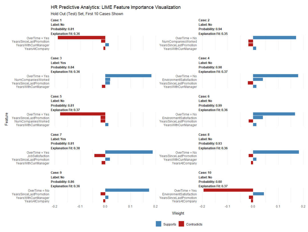
通过LIME特征重要性图,可以发现3个关键特征:
- Training Time
- Job Role
- Over Time
参考资料:
https://www.business-science.io/business/2017/09/18/hr_employee_attrition.html
- 本文固定链接: https://maimengkong.com/learn/1168.html
- 转载请注明: : 萌小白 2022年8月29日 于 卖萌控的博客 发表
- 百度已收录