在Genome-wide association study(GWAS,全基因组关联研究)关联分析的时候,我们经常会看到一些非常漂亮的曼哈顿图,能对候选位点的分布和数值一目了然。

请输入
就用R语言中CMplot包,帮你绘制高质量的曼哈顿图。

请输入

1. 安装CMplot包
> install.packages("CMplot")
> library("CMplot")
#首先读取数据
> data(pig60K) #CMplot包中自带数据,SNP位点信息表
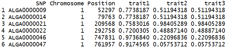
> head(pig60K) #显示部分数据,第一列是SNP的名称,第二列是SNP所在染色体名字,第三列是SNP的位置,后面几列为不同特征的P值
2. 函数及主要参数如下:
CMplot(Pmap,col=c("#377EB8","#4DAF4A","#984EA3","#FF7F00"),bin.size=1e6,pch=19,band=1,cir.band=0.5,H=1.5,ylim=NULL,cex.axis=1,plot.type="b",multracks=FALSE,cex=c(0.5,1,1),r=0.3,xlab="Chromosome",ylab=expression(-log[10](italic(p))),xaxs="i",yaxs="r",outward=FALSE,threshold=NULL,threshold.col="red",threshold.lwd=1, threshold.lty=2, amplify=TRUE, chr.labels=NULL,signal.cex=1.5,signal.pch=19,signal.col="red",signal.line=1,cir.chr=TRUE,cir.chr.h=1.5, chr.den.col=c("darkgreen", "yellow","red"),cir.legend=TRUE,cir.legend.cex=0.6,cir.legend.col="black",LOG10=TRUE,box=FALSE,conf.int.col="grey",file.output=TRUE,file="jpg",dpi=300,memo="",verbose=TRUE)
Pmap:输入数据文件,数据框。
col:设置染色体中点的颜色。
pch:设置点的形状。
band:设置染色体之间的间隔。
H:设置每个圈的高度。
bin.size:设置SNP密度图中的窗口大小。
cex.axis:设置坐标轴字体和标签字体的大小。
plot.type:设置不同的绘图类型,可以设定为 "d", "c", "m", "q" or "b"。
multracks:设置是否需要绘制多个track。
r:设置圈的半径大小。
threshold:设置阈值并添加阈值线。
amplify:设置是否放大显著的点。
signal.cex:设置显著点的大小。
chr.labels:设置染色体的标签。
cir.legend:设置是否显示图例。
file:设置输出图片的格式,可以设定为"jpg", "pdf", "tiff"。
dpi:设置输出图片的分辨度。
memo:设置输出图片文件的名字。
其中各个参数更加详细用法可参看R语言中帮助文档:?CMplot。
3. 作图代码
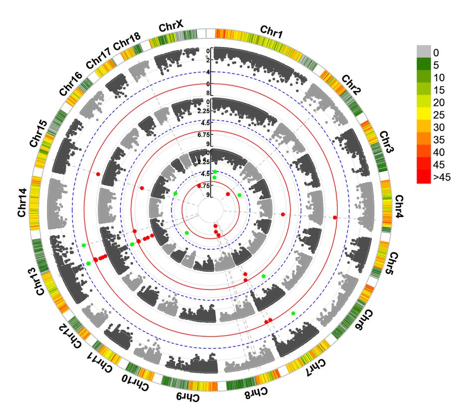
3.1 示例1 -- SNP密度条形图
>CMplot(pig60K,plot.type="d",bin.size=1e6,col=c("darkgreen","yellow","red"),file="jpg",memo="",dpi=300,file.output=TRUE, verbose=TRUE) #绘制SNP在不同染色体的分布情况
# users can personally set the windowsize and the max of legend by:
# bin.size=1e6
# bin.max=N
# memo: add a character to the output file name.

3.2 示例2 -- 环状图
>CMplot(pig60K,plot.type="c",chr.labels=paste("Chr",c(1:18,"X"),sep=""),r=0.4,cir.legend=TRUE,outward=FALSE,cir.legend.col="black",cir.chr.h=1.3,chr.den.col="black",file="jpg",memo="",dpi=300,file.output=TRUE,verbose=TRUE)
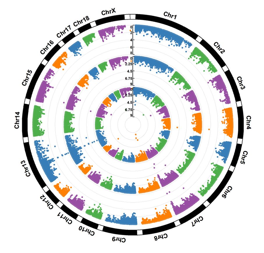
3.3 示例3 -- 多层圈图
>CMplot(pig60K,plot.type="c",r=0.4,col=c("grey30","grey60"),chr.labels=paste("Chr",c(1:18,"X"),sep=""),threshold=c(1e-6,1e-4),cir.chr.h=1.5,amplify=TRUE,threshold.lty=c(1,2),threshold.col=c("red","blue"),signal.line=1,signal.col=c("red","green"),chr.den.col=c("darkgreen","yellow","red"),bin.size=1e6,outward=FALSE,file="jpg",memo="",dpi=300,file.output=TRUE,verbose=TRUE)
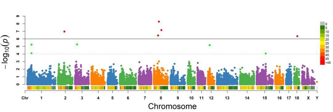
3.4 示例4 -- 曼哈顿图
>CMplot(pig60K,plot.type="m",LOG10=TRUE,threshold=NULL,chr.den.col=NULL,file="jpg",memo="",dpi=300,file.output=TRUE,verbose=TRUE)
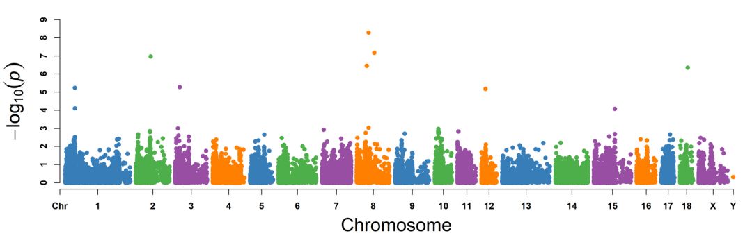
>CMplot(pig60K,plot.type="m",LOG10=TRUE,ylim=NULL,threshold=c(1e-6,1e-4),threshold.lt=c(1,2),threshold.lwd=c(1,1),threshold.col=c("black","grey"),amplify=TRUE,bin.size=1e6,chr.den.col=c("darkgreen","yellow","red"),signal.col=c("red","green"),signal.cex=c(1,1),signal.pch=c(19,19),file="jpg",memo="",dpi=300,file.output=TRUE,verbose=TRUE)
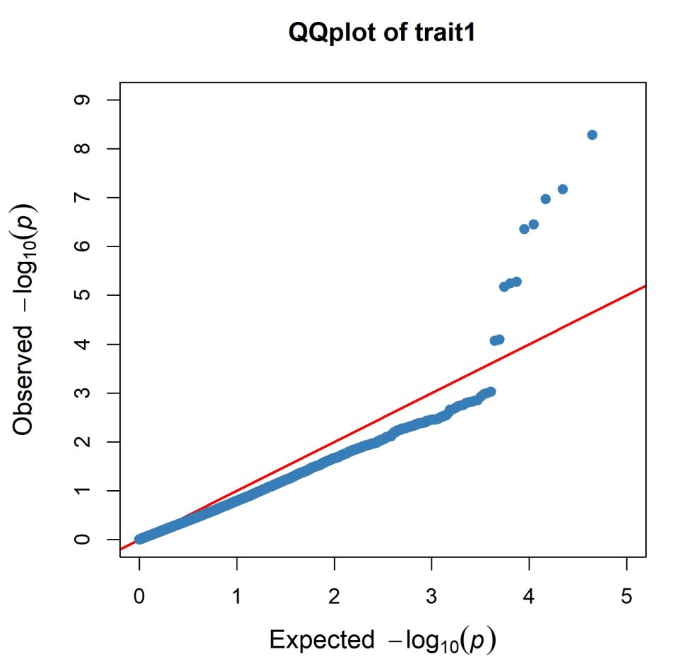
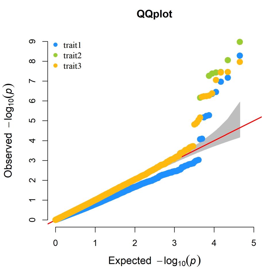
3.5 示例5 -- QQ 图
>CMplot(pig60K,plot.type="q",conf.int.col=NULL,box=TRUE,file="jpg",memo="",dpi=300,file.output=TRUE,verbose=TRUE)
>CMplot(pig60K,plot.type="q",col=c("dodgerblue1","olivedrab3","darkgoldenrod1"),threshold=
1e6,signal.pch=19,signal.cex=1.5,signal.col="red",conf.int.col="grey",box=FALSE,
multracks=TRUE,file="jpg",memo="",dpi=300,file.output=TRUE,verbose=TRUE)
参考资料:https://github.com/YinLiLin/R-CMplot
转自:锐翌基因
- 本文固定链接: https://maimengkong.com/image/1492.html
- 转载请注明: : 萌小白 2023年4月29日 于 卖萌控的博客 发表
- 百度已收录