作者:严涛 浙江大学作物遗传育种在读研究生(生物信息学方向) 伪码农,R语言爱好者,爱开源
编者按: 数据可视化 是解析、理解和展示数据不可缺少的一部分。炫或不炫看个人喜好和功底,能否达意是最基本的要求---最合适的图示和配色表达最直观的含义。长文多图预警,这是关于ggplot2使用的极详细教程(190+图),是入门和晋级参考的不二手册。
前面部分是关于qplot的使用,后面是 ggplot2 图层的使用。原文使用R自带数据集,后面有 生信宝典出品的针对生信常见作图的ggplot2使用教程。为完善之际,本文整理了关于可视化套路(什么图适合做什么), 图形配色(美观不突兀)和多种在线、本地、编程和界面类绘图工具和脚本供集中学习和收藏使用。
简介
本文内容基本是来源于STHDA,这是一份十分详细的 ggplot2使用指南,因此我将其翻译成中文,一是有助于我自己学习理解,另外其他R语言爱好者或者可视化爱好者可以用来学习。翻译过程肯定不能十全十美,各位读者有建议或改进的话,十分欢迎发 Email(tyan@zju.edu.cn)给我。
ggplot2是由 Hadley Wickham创建的一个十分强大的可视化R包。按照 ggplot2的绘图理念,Plot(图)= data(数据集)+ Aesthetics(美学映射)+ Geometry(几何对象):
- data: 数据集,主要是data frame;
- Aesthetics: 美学映射,比如将变量映射给x,y坐标轴,或者映射给颜色、大小、形状等图形属性;
- Geometry: 几何对象,比如柱形图、直方图、散点图、线图、密度图等。
在 ggplot2中有两个主要绘图函数:qplot以及ggplot。
- qplot: 顾名思义,快速绘图;
- ggplot:此函数才是 ggplot2 的精髓,远比qplot强大,可以一步步绘制十分复杂的图形。
由 ggplot2绘制出来的ggplot图可以作为一个变量,然后由print显示出来。
图形类型
根据数据集, ggplot2提供不同的方法绘制图形,主要是为下面几类数据类型提供绘图方法:
- 一个变量x: 连续或离散
- 两个变量x&y:连续和(或)离散
- 连续双变量分布x&y: 都是连续
- 误差棒
- 地图
- 三变量
安装 ggplot2提供三种方式:
#直接安装tidyverse,一劳永逸(推荐,数据分析大礼包)
install.packages("tidyverse")
#直接安装ggplot2
install.packages("ggplot2")
#从Github上安装最新的版本,先安装devtools(如果没安装的话)
devtools::install_github("tidyverse/ggplot2")
加载
library(ggplot2) 数据准备
数据集应该数据框data.frame
本文将使用数据集 mtcars。
#load the data set
data(mtcars)
df <- mtcars[, c("mpg","cyl","wt")]
#将cyl转为因子型factor
df$cyl <- as.factor(df$cyl)
head(df) ## mpg cyl wt
## Mazda RX4 21.0 6 2.620
## Mazda RX4 Wag 21.0 6 2.875
## Datsun 710 22.8 4 2.320
## Hornet 4 Drive 21.4 6 3.215
## Hornet Sportabout 18.7 8 3.440
## Valiant 18.1 6 3.460 qplot
qplot类似于R基本绘图函数plot,可以快速绘制常见的几种图形:、、、直方图以及密度曲线图。其绘图格式为:
qplot(x, y=NULL, data, geom="auto")
其中:
- x,y: 根据需要绘制的图形使用;
- data:数据集;
- geom:几何图形,变量x,y同时指定的话默认为散点图,只指定x的话默认为直方图。
R语言学习 - 箱线图(小提琴图、抖动图、区域散点图)
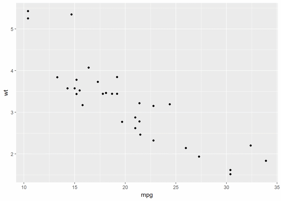
qplot(x=mpg, y=wt, data=df, geom = "point")

也可以添加平滑曲线
qplot(x=mpg, y=wt, data = df, geom = c("point", "smooth"))

还有其他参数可以修改,比如点的形状、大小、颜色等
#将变量cyl映射给颜色和形状
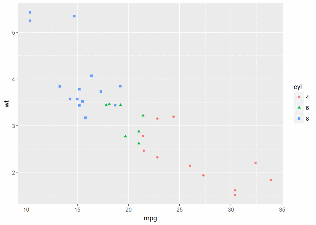
qplot(x=mpg, y=wt, data = df, colour=cyl, shape=cyl)
箱线图、小提琴图、点图 #构造数据集
set.seed(1234)
wdata <- data.frame(
sex=factor(rep(c("F", "M"), each=200)),
weight=c(rnorm(200, 55), rnorm(200, 58))
)
head(wdata) ## sex weight
## 1 F 53.79293
## 2 F 55.27743
## 3 F 56.08444
## 4 F 52.65430
## 5 F 55.42912
## 6 F 55.50606
箱线图
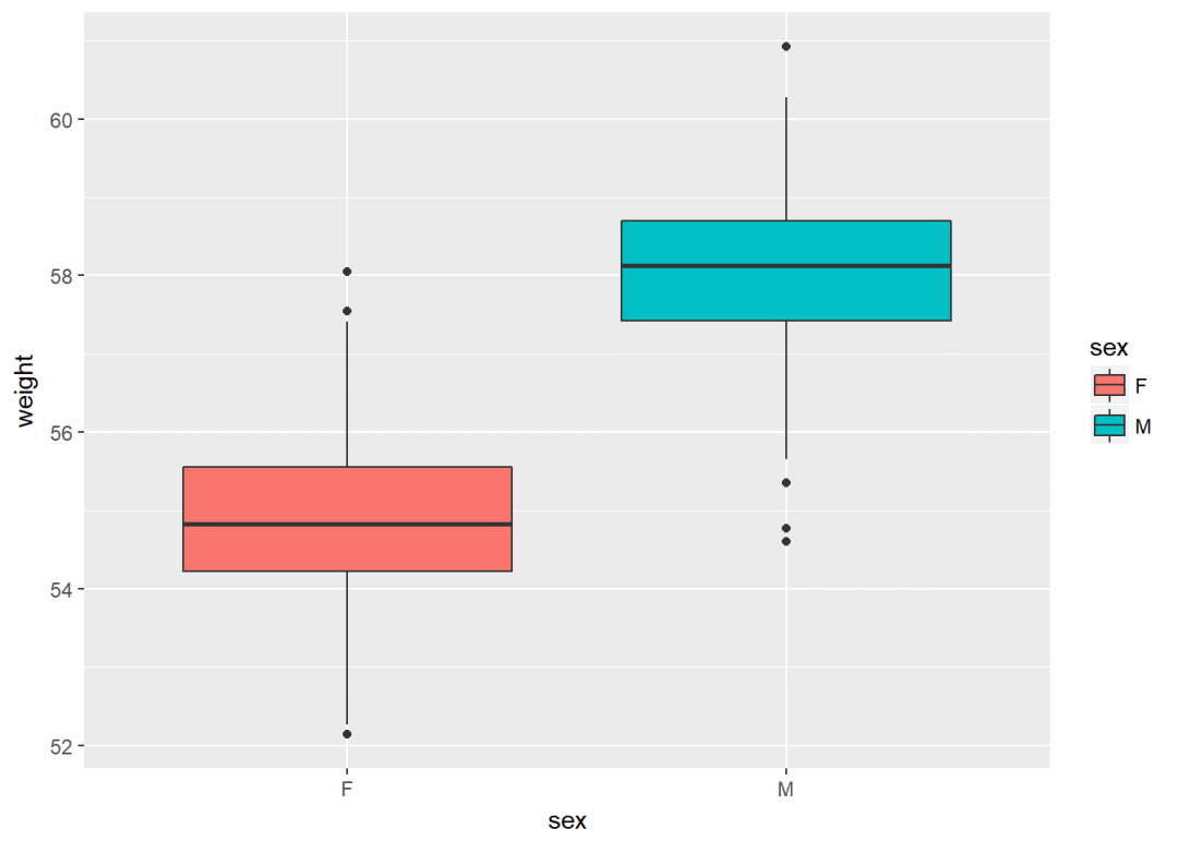
qplot(sex, weight, data = wdata, geom = "boxplot", fill=sex)
小提琴图
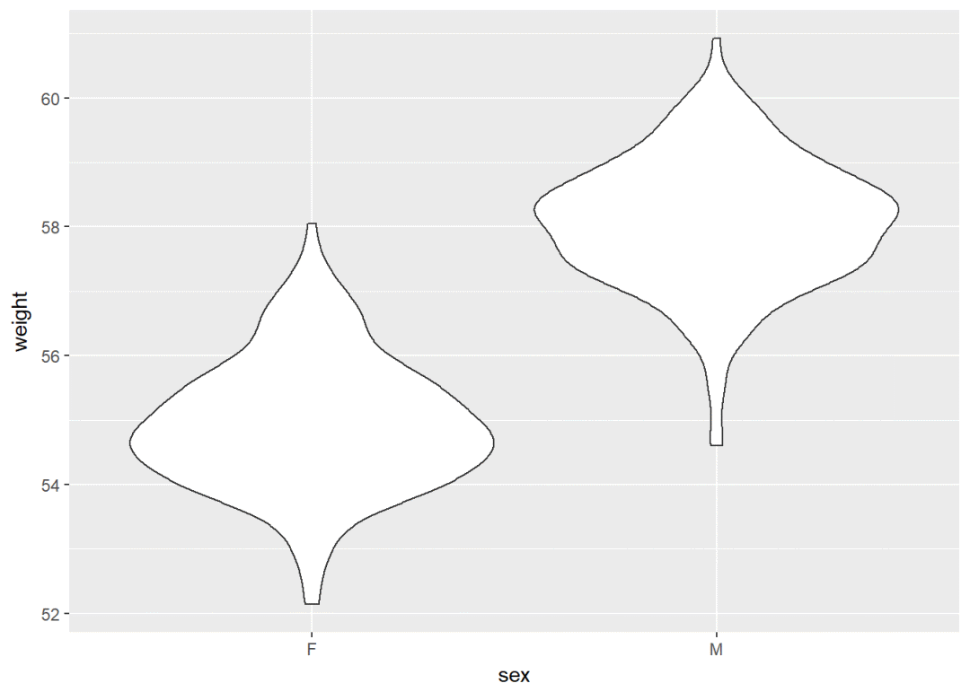
qplot(sex, weight, data = wdata, geom = "violin")
点图
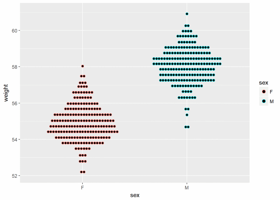
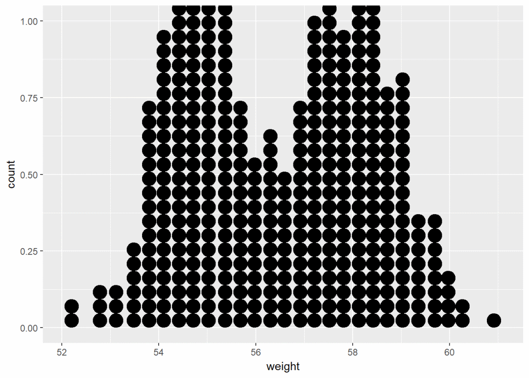
qplot(sex, weight, data = wdata, geom = "dotplot", stackdir="center", binaxis="y", dotsize=0.5, color=sex)
直方图、密度图
直方图
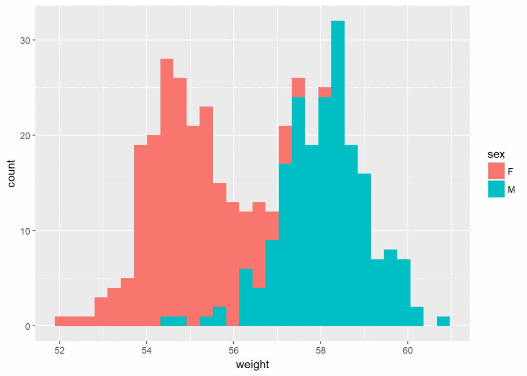
qplot(weight, data = wdata, geom = "histogram", fill=sex)
密度图
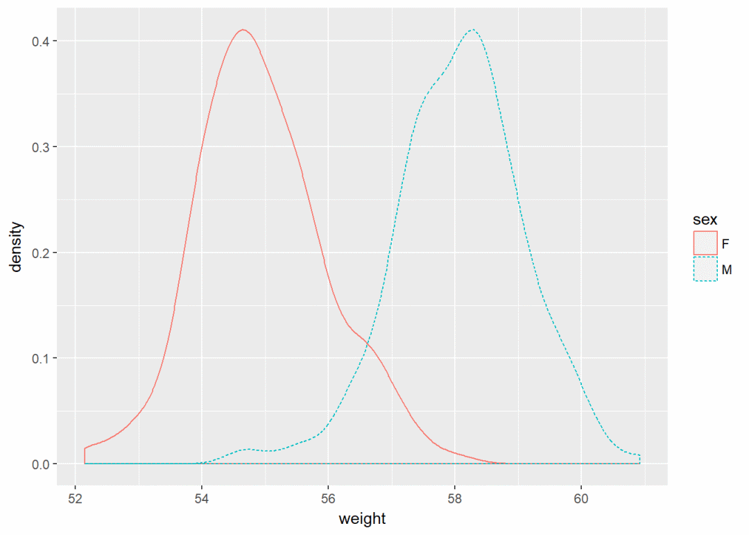
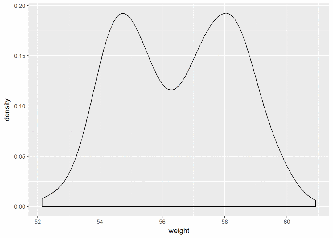
qplot(weight, data = wdata, geom = "density", color=sex, linetype=sex)
ggplot
上文中的qplot绘制散点图:
qplot(x=mpg, y=wt, data=df, geom = "point")
在ggplot中完全可以如下实现:
ggplot(data=df, aes(x=mpg, y=wt))+
geom_point
改变点形状、大小、颜色等属性
ggplot(data=df, aes(x=mpg, y=wt))+geom_point(color="blue", size=2, shape=23)
绘图过程中常常要用到转换(transformation),这时添加图层的另一个方法是用stat_*函数。
下例中的geom_density与stat_density是等价的
ggplot(wdata, aes(x=weight))+geom_density
等价于
ggplot(wdata, aes(x=weight))+stat_density
一个变量:连续型对于每一种几何图形。 ggplot2基本都提供了 geom 和 stat
使用数据集wdata,先计算出不同性别的体重平均值
library(plyr)
mu <- ddply(wdata, "sex", summarise, grp.mean=mean(weight))
先绘制一个图层a,后面逐步添加图层
a <- ggplot(wdata, aes(x=weight))
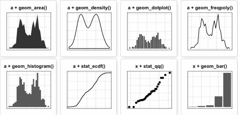
可能添加的图层有:
- 对于一个连续变量:
- 面积图geom_area
- 密度图geom_density
- 点图geom_dotplot
- 频率多边图geom_freqpoly
- 直方图geom_histogram
- 经验累积密度图stat_ecdf
- QQ图stat_qq
- 对于一个离散变量:
- 条形图geom_bar
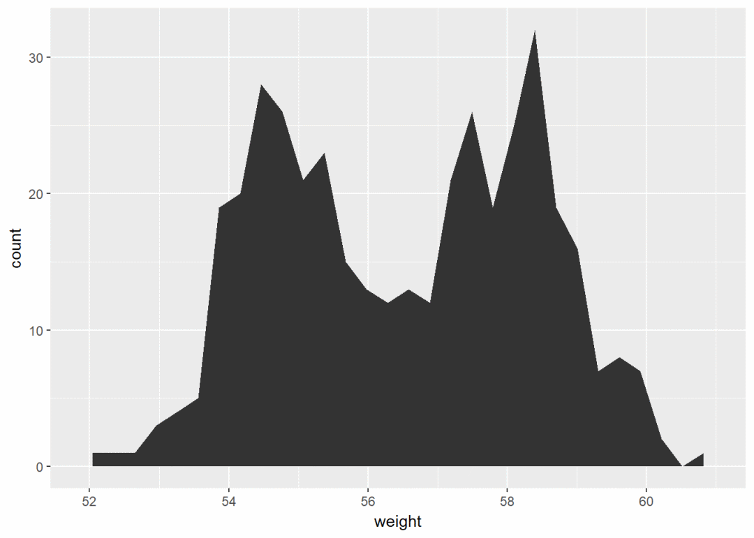
面积图 a+geom_area(stat = "bin")
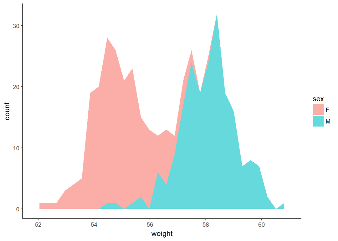
改变颜色
a+geom_area(aes(fill=sex), stat = "bin", alpha=0.6)+
theme_classic
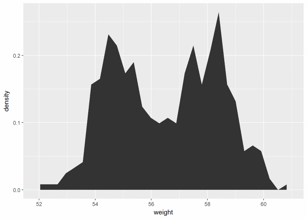
a+geom_area(aes(y=..density..), stat = "bin")注意:y轴默认为变量weight的数量即count,如果y轴要显示密度,可用以下代码:
可以通过修改不同属性如透明度、填充颜色、大小、线型等自定义图形:
密度图
使用以下函数:
- geom_density:绘制密度图
- geom_vline:添加竖直线
- scale_color_manual:手动修改颜色
根据sex修改颜色,将sex映射给line颜色
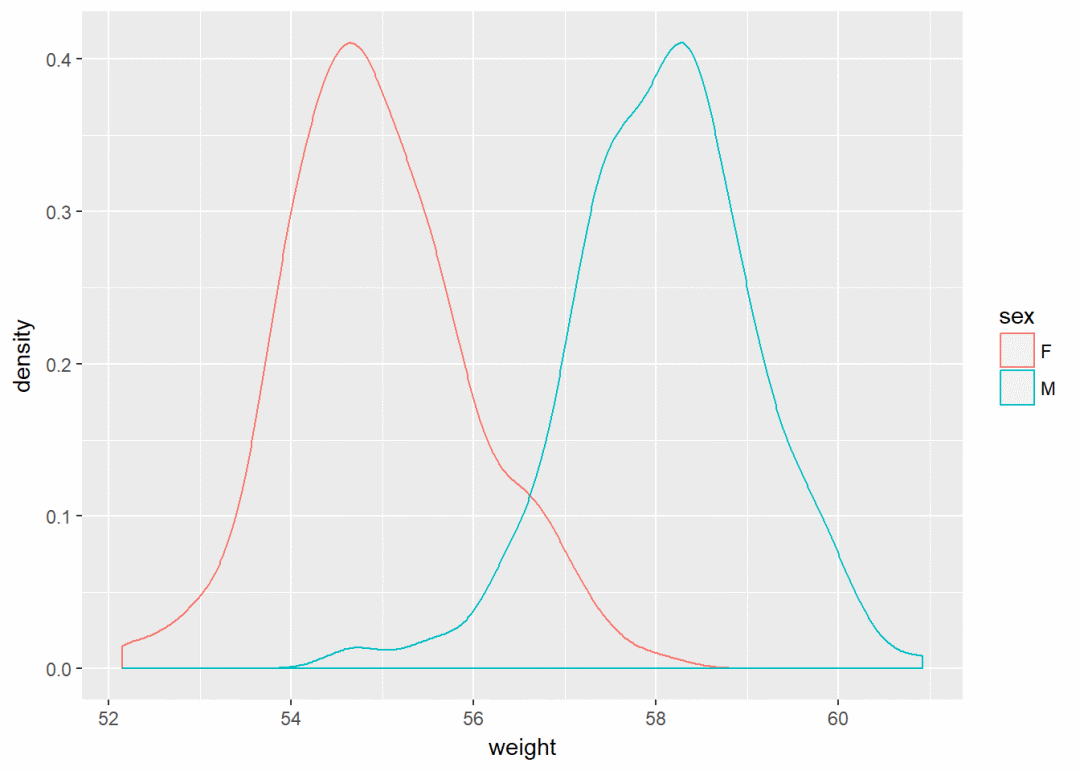
a+geom_density(aes(color=sex))
修改填充颜色以及透明度
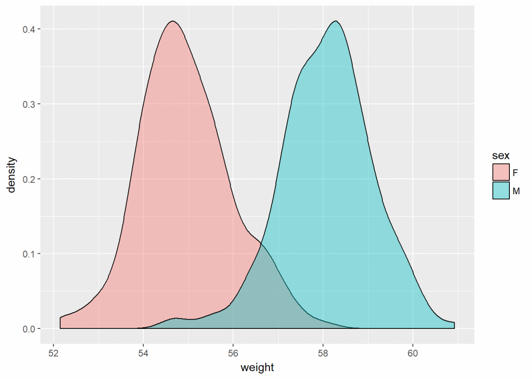
a+geom_density(aes(fill=sex), alpha=0.4)
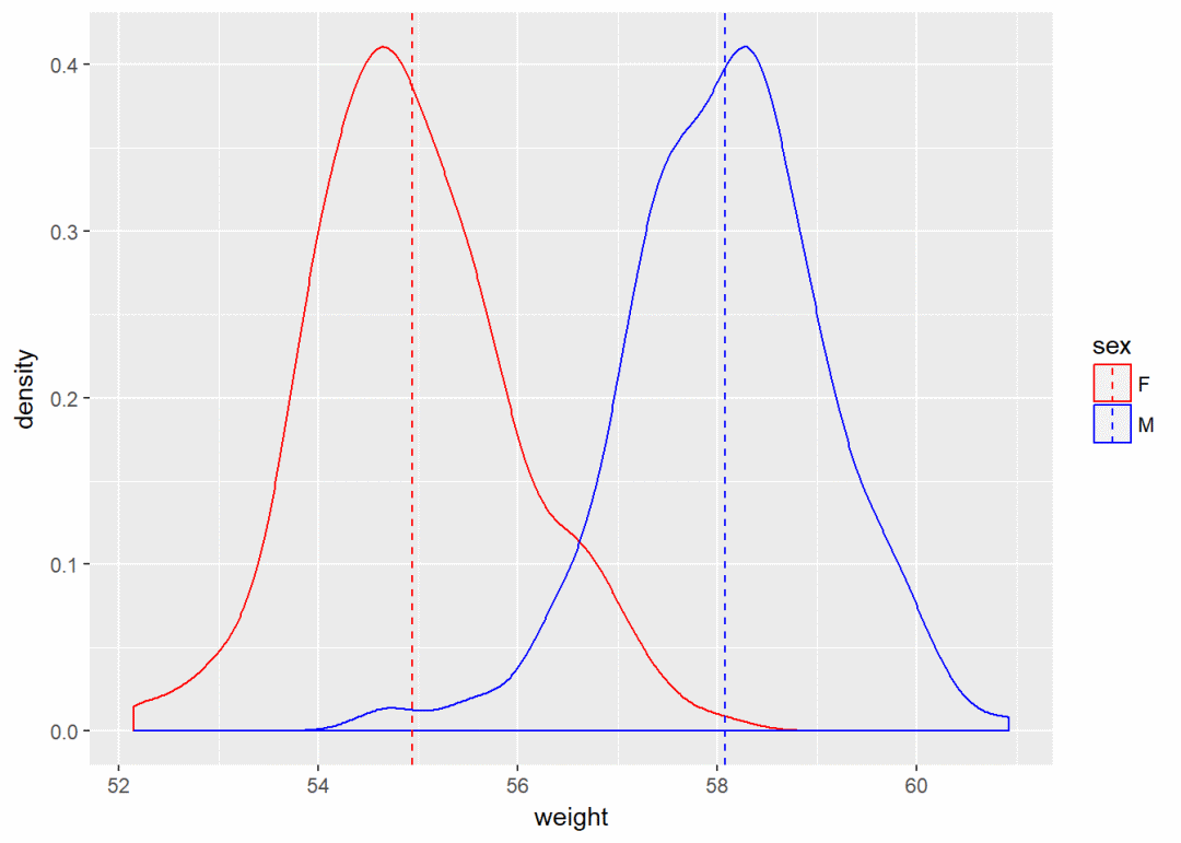
添加均值线以及手动修改颜色
a+geom_density(aes(color=sex))+
geom_vline(data=mu, aes(xintercept=grp.mean, color=sex), linetype="dashed")+
scale_color_manual(values = c("red", "blue"))
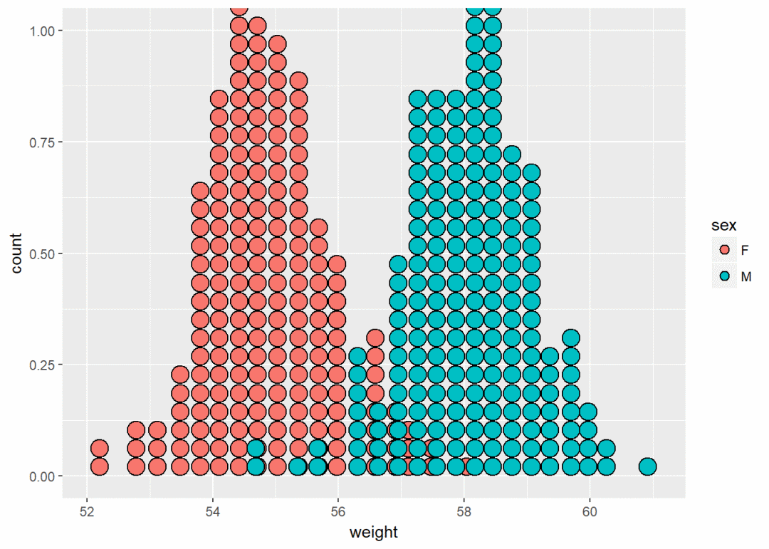
点图 a+geom_dotplot
将sex映射给颜色
a+geom_dotplot(aes(fill=sex))
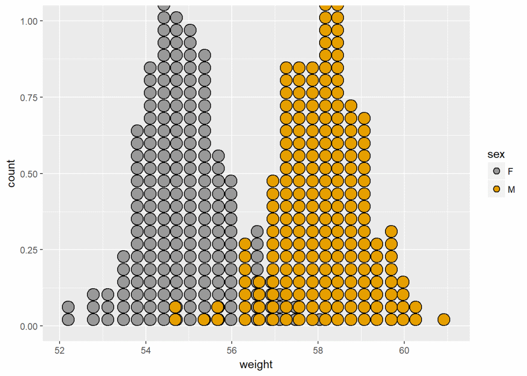
手动修改颜色
a+geom_dotplot(aes(fill=sex))+
scale_fill_manual(values=c("#999999", "#E69F00"))
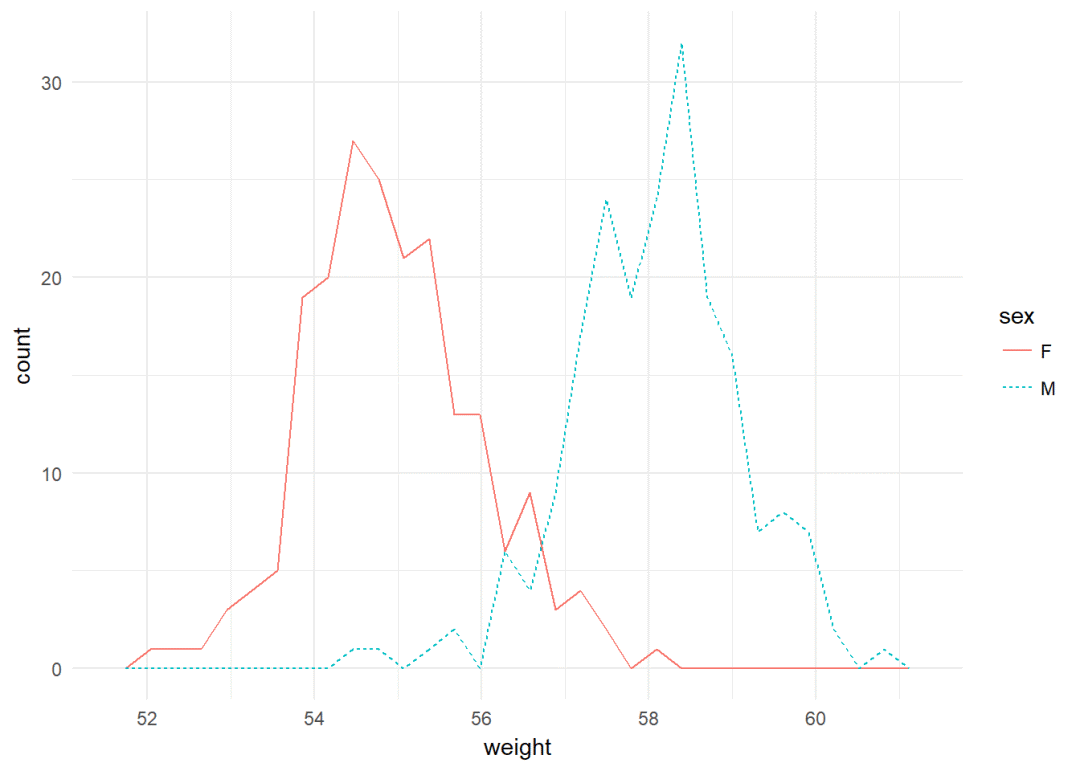
频率多边图 a+geom_freqpoly
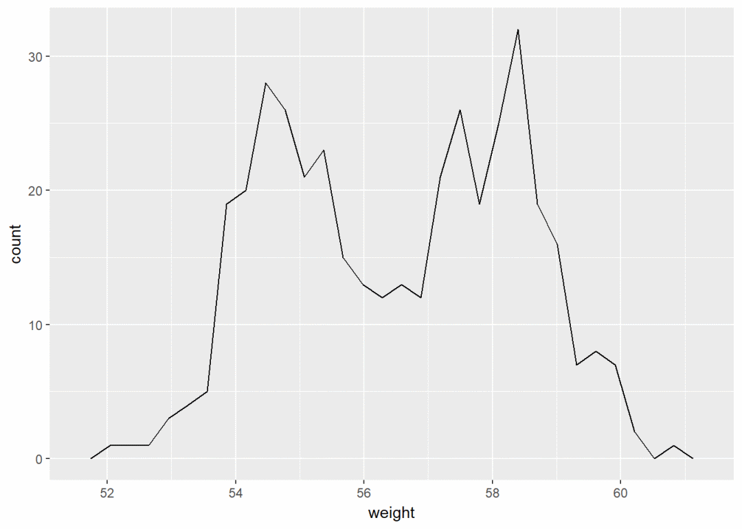
y轴显示为密度
a+geom_freqpoly(aes(y=..density..))+
theme_minimal

修改颜色以及线型
a+geom_freqpoly(aes(color=sex, linetype=sex))+
theme_minimal
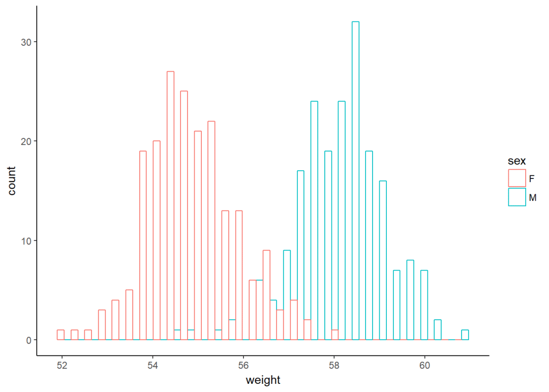
直方图 a+geom_histogram
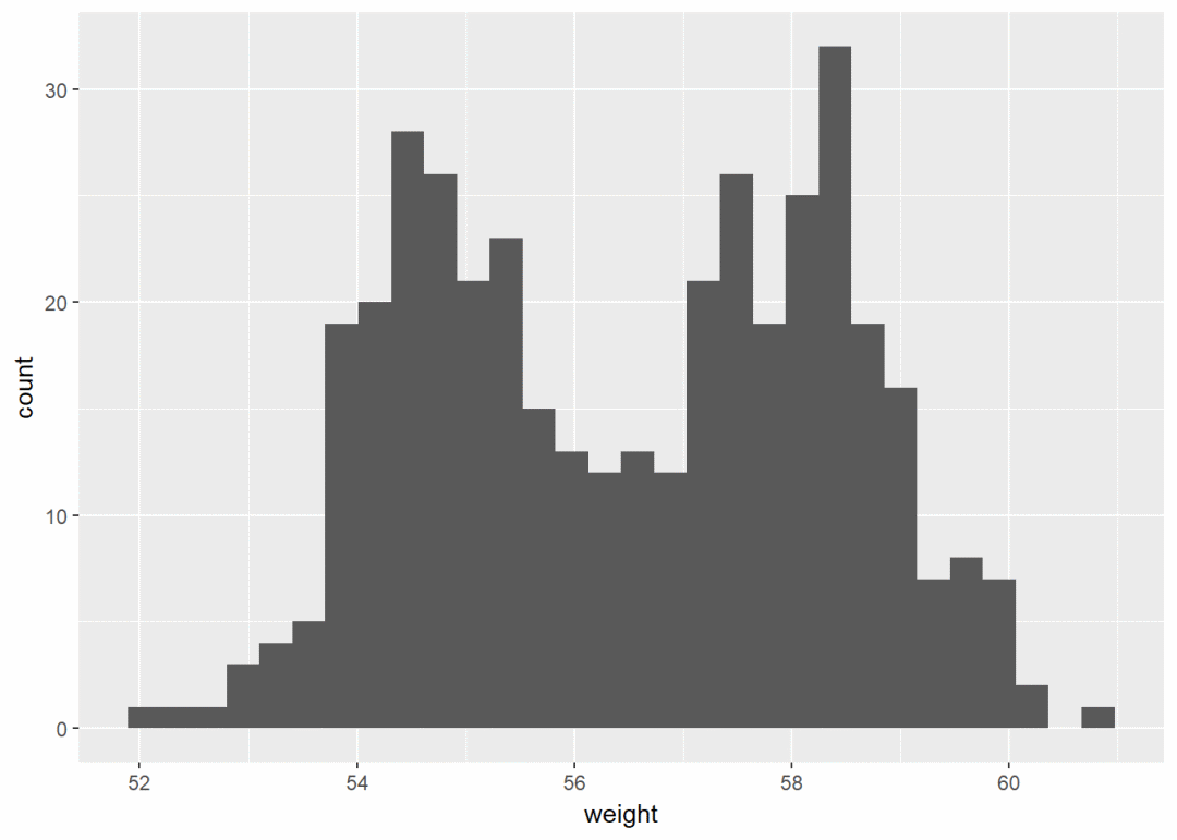
将sex映射给线颜色
a+geom_histogram(aes(color=sex), fill="white", position = "dodge")+theme_classic
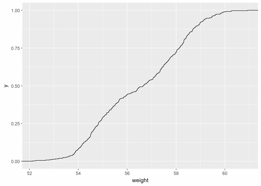
经验累积密度图 a+stat_ecdf
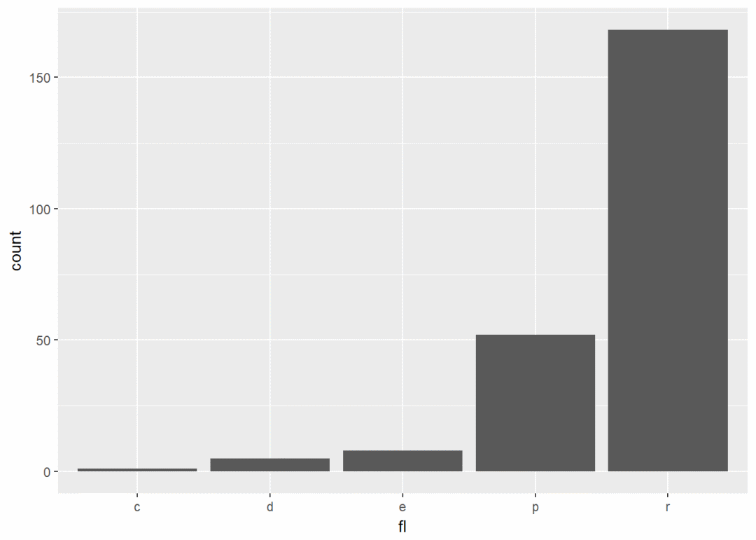
QQ图 ggplot(data = mtcars, aes(sample=mpg))+stat_qq 一个离散变量 #加载数据集
data(mpg)
b <- ggplot(mpg, aes(x=fl))
b+geom_bar
修改填充颜色
b+geom_bar(fill="steelblue", color="black")+theme_classic

两个变量:x,y皆连续
使用数据集mtcars, 先创建一个ggplot图层
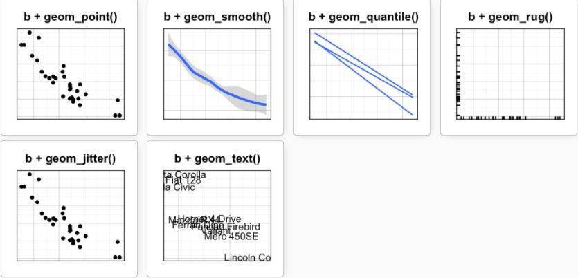
b <- ggplot(data = mtcars, aes(x=wt, y=mpg))
可能添加的图层有:
- geom_point:散点图
- geom_smooth:平滑线
- geom_quantile:分位线
- geom_rug:边际地毯线
- geom_jitter:避免重叠
- geom_text:添加文本注释
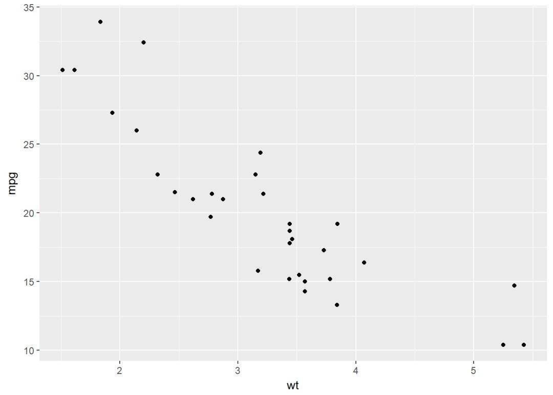
散点图 b+geom_point
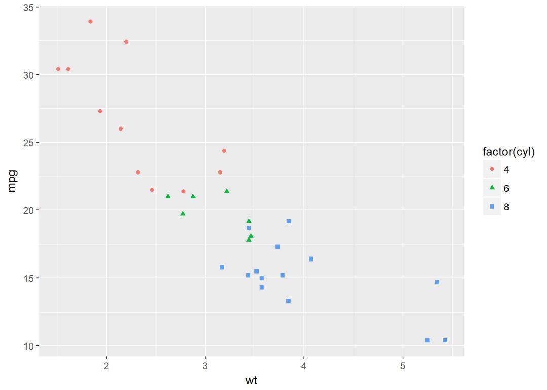
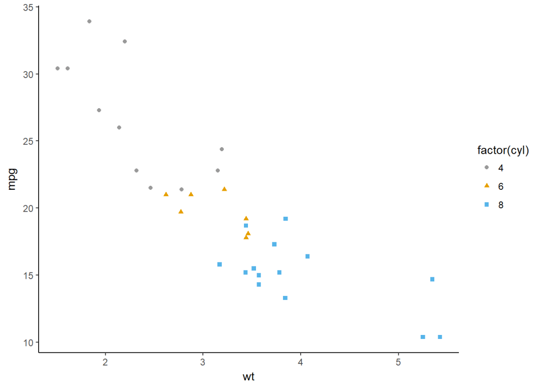
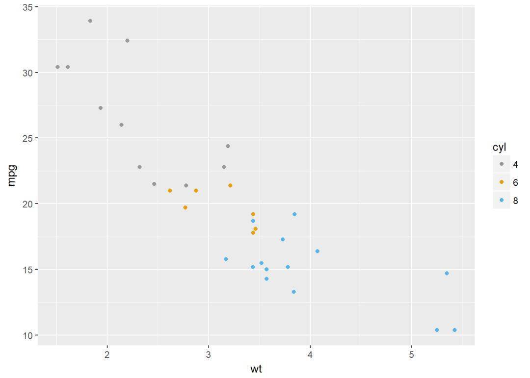
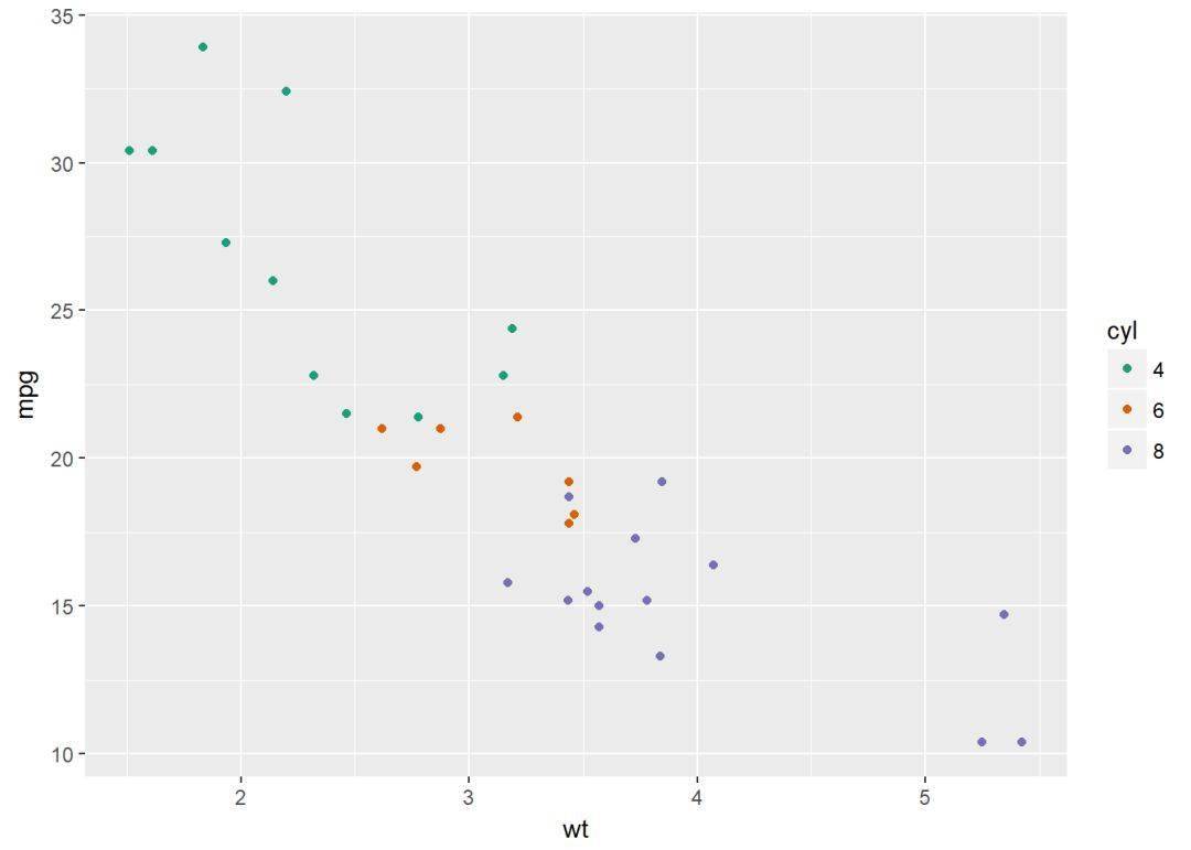
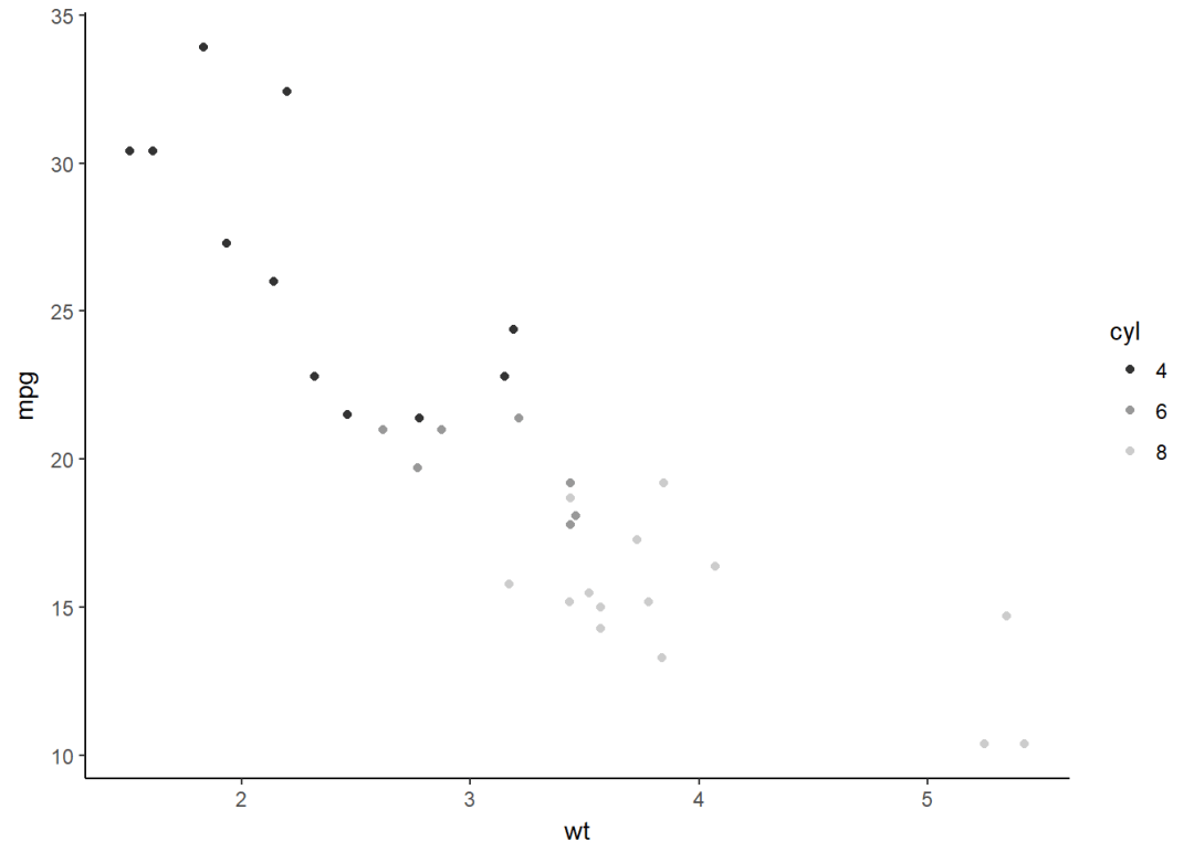
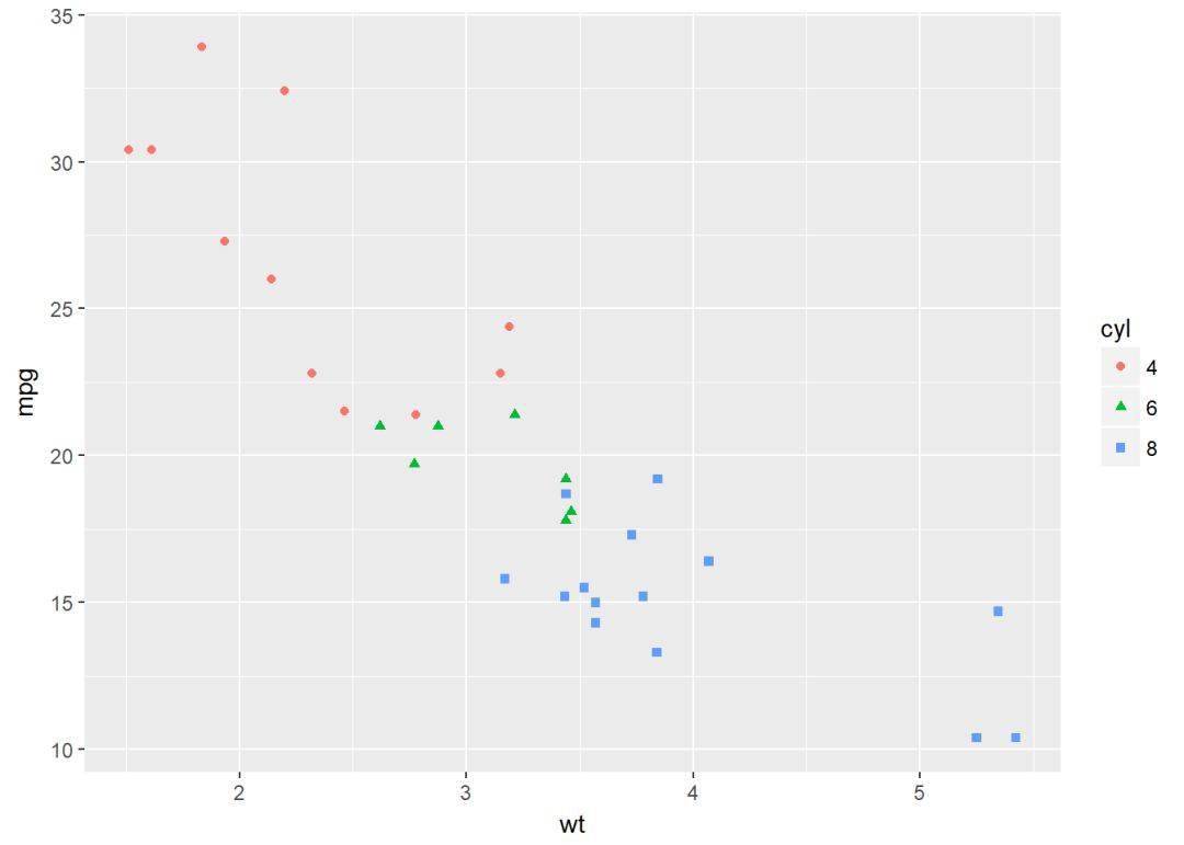
将变量cyl映射给点的颜色和形状
b + geom_point(aes(color = factor(cyl), shape = factor(cyl)))
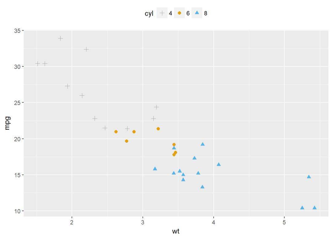
自定义颜色
b+geom_point(aes(color=factor(cyl), shape=factor(cyl)))+
scale_color_manual(values=c("#999999", "#E69F00", "#56B4E9"))+theme_classic
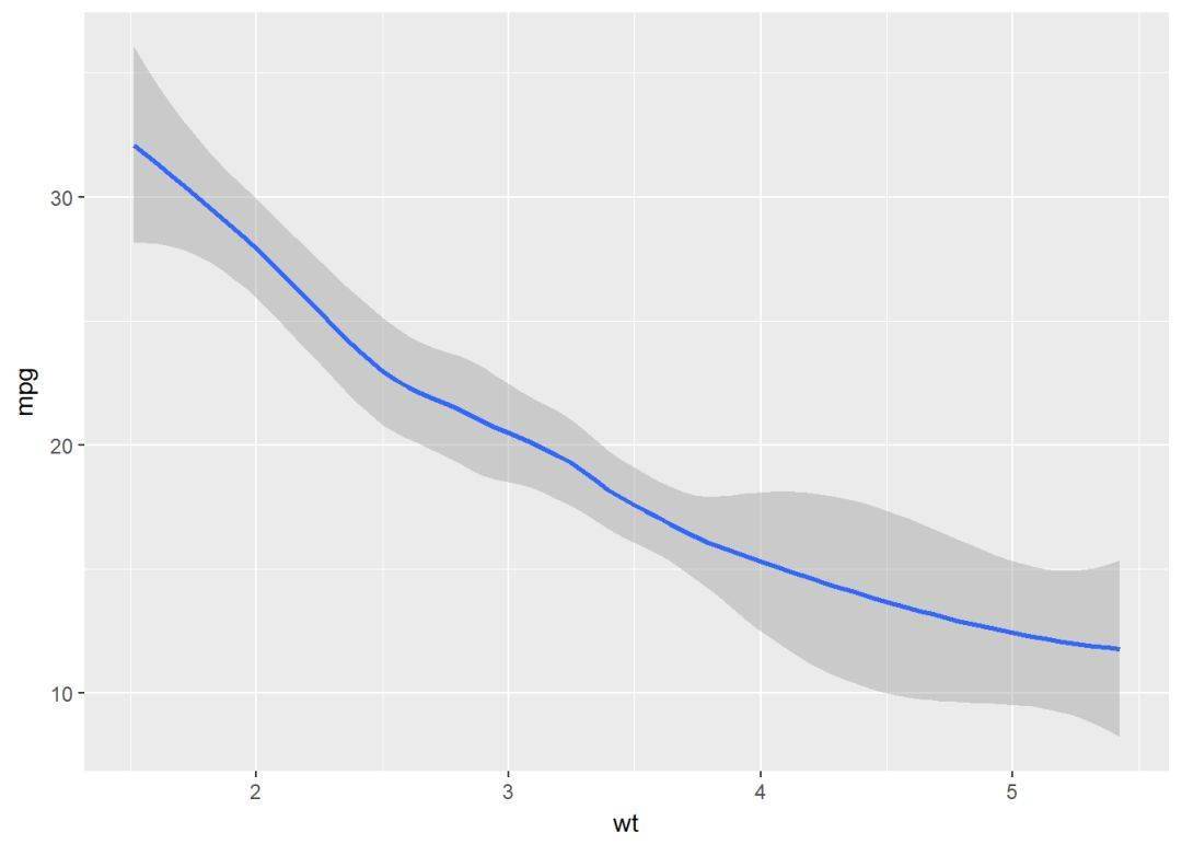
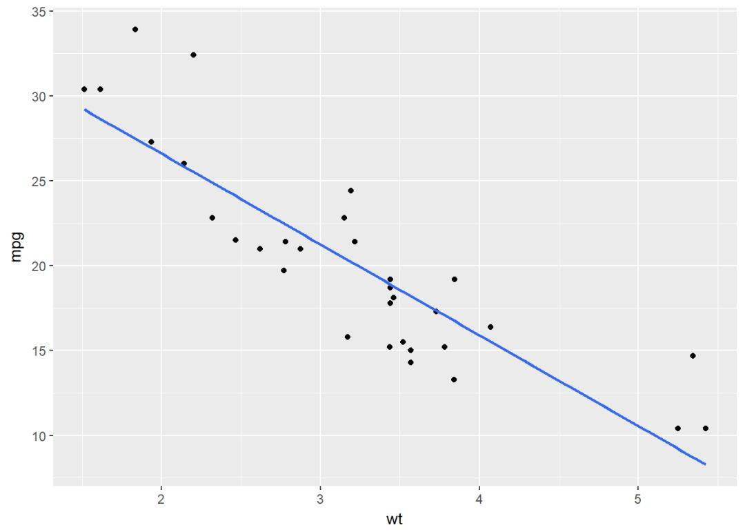
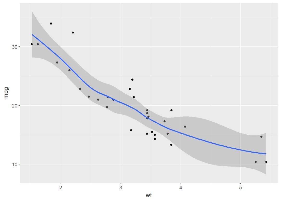
平滑线
可以添加回归曲线
b+geom_smooth
散点图+回归线
b+geom_point+
geom_smooth(method = "lm", se=FALSE)#去掉置信区间
使用loess方法
b+geom_point+
geom_smooth(method = "loess")
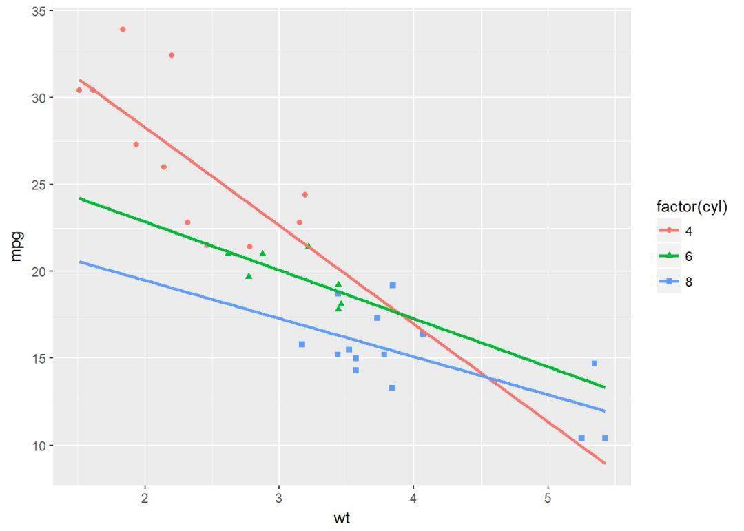
将变量映射给颜色和形状
b+geom_point(aes(color=factor(cyl), shape=factor(cyl)))+
geom_smooth(aes(color=factor(cyl), shape=factor(cyl)), method = "lm", se=FALSE, fullrange=TRUE)
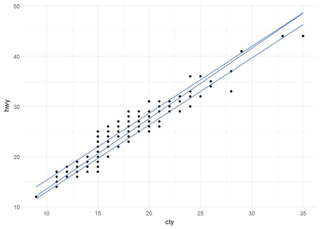
分位线 ggplot(data = mpg, aes(cty, hwy))+
geom_point+geom_quantile+
theme_minimal
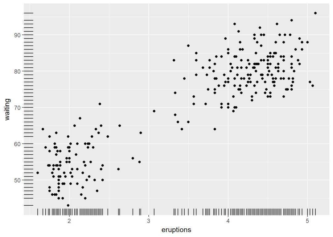
边际地毯线
使用数据集 faithful
ggplot(data = faithful, aes(x=eruptions, y=waiting))+
geom_point+geom_rug
避免重叠
实际上 geom_jitter 是 geom_point(position="jitter") 的简称,下面使用数据集 mpg
p <- ggplot(data = mpg, aes(displ, hwy))
p+geom_point
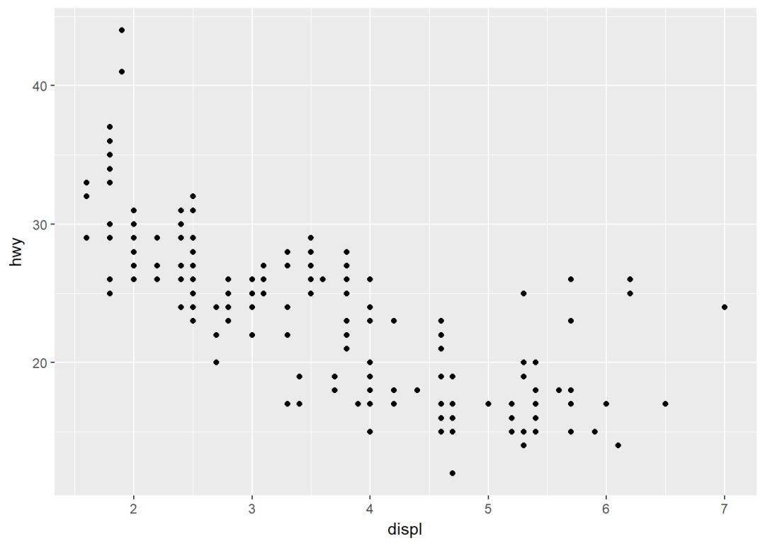
增加抖动防止重叠
p+geom_jitter(width = 0.5, height = 0.5)
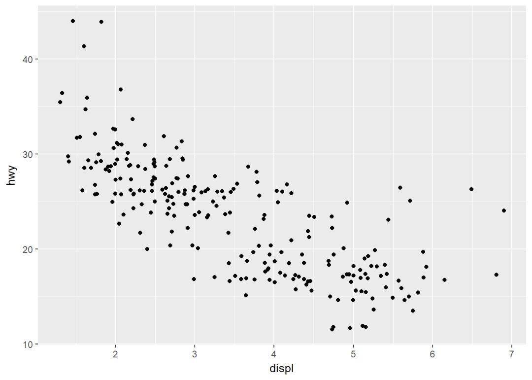
其中两个参数:
- width:x轴方向的抖动幅度
- height:y轴方向的抖动幅度
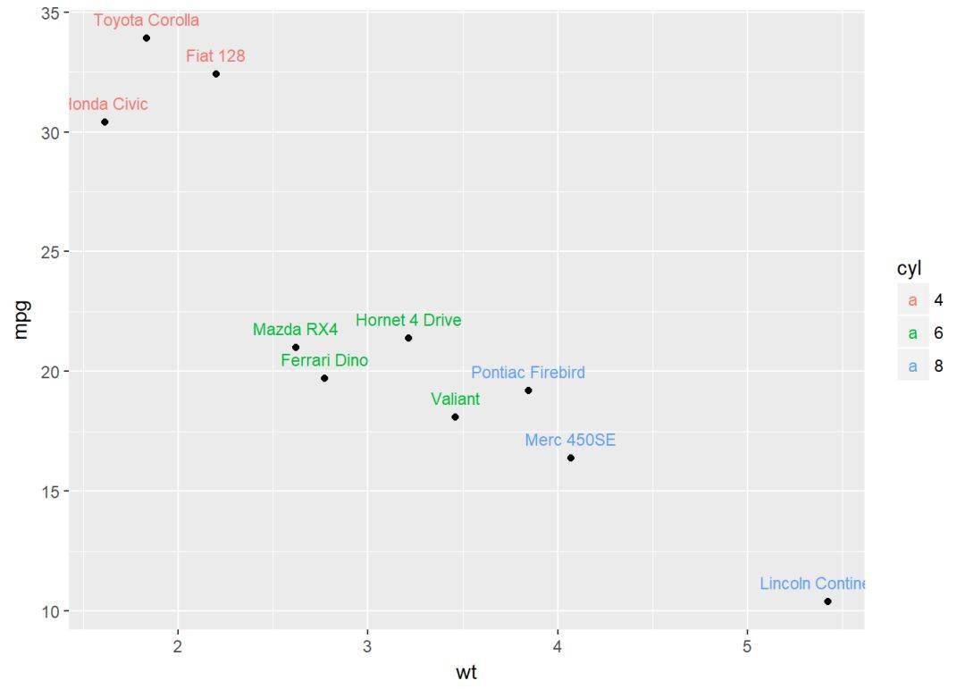
参数label用来指定注释标签 (ggrepel可以避免标签重叠)
b+geom_text(aes(label=rownames(mtcars)))
两个变量:连续二元分布
使用数据集 diamonds
head(diamonds[, c("carat", "price")]) ## # A tibble: 6 x 2
## carat price
## <dbl> <int>
## 1 0.23 326
## 2 0.21 326
## 3 0.23 327
## 4 0.29 334
## 5 0.31 335
## 6 0.24 336
创建ggplot图层,后面再逐步添加图层
c <- ggplot(data=diamonds, aes(carat, price))
可添加的图层有:
- geom_bin2d: 二维封箱热图
- geom_hex: 六边形封箱图
- geom_density_2d: 二维等高线密度图
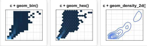
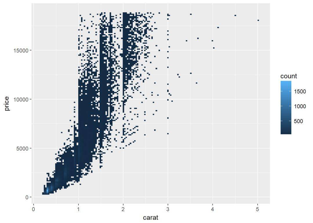
二维封箱热图
geom_bin2d 将点的数量用矩形封装起来,通过颜色深浅来反映点密度
c+geom_bin2d
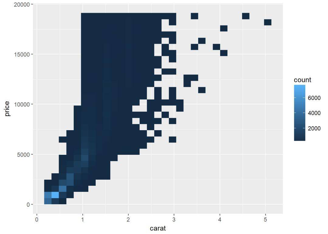
设置bin的数量
c+geom_bin2d(bins=150)
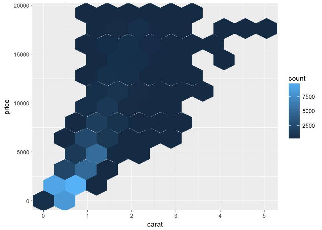
六边形封箱图
geom_hex依赖于另一个R包 hexbin,所以没安装的先安装:
install.packages("hexbin") library(hexbin)
c+geom_hex
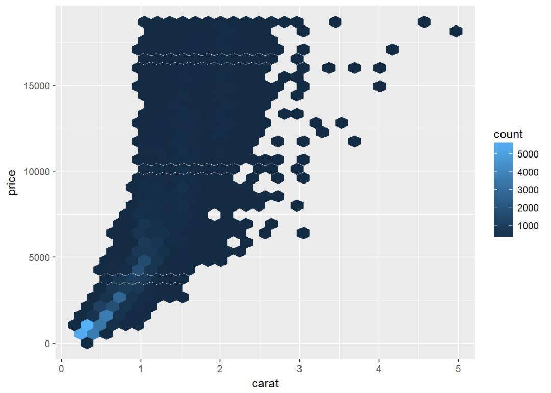
修改bin的数目
c+geom_hex(bins=10)
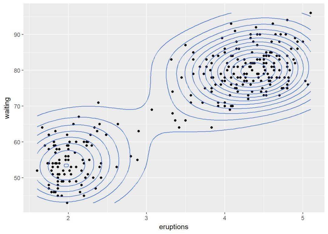
二维等高线密度图 sp <- ggplot(faithful, aes(x=eruptions, y=waiting))
sp+geom_point+ geom_density_2d
两个变量:连续函数
主要是如何通过线来连接两个变量,使用数据集 economics。
head(economics) ## # A tibble: 6 x 6
## date pce pop psavert uempmed unemploy
## <date> <dbl> <int> <dbl> <dbl> <int>
## 1 1967-07-01 507.4 198712 12.5 4.5 2944
## 2 1967-08-01 510.5 198911 12.5 4.7 2945
## 3 1967-09-01 516.3 199113 11.7 4.6 2958
## 4 1967-10-01 512.9 199311 12.5 4.9 3143
## 5 1967-11-01 518.1 199498 12.5 4.7 3066
## 6 1967-12-01 525.8 199657 12.1 4.8 3018
先创建一个ggplot图层,后面逐步添加图层
d <- ggplot(data = economics, aes(x=date, y=unemploy))
可添加的图层有:
- geom_area:面积图
- geom_line:折线图
- geom_step: 阶梯图
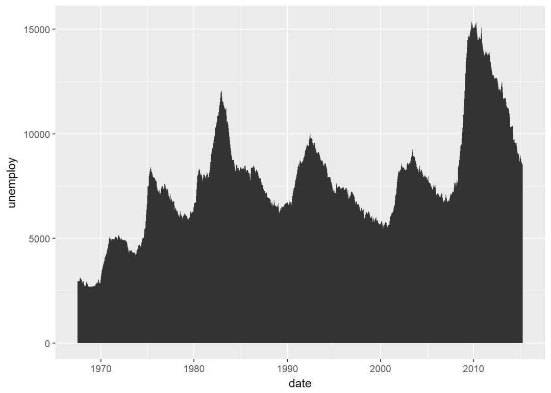
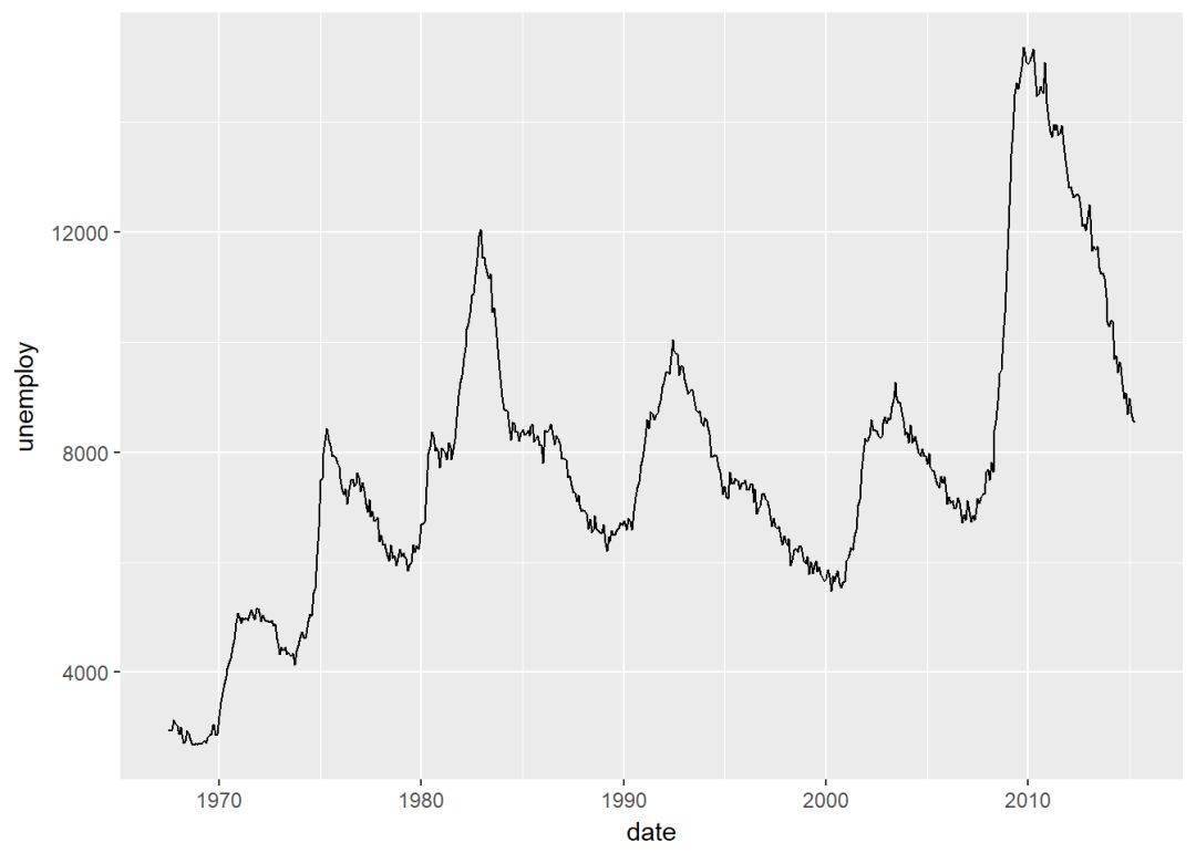
线图 d+geom_line

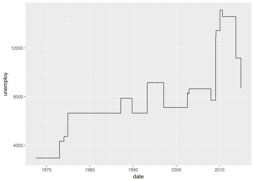
阶梯图 set.seed(1111)
ss <- economics[sample(1:nrow(economics), 20),]
ggplot(ss, aes(x=date, y=unemploy))+
geom_step
两个变量:x离散,y连续
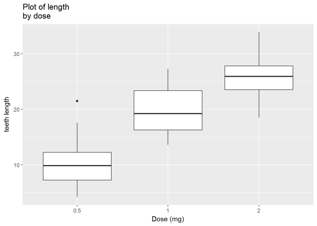
使用数据集 ToothGrowth,其中的变量len(Tooth length)是连续变量,dose是离散变量。
ToothGrowth$dose <- as.factor(ToothGrowth$dose)
head(ToothGrowth) ## len supp dose
## 1 4.2 VC 0.5
## 2 11.5 VC 0.5
## 3 7.3 VC 0.5
## 4 5.8 VC 0.5
## 5 6.4 VC 0.5
## 6 10.0 VC 0.5
创建图层
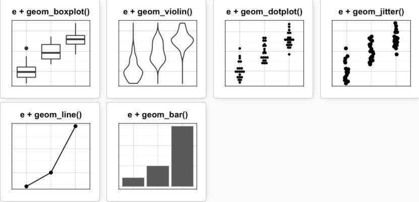
e <- ggplot(data = ToothGrowth, aes(x=dose, y=len))
可添加的图层有:
- geom_boxplot: 箱线图
- geom_violin:小提琴图
- geom_dotplot:点图
- geom_jitter: 带状图
- geom_line: 线图
- geom_bar: 条形图
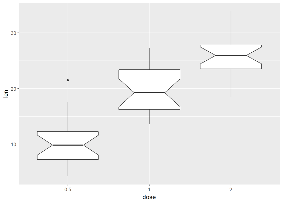
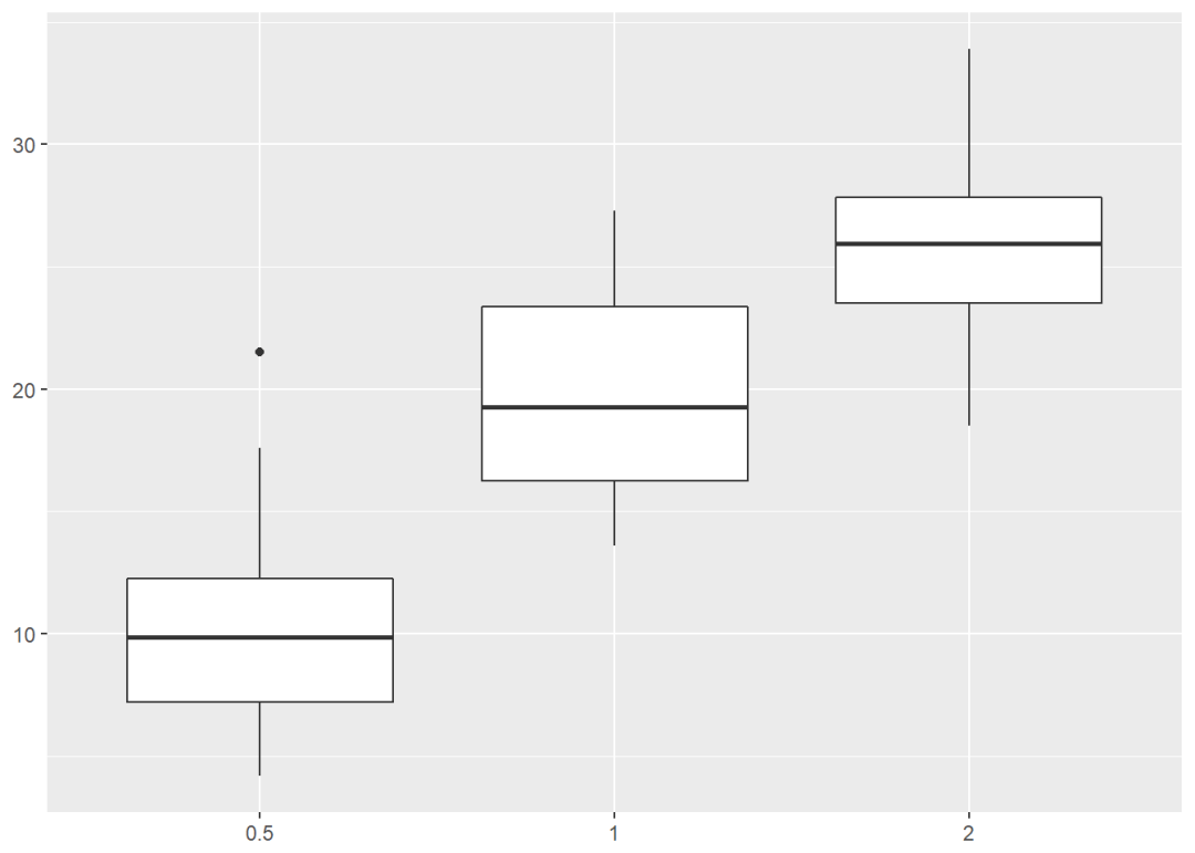
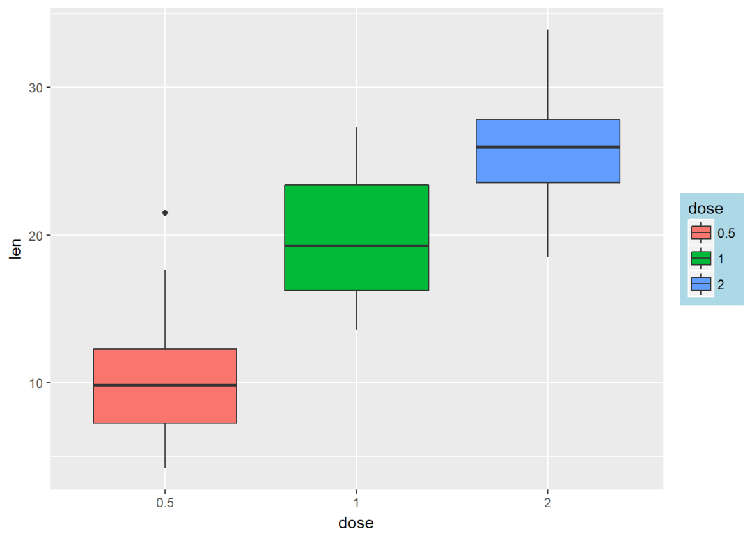
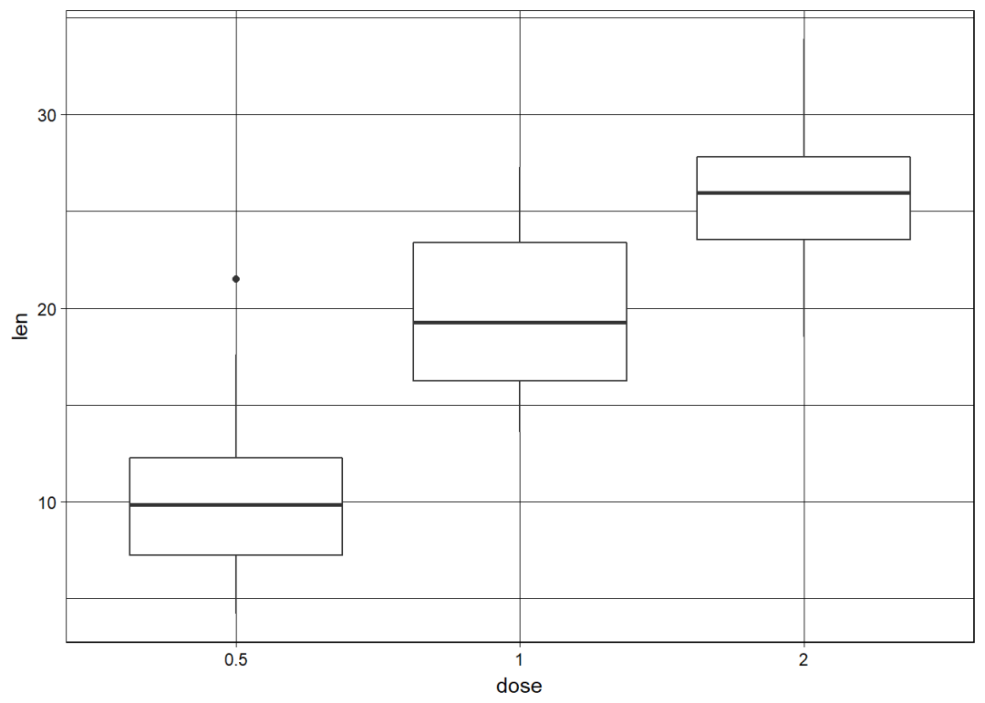
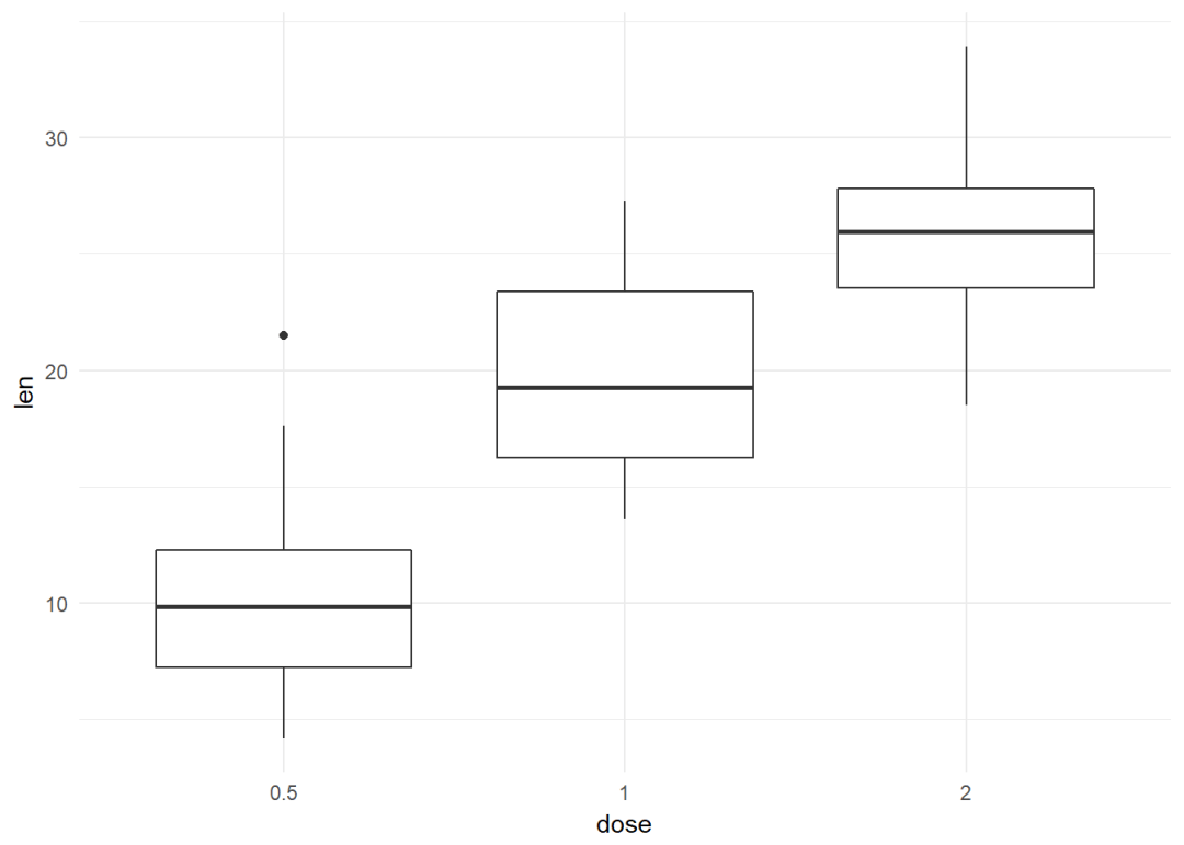
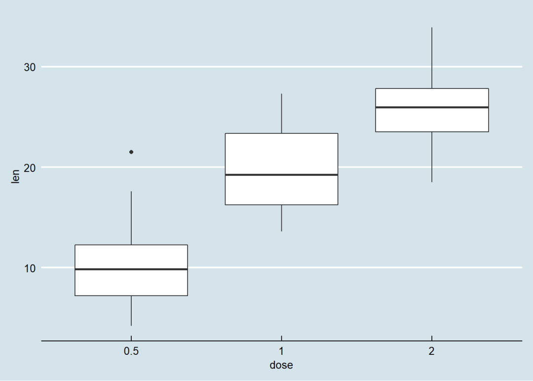
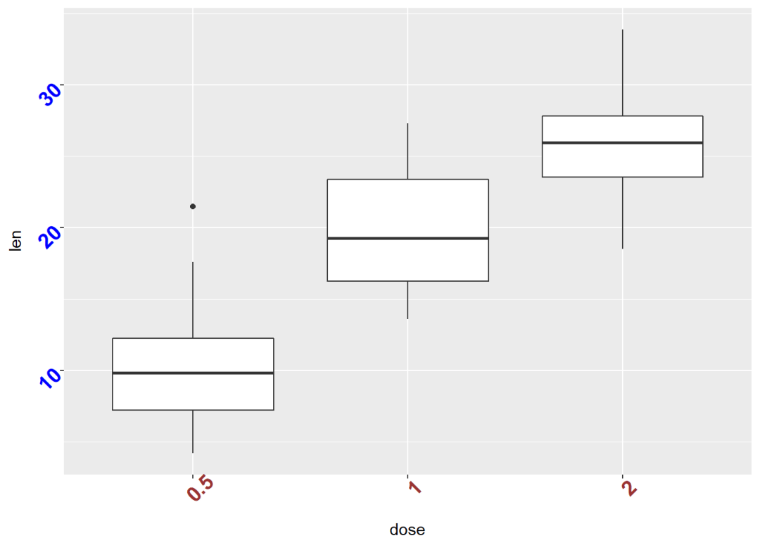
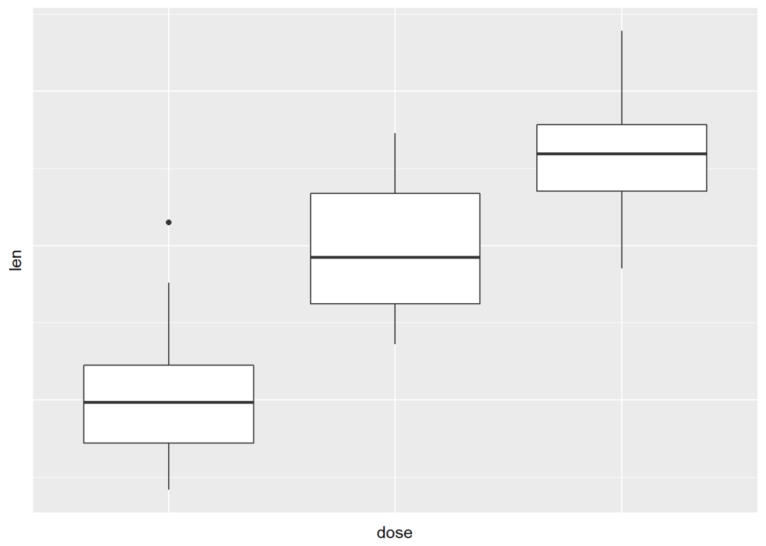
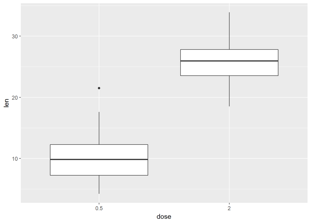
箱线图 e+geom_boxplot
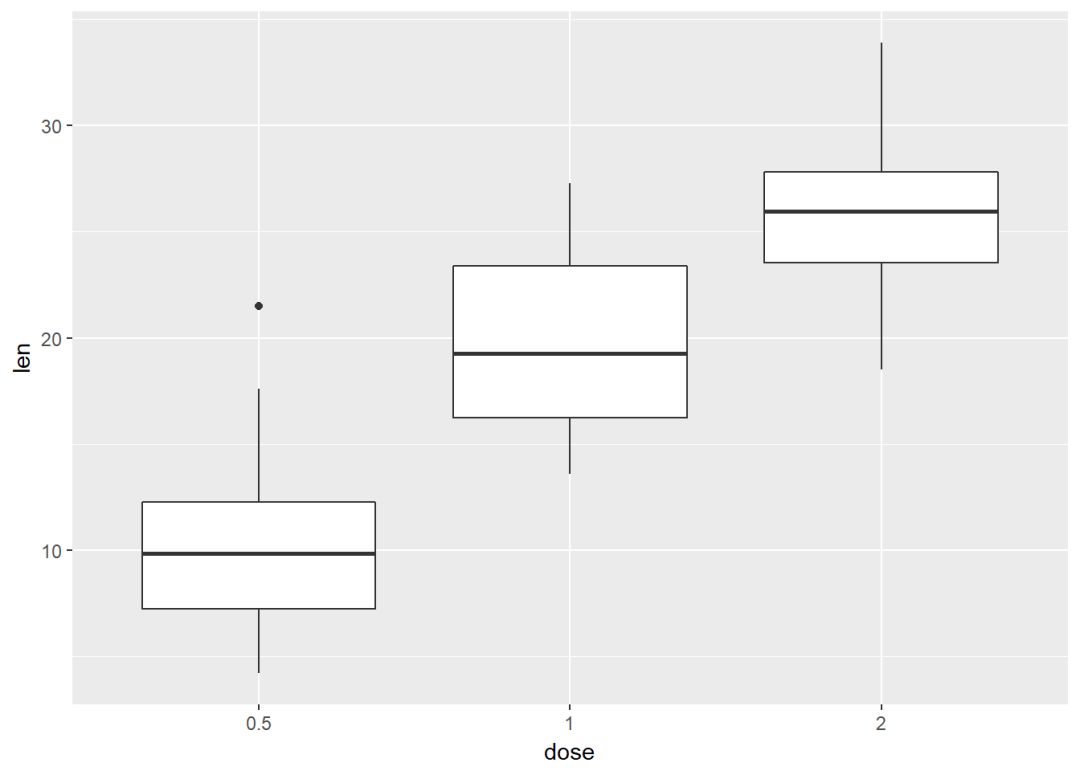
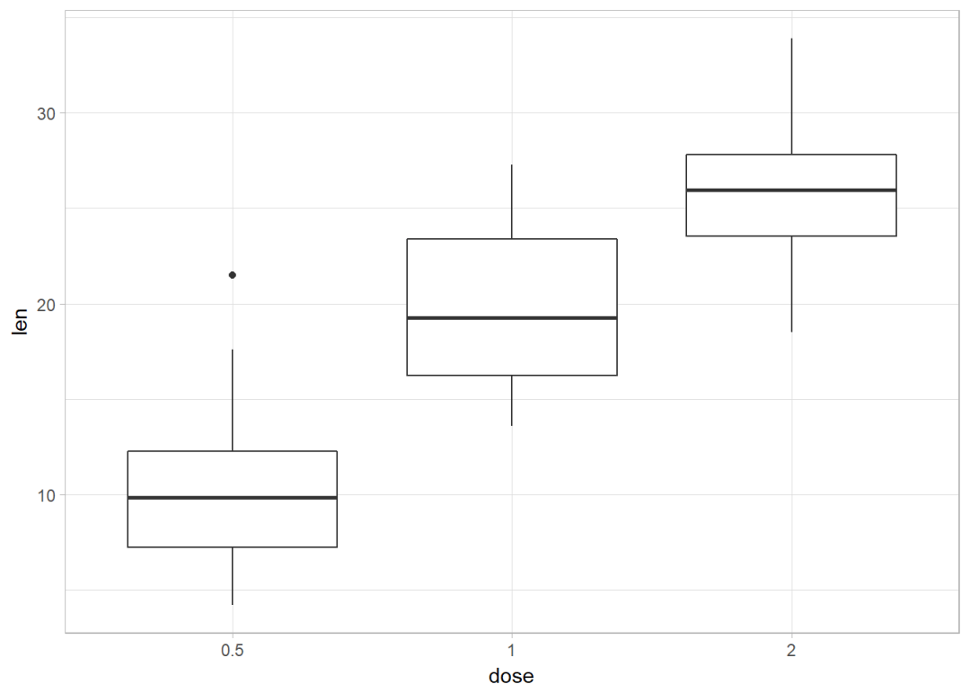
添加有缺口的箱线图
e+geom_boxplot(notch = TRUE)
按dose分组映射给颜色
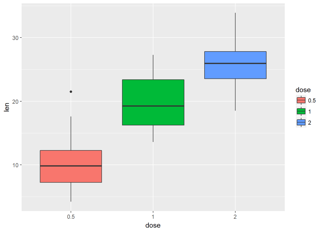
e+geom_boxplot(aes(color=dose))
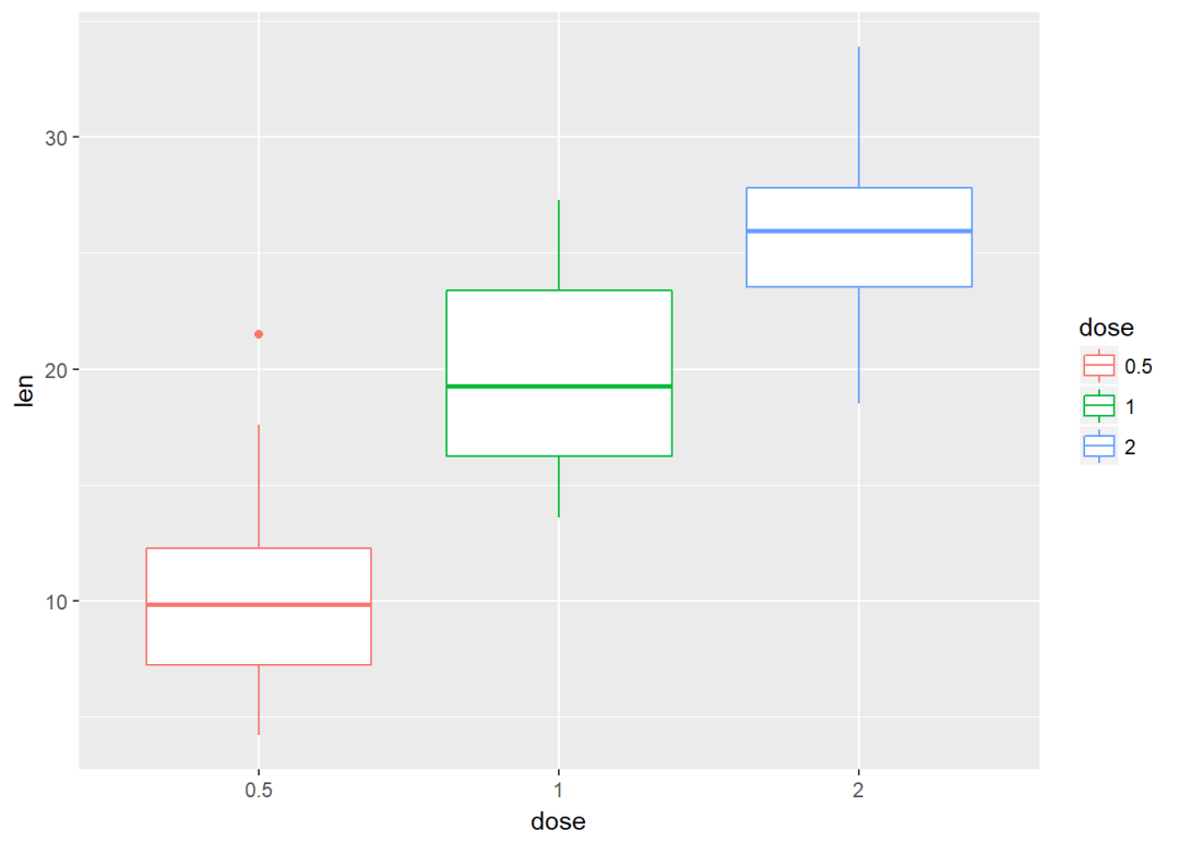
将dose映射给填充颜色
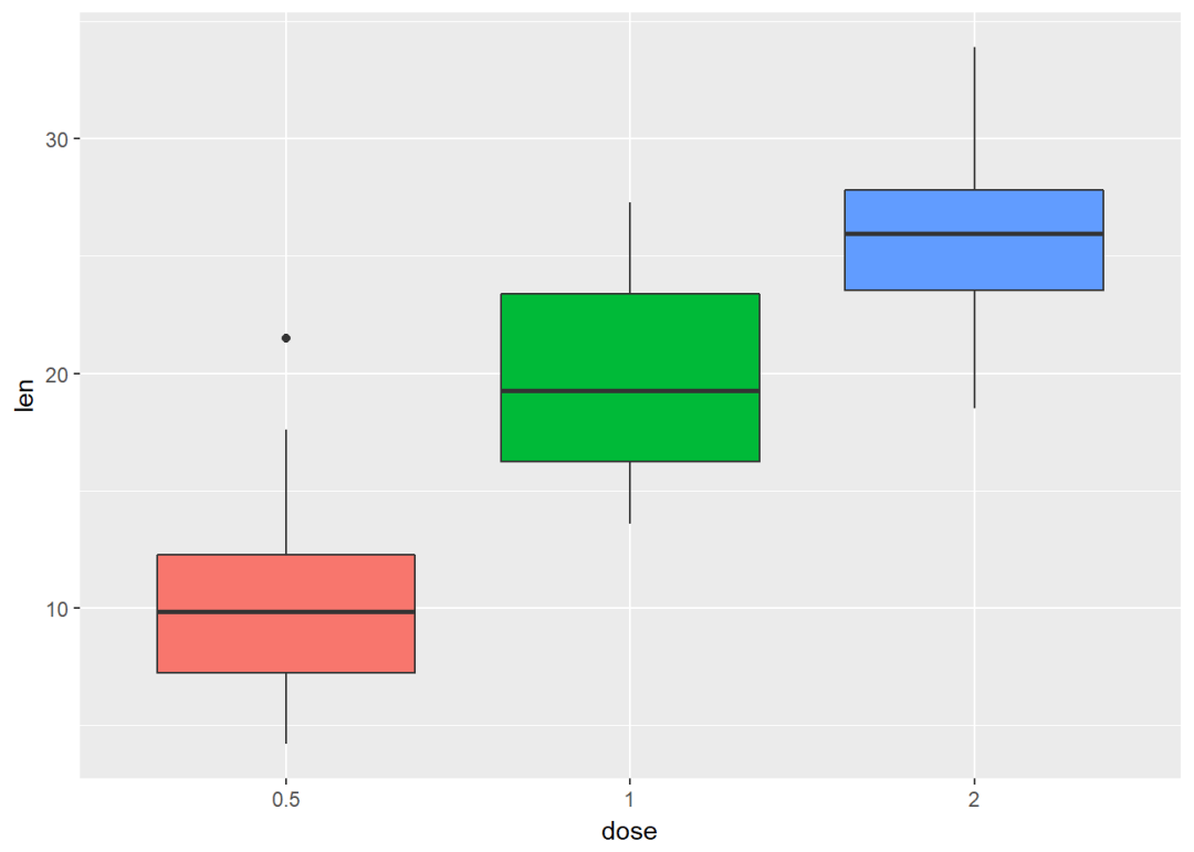
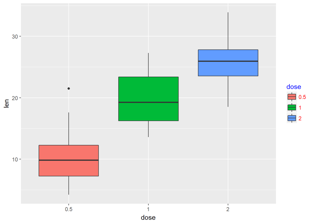
e+geom_boxplot(aes(fill=dose))

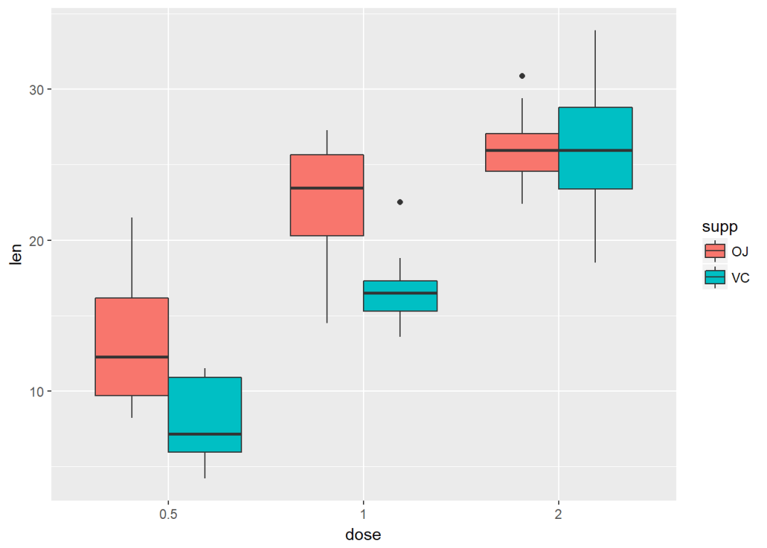
按supp进行分类并映射给填充颜色
ggplot(ToothGrowth, aes(x=dose, y=len))+ geom_boxplot(aes(fill=supp))
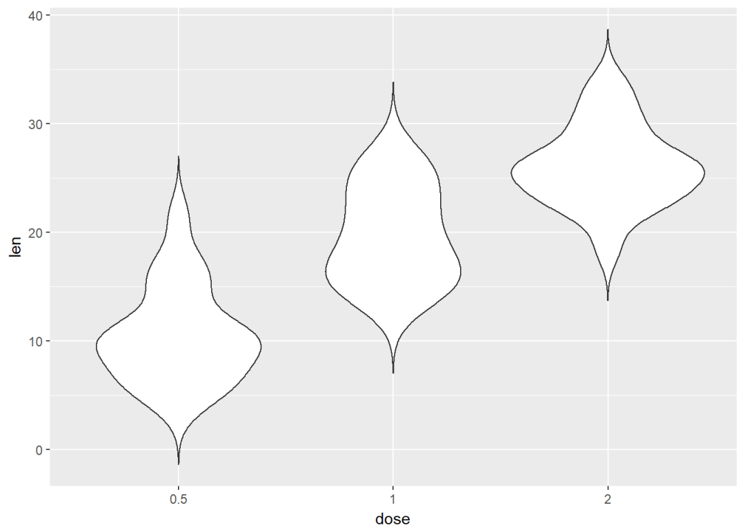
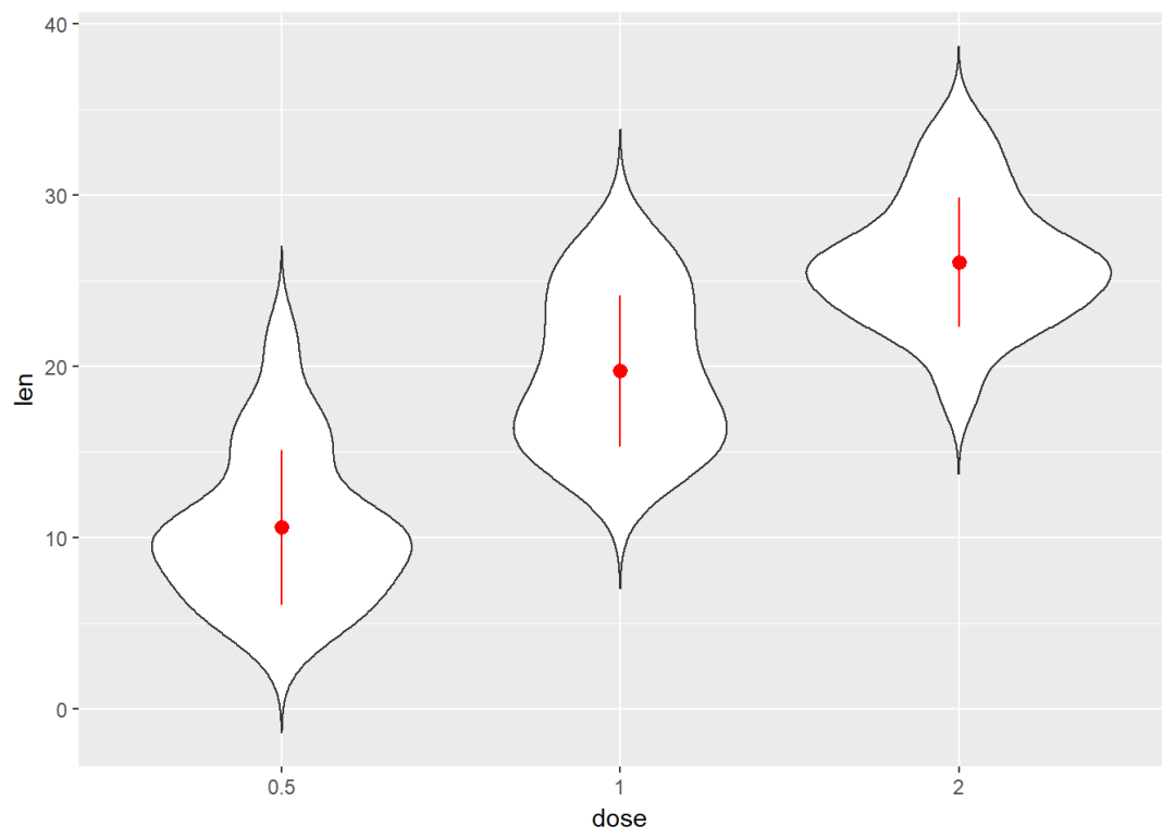
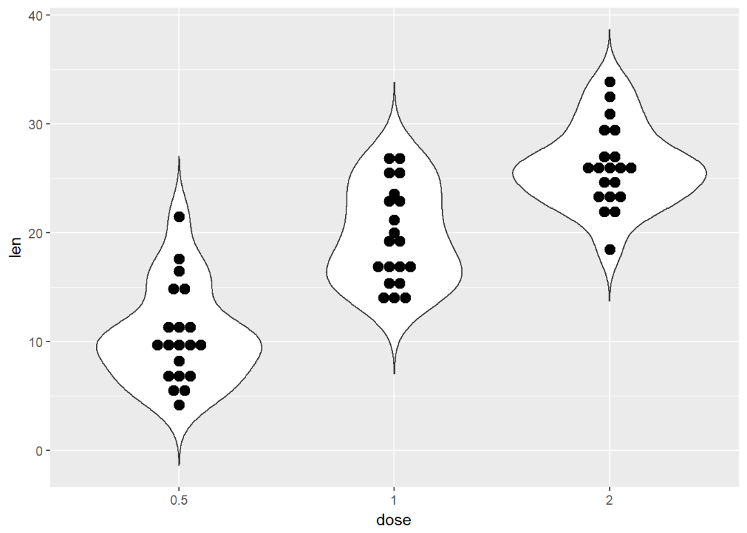
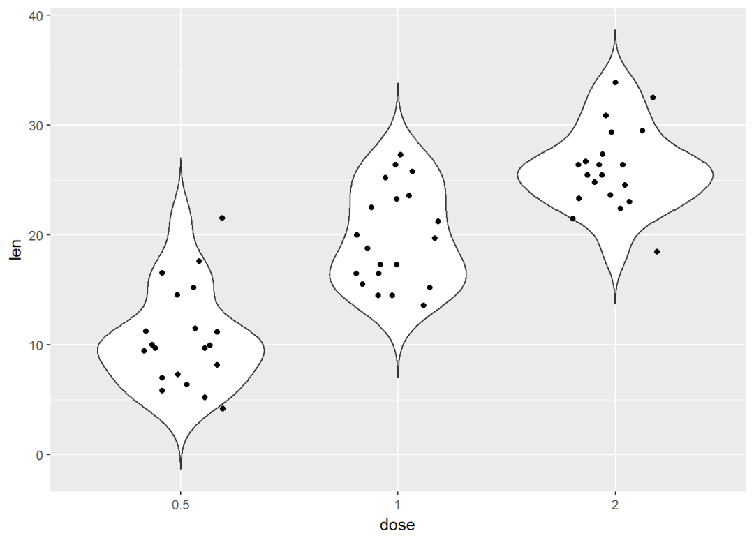
小提琴图 e+geom_violin(trim = FALSE)
添加中值点
e+geom_violin(trim = FALSE)+
stat_summary(fun.data = mean_sdl, fun.args = list(mult=1),
geom="pointrange", color="red")
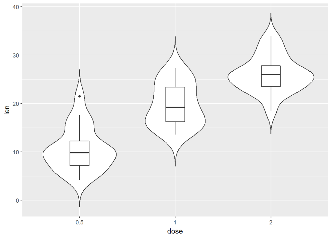
与箱线图结合
e+geom_violin(trim = FALSE)+
geom_boxplot(width=0.2)
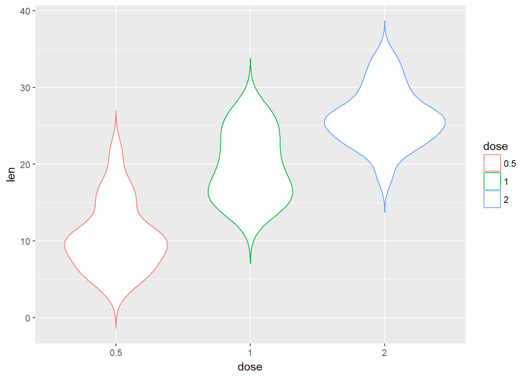
将dose映射给颜色进行分组
e+geom_violin(aes(color=dose), trim = FALSE)
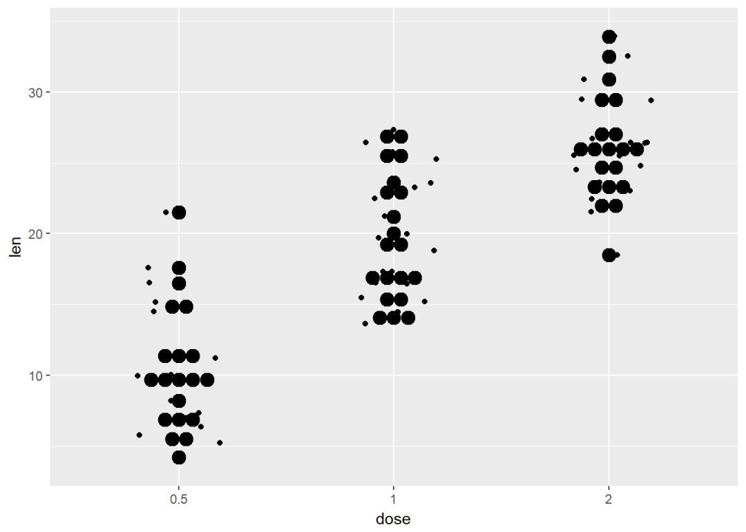
点图 e+geom_dotplot(binaxis = "y", stackdir = "center")

添加中值点
e + geom_dotplot(binaxis = "y", stackdir = "center") +
stat_summary(fun.data=mean_sdl, color = "red",geom = "pointrange",fun.args=list(mult=1))

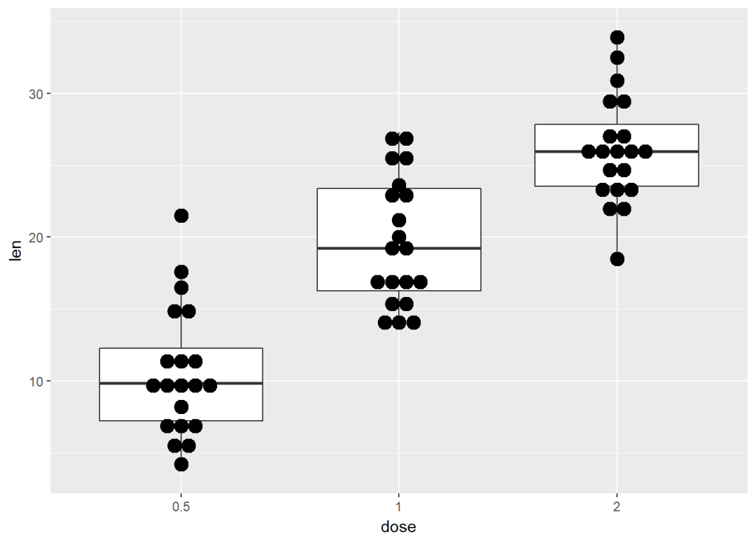
与箱线图结合
e + geom_boxplot +
geom_dotplot(binaxis = "y", stackdir = "center")
添加小提琴图
e + geom_violin(trim = FALSE) +
geom_dotplot(binaxis='y', stackdir='center')
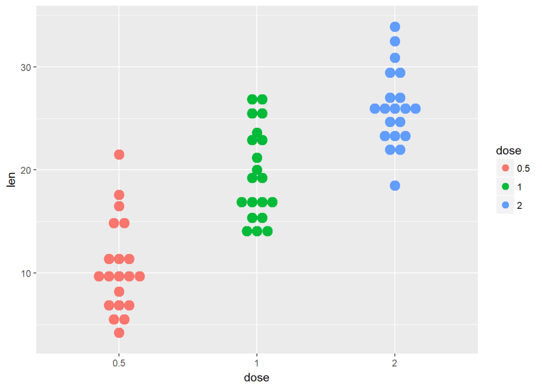
将dose映射给颜色以及填充色
e + geom_dotplot(aes(color = dose, fill = dose),
binaxis = "y", stackdir = "center")
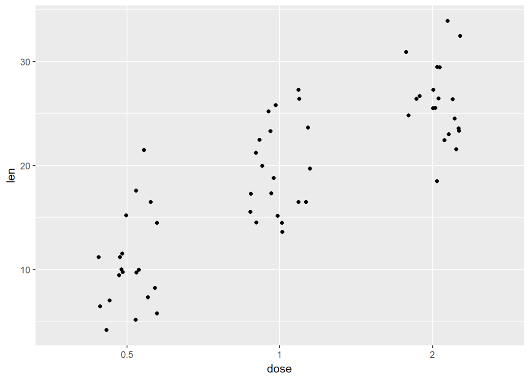
带状图
带状图是一种一维散点图,当样本量很小时,与箱线图相当
e + geom_jitter(position=position_jitter(0.2))
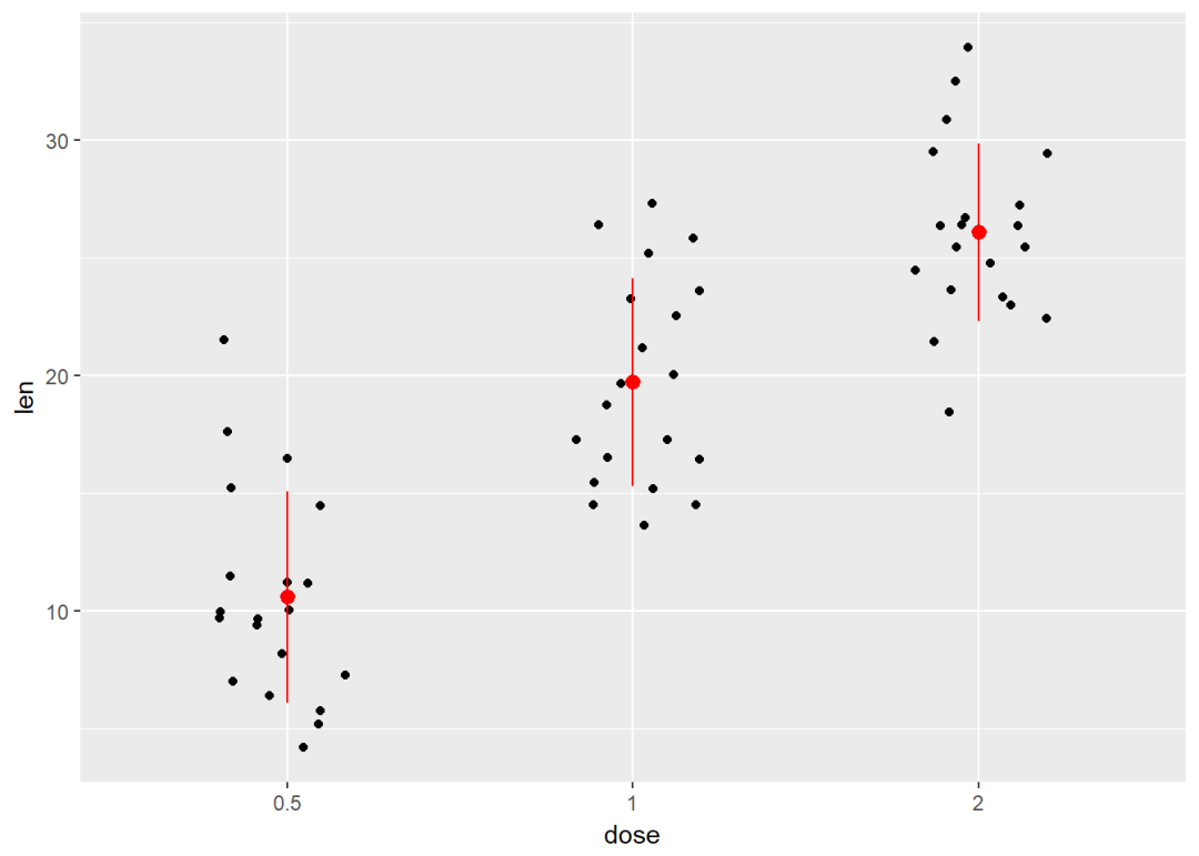
添加中值点
e + geom_jitter(position=position_jitter(0.2)) +
stat_summary(fun.data="mean_sdl", fun.args = list(mult=1),
geom="pointrange", color = "red")
与点图结合
e + geom_jitter(position=position_jitter(0.2)) +
geom_dotplot(binaxis = "y", stackdir = "center")
与小提琴图结合
e + geom_violin(trim = FALSE) +
geom_jitter(position=position_jitter(0.2))
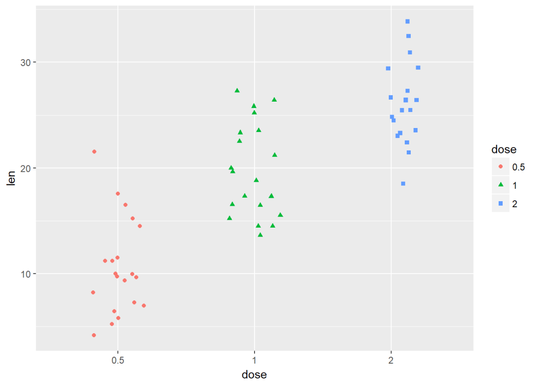
将dose映射给颜色和形状
e + geom_jitter(aes(color = dose, shape = dose),
position=position_jitter(0.2))
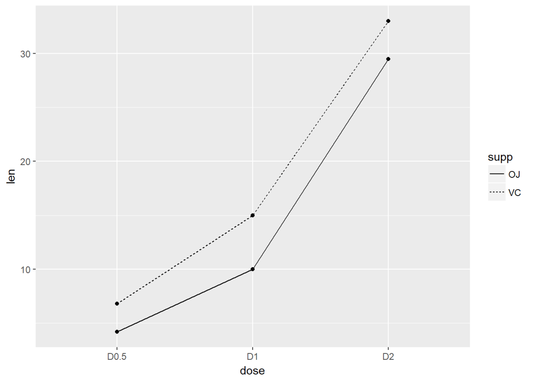
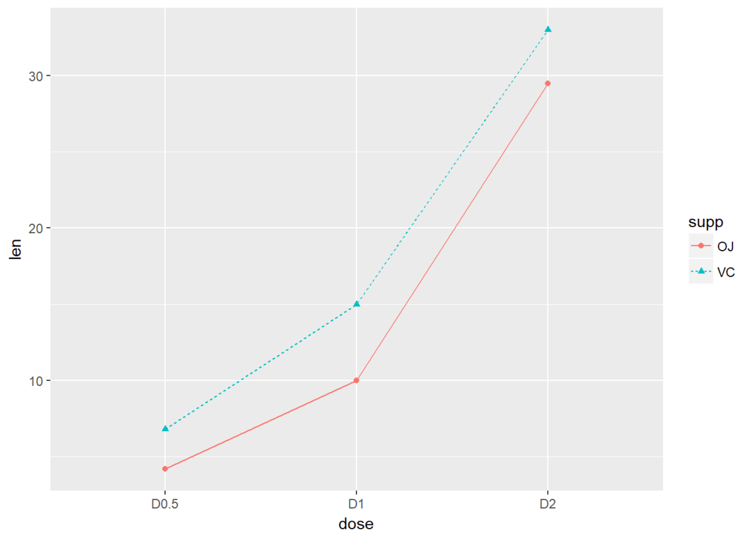
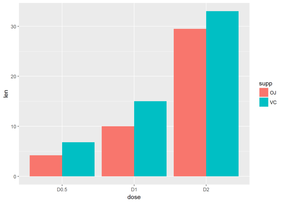
线图 #构造数据集
df <- data.frame(supp=rep(c("VC", "OJ"), each=3),
dose=rep(c("D0.5", "D1", "D2"),2),
len=c(6.8, 15, 33, 4.2, 10, 29.5))
head(df) ## supp dose len
## 1 VC D0.5 6.8
## 2 VC D1 15.0
## 3 VC D2 33.0
## 4 OJ D0.5 4.2
## 5 OJ D1 10.0
## 6 OJ D2 29.5
将supp映射线型
ggplot(df, aes(x=dose, y=len, group=supp)) +
geom_line(aes(linetype=supp))+
geom_point
修改线型、点的形状以及颜色
ggplot(df, aes(x=dose, y=len, group=supp)) +
geom_line(aes(linetype=supp, color = supp))+
geom_point(aes(shape=supp, color = supp))
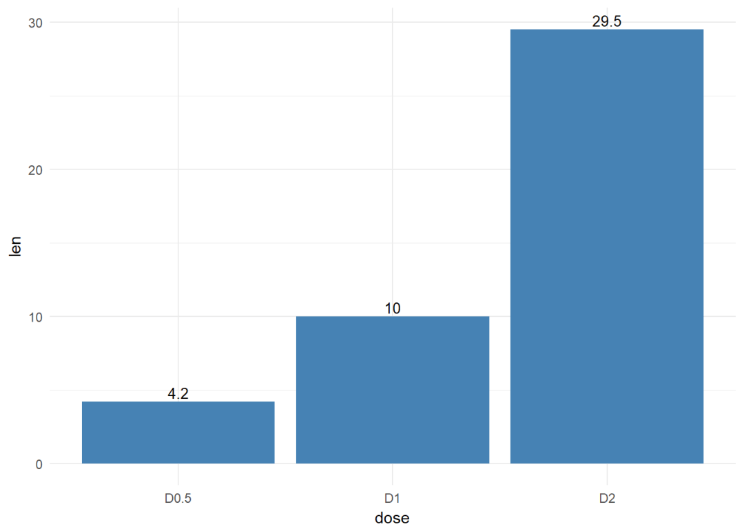
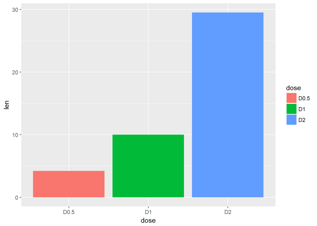
条形图 #构造数据集
df <- data.frame(dose=c("D0.5", "D1", "D2"),
len=c(4.2, 10, 29.5))
head(df) ## dose len
## 1 D0.5 4.2
## 2 D1 10.0
## 3 D2 29.5 df2 <- data.frame(supp=rep(c("VC", "OJ"), each=3),
dose=rep(c("D0.5", "D1", "D2"),2),
len=c(6.8, 15, 33, 4.2, 10, 29.5))
head(df2) ## supp dose len
## 1 VC D0.5 6.8
## 2 VC D1 15.0
## 3 VC D2 33.0
## 4 OJ D0.5 4.2
## 5 OJ D1 10.0
## 6 OJ D2 29.5
创建图层
f <- ggplot(df, aes(x = dose, y = len))
f + geom_bar(stat = "identity")

修改填充色以及添加标签
f + geom_bar(stat="identity", fill="steelblue")+
geom_text(aes(label=len), vjust=-0.3, size=3.5)+
theme_minimal
将dose映射给条形图颜色
f + geom_bar(aes(color = dose),
stat="identity", fill="white")

修改填充色
f + geom_bar(aes(fill = dose), stat="identity")
将变量supp映射给填充色,从而达到分组效果
g <- ggplot(data=df2, aes(x=dose, y=len, fill=supp))
g + geom_bar(stat = "identity")#position默认为stack
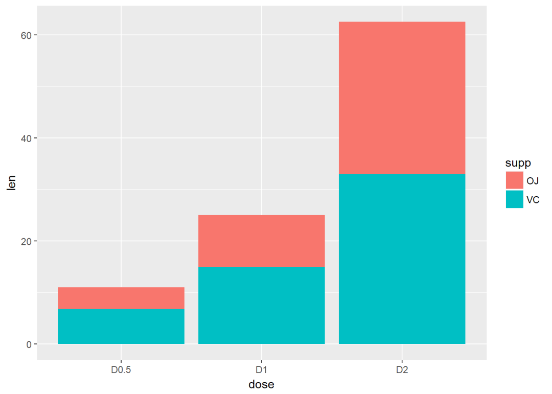
修改position为dodge
g + geom_bar(stat="identity", position=position_dodge)
两个变量:x、y皆离散
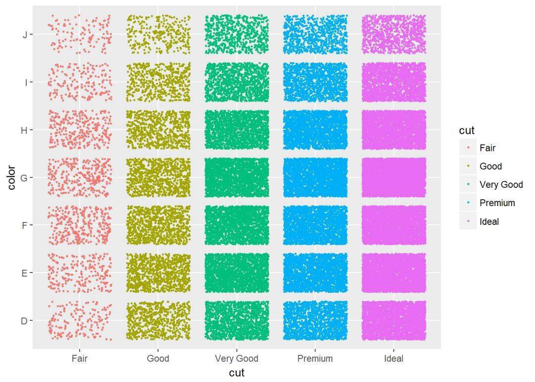
使用数据集diamonds中的两个离散变量color以及cut
ggplot(diamonds, aes(cut, color)) +
geom_jitter(aes(color = cut), size = 0.5)
两个变量:绘制误差图 df <- ToothGrowth
df$dose <- as.factor(df$dose)
head(df) ## len supp dose
## 1 4.2 VC 0.5
## 2 11.5 VC 0.5
## 3 7.3 VC 0.5
## 4 5.8 VC 0.5
## 5 6.4 VC 0.5
## 6 10.0 VC 0.5
绘制误差图需要知道均值以及标准误,下面这个函数用来计算每组的均值以及标准误。
data_summary <- function(data, varname, grps){
require(plyr)
summary_func <- function(x, col){
c(mean = mean(x[[col]], na.rm=TRUE),
sd = sd(x[[col]], na.rm=TRUE))
}
data_sum<-ddply(data, grps, .fun=summary_func, varname)
data_sum <- rename(data_sum, c("mean" = varname))
return(data_sum)
}
计算均值以及标准误
df2 <- data_summary(df, varname="len", grps= "dose")
# Convert dose to a factor variable
df2$dose=as.factor(df2$dose)
head(df2) ## dose len sd
## 1 0.5 10.605 4.499763
## 2 1 19.735 4.415436
## 3 2 26.100 3.774150
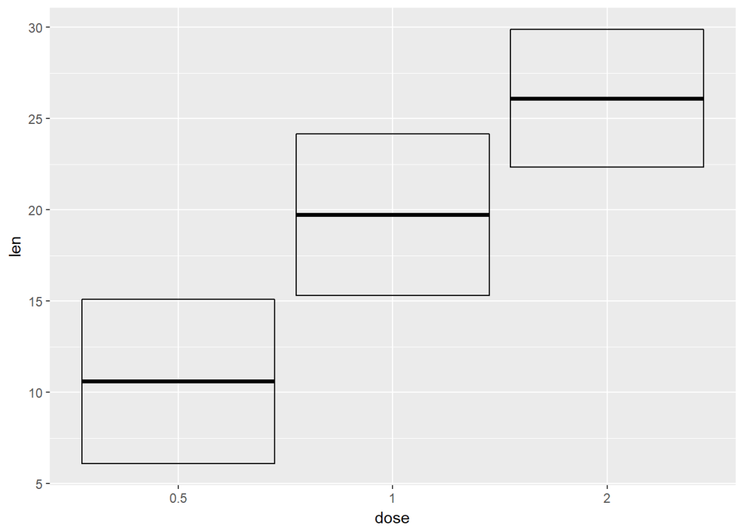
创建图层
f <- ggplot(df2, aes(x = dose, y = len,
ymin = len-sd, ymax = len+sd))
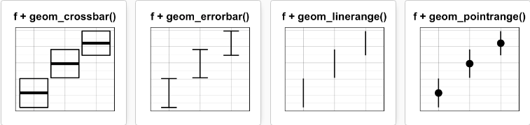
可添加的图层有:
- geom_crossbar: 空心柱,上中下三线分别代表ymax、mean、ymin
- geom_errorbar: 误差棒
- geom_errorbarh: 水平误差棒
- geom_linerange:竖直误差线
- geom_pointrange:中间为一点的误差线
具体如下:
geom_crossbar f+geom_crossbar
将dose映射给颜色
f+geom_crossbar(aes(color=dose))
自定义颜色
f+geom_crossbar(aes(color=dose))+
scale_color_manual(values = c("#999999", "#E69F00", "#56B4E9"))+theme_classic
修改填充色
f+geom_crossbar(aes(fill=dose))+
scale_fill_manual(values = c("#999999", "#E69F00", "#56B4E9"))+
theme_classic
通过将supp映射给颜色实现分组,可以利用函数stat_summary来计算mean和sd
f <- ggplot(df, aes(x=dose, y=len, color=supp))
f+stat_summary(fun.data = mean_sdl, fun.args = list(mult=1), geom="crossbar", width=0.6, position = position_dodge(0.8))

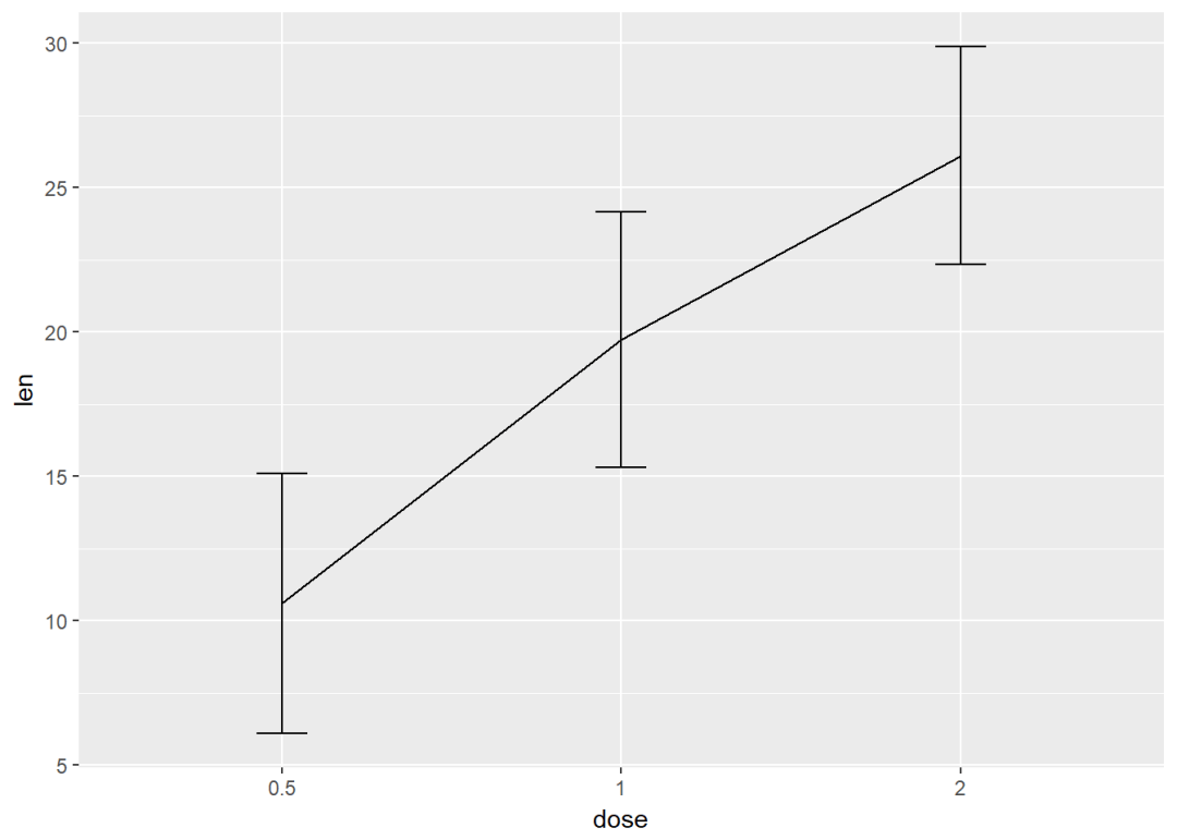
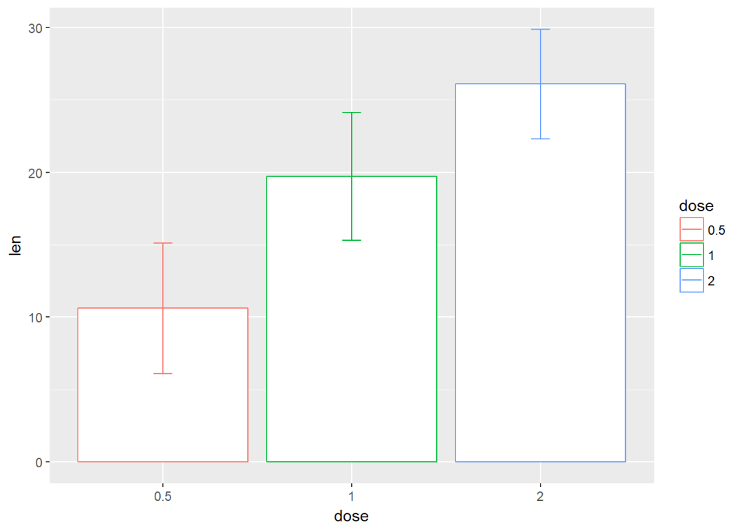
误差棒 f <- ggplot(df2, aes(x=dose, y=len, ymin=len-sd, ymax=len+sd))
将dose映射给颜色
f+geom_errorbar(aes(color=dose), width=0.2)
与线图结合
f+geom_line(aes(group=1))+
geom_errorbar(width=0.15)
与条形图结合,并将变量dose映射给颜色
f+geom_bar(aes(color=dose), stat = "identity", fill="white")+
geom_errorbar(aes(color=dose), width=0.1)
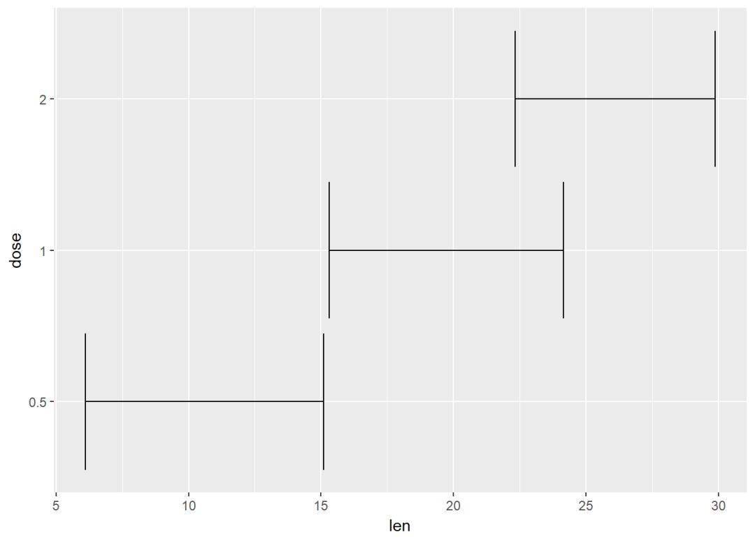
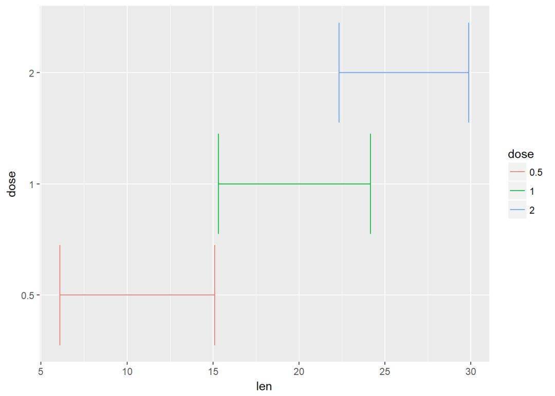
水平误差棒 #构造数据集
df2 <- data_summary(ToothGrowth, varname="len", grps = "dose")
df2$dose <- as.factor(df2$dose)
head(df2) ## dose len sd
## 1 0.5 10.605 4.499763
## 2 1 19.735 4.415436
## 3 2 26.100 3.774150
创建图层
f <- ggplot(data = df2, aes(x=len, y=dose,xmin=len-sd, xmax=len+sd))
参数xmin与xmax用来设置水平误差棒
f+geom_errorbarh
通过映射实现分组
f+geom_errorbarh(aes(color=dose))
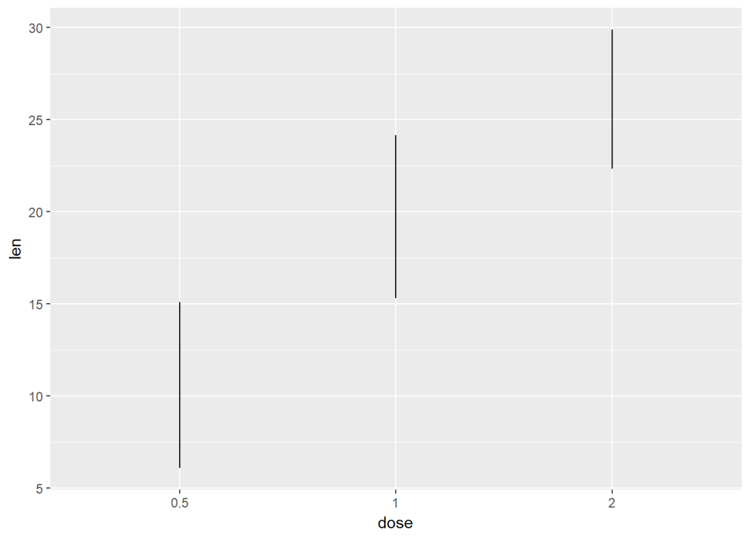
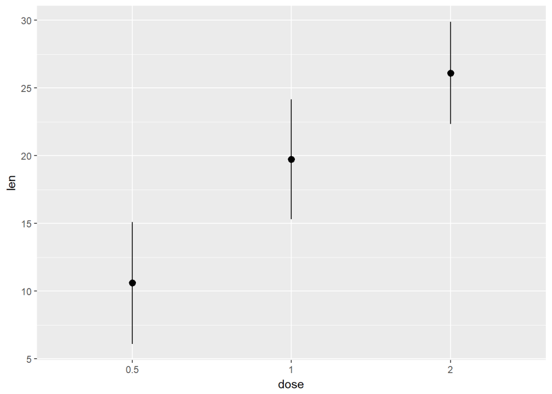
geom_linerange与geom_pointrange f <- ggplot(df2, aes(x=dose, y=len, ymin=len-sd, ymax=len+sd))
line range
f+geom_linerange
point range
f+geom_pointrange
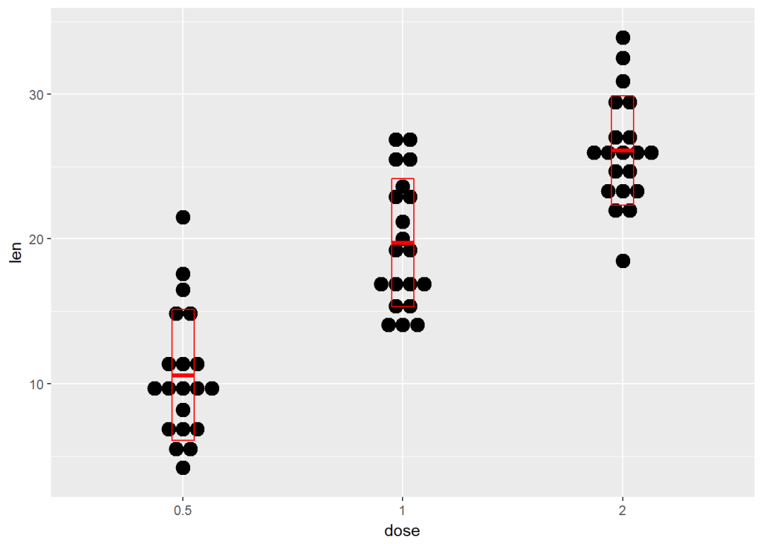
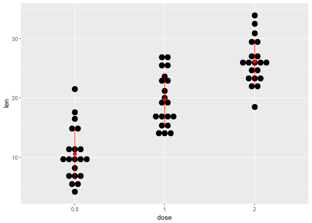
点图+误差棒 g <- ggplot(df, aes(x=dose, y=len))+
geom_dotplot(binaxis = "y", stackdir = "center")
添加geom_crossbar
g+stat_summary(fun.data = mean_sdl, fun.args = list(mult=1), geom="crossbar", color="red", width=0.1)
添加geom_errorbar
g + stat_summary(fun.data=mean_sdl, fun.args = list(mult=1),
geom="errorbar", color="red", width=0.2) +
stat_summary(fun.y=mean, geom="point", color="red")

添加geom_pointrange
g + stat_summary(fun.data=mean_sdl, fun.args = list(mult=1),
geom="pointrange", color="red")
两个变量:地图绘制
ggplot2提供了绘制地图的函数 geom_map ,依赖于包 maps提供地理信息。
安装 map
install.paclages("maps")
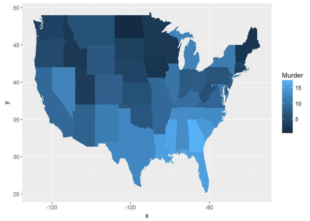
下面将绘制美国地图,数据集采用 USArrests
library(maps)
head(USArrests) ## Murder Assault UrbanPop Rape
## Alabama 13.2 236 58 21.2
## Alaska 10.0 263 48 44.5
## Arizona 8.1 294 80 31.0
## Arkansas 8.8 190 50 19.5
## California 9.0 276 91 40.6
## Colorado 7.9 204 78 38.7
对数据进行整理一下,添加一列state
crimes <- data.frame(state=tolower(rownames(USArrests)), USArrests)
head(crimes) ## Murder Assault UrbanPop Rape
## Alabama 13.2 236 58 21.2
## Alaska 10.0 263 48 44.5
## Arizona 8.1 294 80 31.0
## Arkansas 8.8 190 50 19.5
## California 9.0 276 91 40.6
## Colorado 7.9 204 78 38.7 #数据重铸
library(reshape2)
crimesm <- melt(crimes, id=1)
head(crimesm) ## state variable value
## 1 alabama Murder 13.2
## 2 alaska Murder 10.0
## 3 arizona Murder 8.1
## 4 arkansas Murder 8.8
## 5 california Murder 9.0
## 6 colorado Murder 7.9 map_data <- map_data("state")
#绘制地图,使用Murder进行着色
ggplot(crimes, aes(map_id=state))+
geom_map(aes(fill=Murder), map=map_data)+
expand_limits(x=map_data$long, y=map_data$lat)
三个变量
使用数据集 mtcars,首先绘制一个相关性图
#构造数据
df <- mtcars[, c(1,3,4,5,6,7)]
head(df) ## mpg disp hp drat wt qsec
## Mazda RX4 21.0 160 110 3.90 2.620 16.46
## Mazda RX4 Wag 21.0 160 110 3.90 2.875 17.02
## Datsun 710 22.8 108 93 3.85 2.320 18.61
## Hornet 4 Drive 21.4 258 110 3.08 3.215 19.44
## Hornet Sportabout 18.7 360 175 3.15 3.440 17.02
## Valiant 18.1 225 105 2.76 3.460 20.22 cormat <- round(cor(df), 2)
cormat_melt <- melt(cormat)
head(cormat) ## mpg disp hp drat wt qsec
## mpg 1.00 -0.85 -0.78 0.68 -0.87 0.42
## disp -0.85 1.00 0.79 -0.71 0.89 -0.43
## hp -0.78 0.79 1.00 -0.45 0.66 -0.71
## drat 0.68 -0.71 -0.45 1.00 -0.71 0.09
## wt -0.87 0.89 0.66 -0.71 1.00 -0.17
## qsec 0.42 -0.43 -0.71 0.09 -0.17 1.00
创建图层:
g <- ggplot(cormat_melt, aes(x=Var1, y=Var2))
在此基础上可添加的图层有:
- geom_tile: 瓦片图
- geom_raster: 光栅图,瓦片图的一种,只不过所有的tiles都是一样的大小
现在使用使用geom_tile绘制相关性矩阵图,我们这里这绘制下三角矩阵图,首先要整理数据:
#获得相关矩阵的下三角
get_lower_tri <- function(cormat){
cormat[upper.tri(cormat)] <- NA
return(cormat)
}
#获得相关矩阵的上三角
get_upper_tri <- function(cormat){
cormat[lower.tri(cormat)] <- NA
return(cormat)
}
upper_tri <- get_upper_tri(cormat = cormat)
head(upper_tri) ## mpg disp hp drat wt qsec
## mpg 1 -0.85 -0.78 0.68 -0.87 0.42
## disp NA 1.00 0.79 -0.71 0.89 -0.43
## hp NA NA 1.00 -0.45 0.66 -0.71
## drat NA NA NA 1.00 -0.71 0.09
## wt NA NA NA NA 1.00 -0.17
## qsec NA NA NA NA NA 1.00
绘制相关矩阵图
#数据重铸
upper_tri_melt <- melt(upper_tri, na.rm = TRUE)
ggplot(data=upper_tri_melt, aes(Var1, y=Var2, fill=value))+
geom_tile(color="white")+
scale_fill_gradient2(low = "blue", high = "red", mid = "white", midpoint = 0, limit=c(-1, 1), space = "Lab", name="PersonnCorrelation")+
theme_minimal+
theme(axis.text.x = element_text(angle = 45, vjust = 1, size = 12, hjust = 1))+
coord_fixed
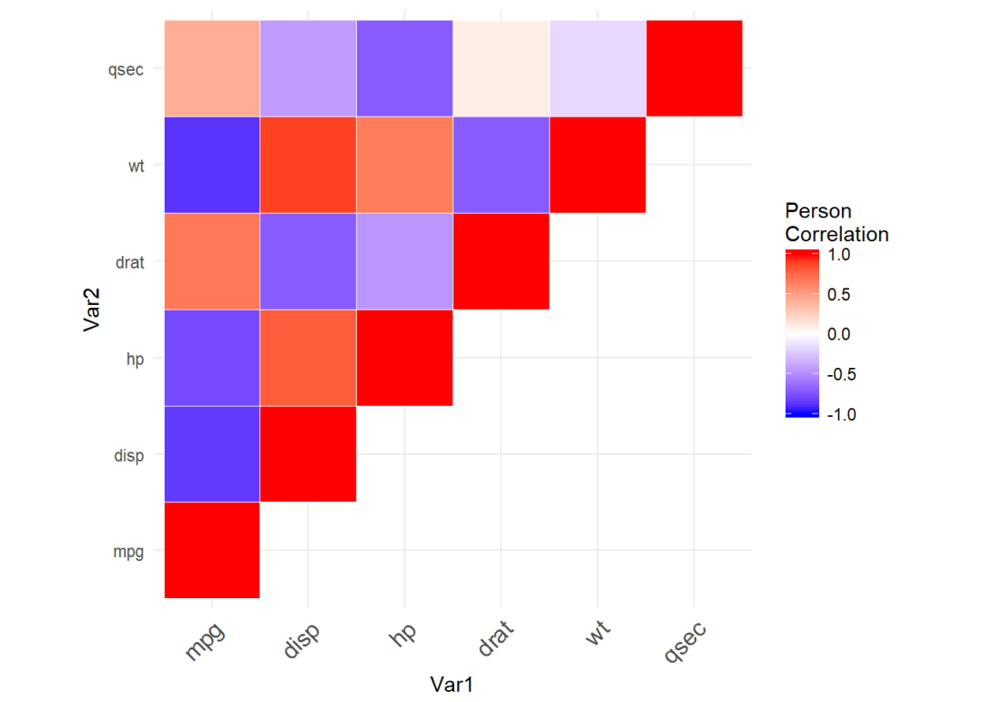
上图中蓝色代表互相关,红色代表正相关,至于coord_fixed保证x,y轴比例为1
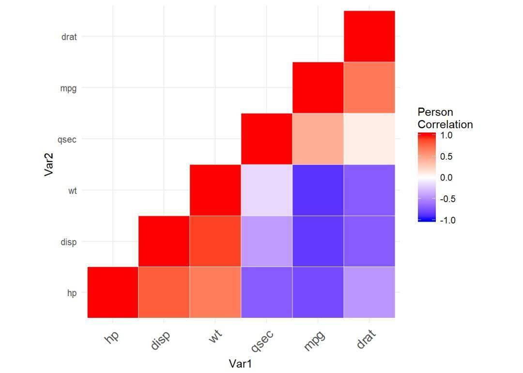
可以看出上图顺序有点乱,我们可以对相关矩阵进行排序
#构造函数
reorder_cormat <- function(cormat){
dd <- as.dist((1-cormat)/2)
hc <- hclust(dd)
cormat <- cormat[hc$order, hc$order]
}
cormat <- reorder_cormat(cormat)
lower_tri <- get_lower_tri(cormat)
lower_tri_melt <- melt(lower_tri, na.rm = TRUE)
head(lower_tri_melt) ## Var1 Var2 value
## 1 hp hp 1.00
## 2 disp hp 0.79
## 3 wt hp 0.66
## 4 qsec hp -0.71
## 5 mpg hp -0.78
## 6 drat hp -0.45
绘制图形
ggheatmap <- ggplot(lower_tri_melt, aes(Var1, Var2, fill=value))+
geom_tile(color="white")+
scale_fill_gradient2(low = "blue", high = "red", mid = "white", midpoint = 0, limit=c(-1, 1), space = "Lab", name="PersonnCorrelation")+
theme_minimal+
theme(axis.text.x = element_text(angle = 45, vjust = 1,
size = 12, hjust = 1))+
coord_fixed
print(ggheatmap)
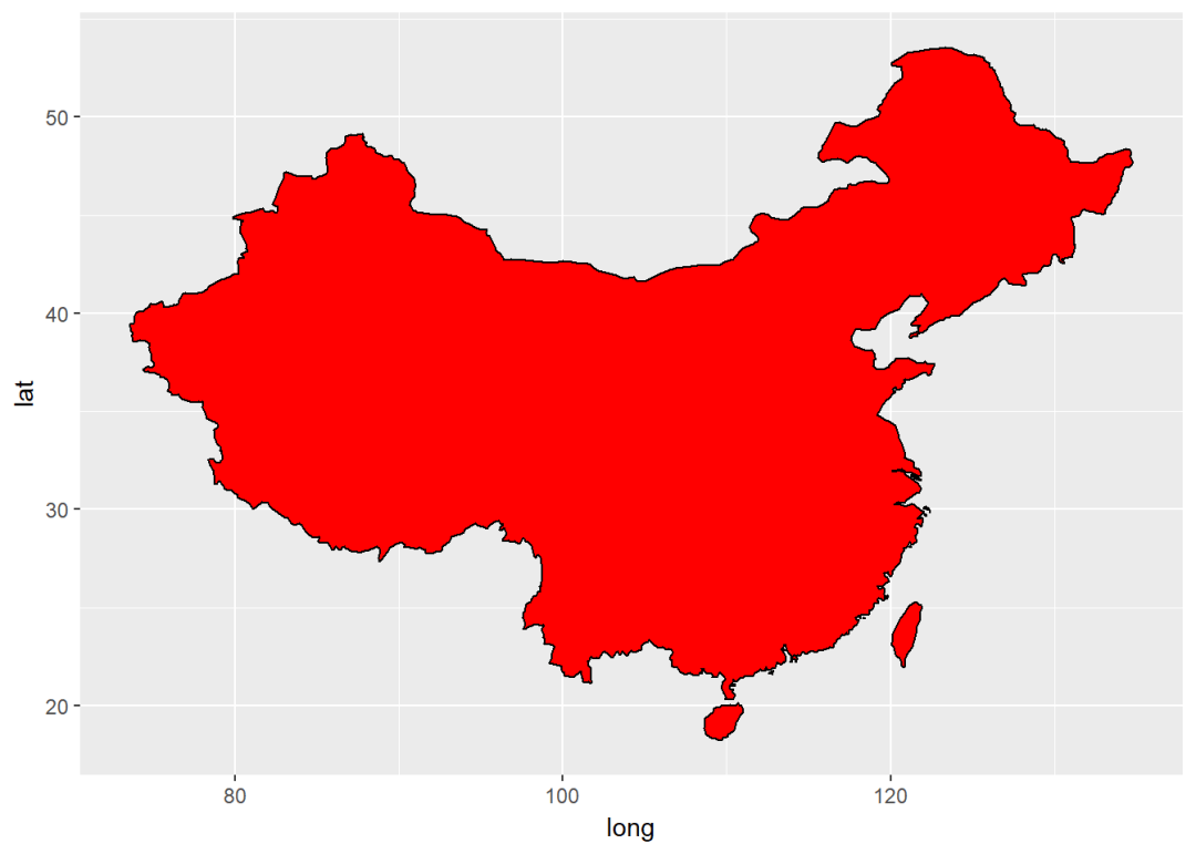
图元:多边形、路径、带状、射线(线段)、矩形等
本节主要讲述的是添加图形元件,将用到一下函数:
- geom_polygon:添加多边形
- geom_path: 路径
- geom_ribbon: 带状
- geom_segment: 射线、线段
- geom_curve: 曲线
- geom_rect: 二维矩形
map_data("world")%>%
filter(region==c("China", "Taiwan"))%>%
ggplot(aes(x=long, y=lat, group=group))+
geom_polygon(fill="red", color="black")
添加路径、带状、矩形
创建图层
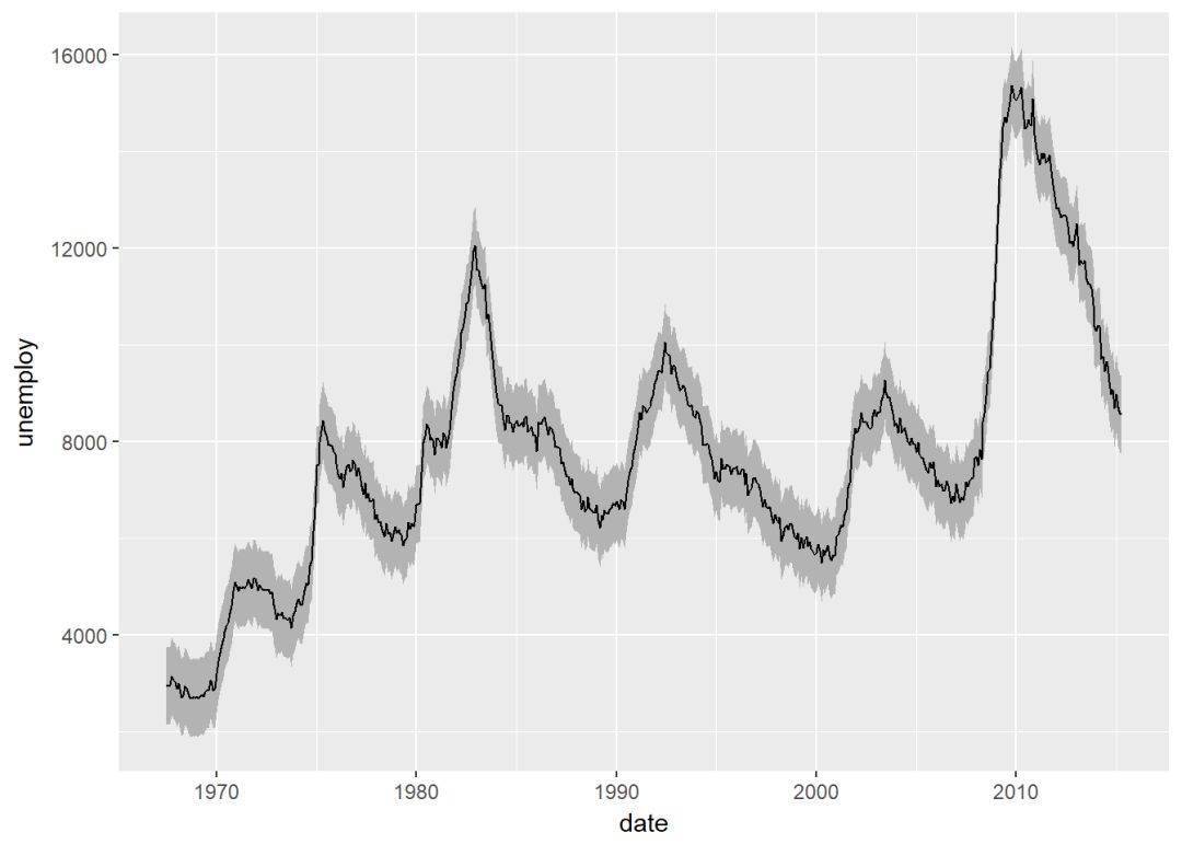
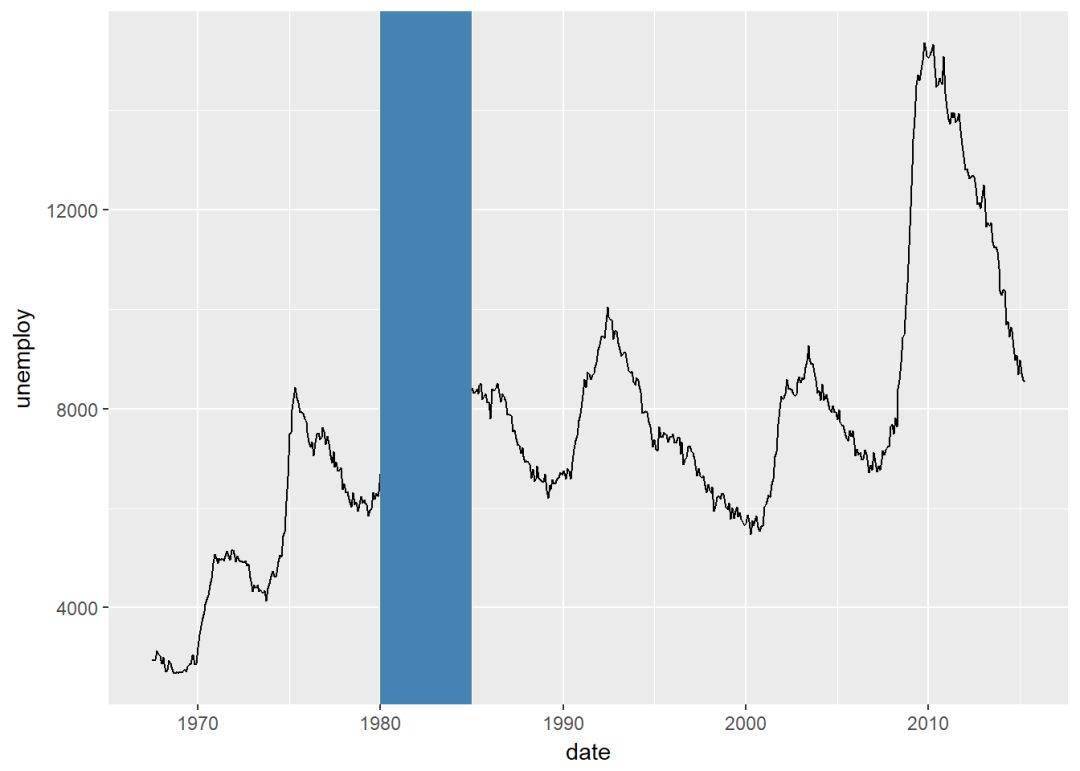
h <- ggplot(economics, aes(date, unemploy))
添加路径
h+geom_path
添加带状
h+geom_ribbon(aes(ymin=unemploy-800, ymax=unemploy+800), fill = "grey70")+geom_line(aes(y=unemploy))
添加矩形
h+
geom_path+
geom_rect(aes(xmin=as.Date("1980-01-01"), ymin=-Inf, xmax=as.Date("1985-01-01"), ymax=Inf), fill="steelblue")
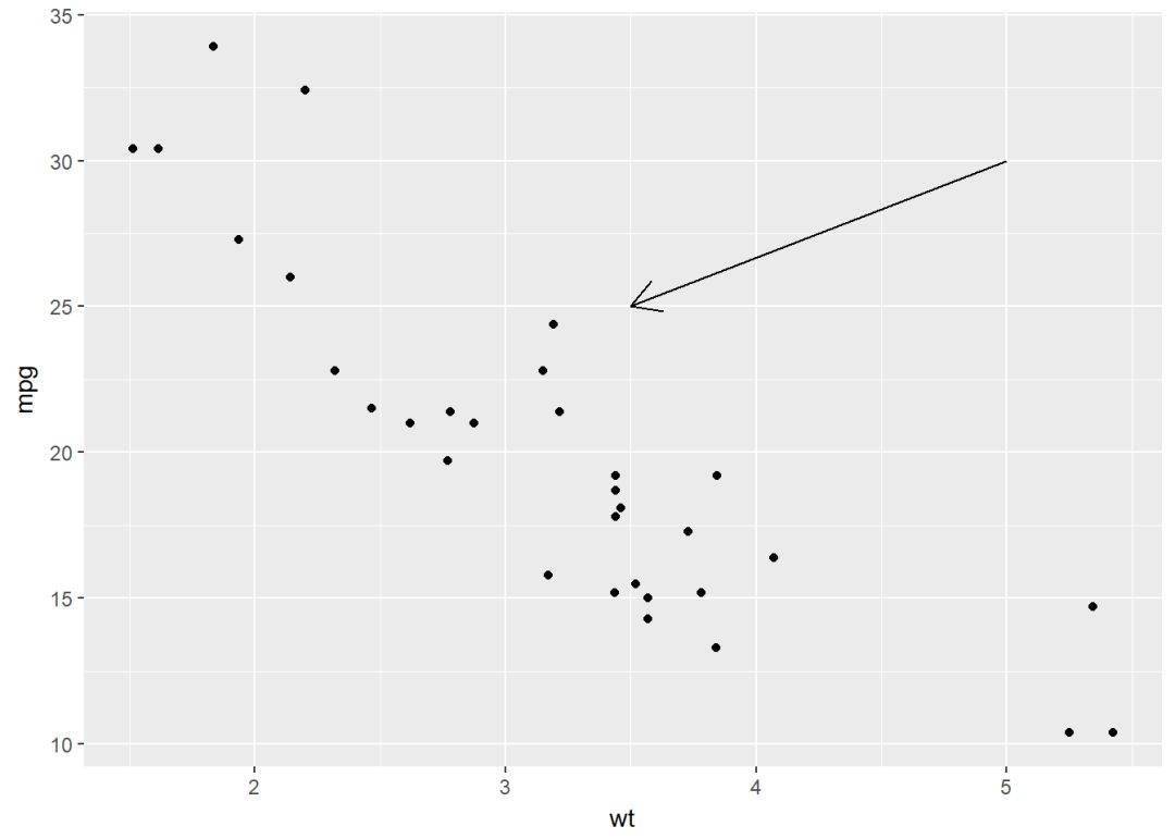
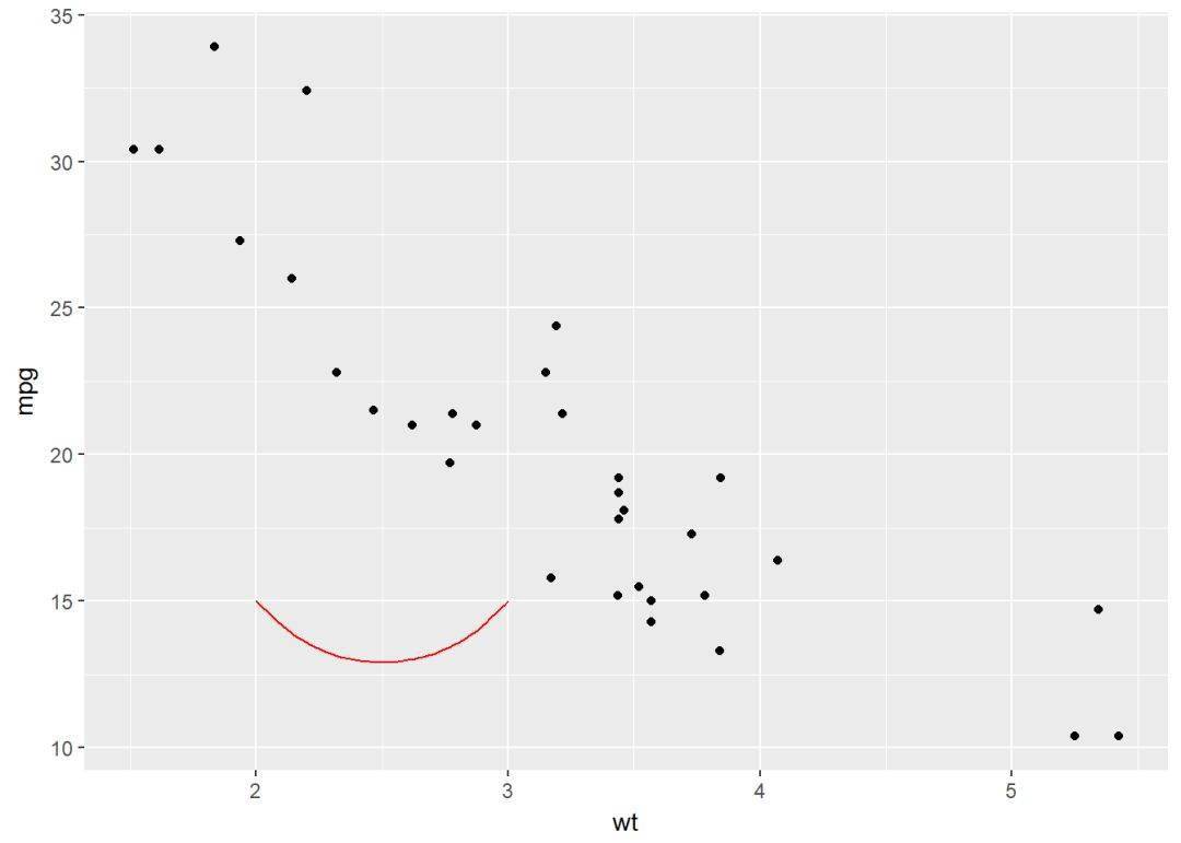
添加线段 i <- ggplot(mtcars, aes(wt, mpg))+geom_point
#添加线段
i+geom_segment(aes(x=2, y=15, xend=3, yend=15))
添加箭头
i+geom_segment(aes(x=5, y=30, xend=3.5, yend=25), arrow = arrow(length = unit(0.5, "cm")))
添加曲线 i+geom_curve(aes(x=2, y=15, xend=3, yend=15), color="red")
图形参数:主标题、坐标轴标签、图例标题
创建图层
ToothGrowth$dose <- as.factor(ToothGrowth$dose)
p <- ggplot(ToothGrowth, aes(x=dose, y=len))+geom_boxplot
修改标题以及标签的函数有:
- ggtitle(“New main title”): 添加主标题
- xlab(“New X axis label”): 修改x轴标签
- ylab(“New Y axis label”): 修改y轴标签
- labs(title = “New main title”, x = “New X axis label”, y = “New Y axis label”): 可同时添加主标题以及坐标轴标签,另外,图例标题也可以用此函数修改
修改标签属性:颜色、字体、大小等
使用theme修改,element_text可以具体修改图形参数,element_blank隐藏标签
#修改标签
p+theme(
plot.title = element_text(color = "red", size = 14, face = "bold.italic"),
axis.title.x = element_text(color="blue", size = 14, face = "bold"),
axis.title.y = element_text(color="#993333", size = 14, face = "bold")
)
#隐藏标签
p+theme(
plot.title = element_blank,
axis.title.x = element_blank,
axis.title.y = element_blank
)
修改图例标题 p <- ggplot(ToothGrowth, aes(x=dose, y=len, fill=dose))+
geom_boxplot
p
#修改图例标题
p+labs(fill="Dose (mg)")

图例位置以及外观 修改图例位置以及外观 #图例位置在最上面,有五个选项:"left","top", "right", "bottom", "none"
p+theme(legend.position = "top")

移除图例
p+theme(legend.position = "none")
修改图例标题以及标签外观
p+theme(
legend.title = element_text(color="blue"),
legend.text = element_text(color="red")
)
修改图例背景
p+theme(legend.background = element_rect(fill="lightblue"))
利用scale函数自定义图例
主要两个函数:
- scale_x_discrete:修改图例标签顺序
- scale_fill_discrete: 修改图例标题以及标签
p+scale_x_discrete(limits=c("2", "0.5", "1"))

#修改标题以及标签
p+scale_fill_discrete(name="Dose", label=c("A","B","C")) 自动/手动修改颜色 mtcars$cyl <- as.factor(mtcars$cyl)
创建图层
# boxplot
bp <- ggplot(ToothGrowth, aes(x=dose, y=len))
# scatter plot
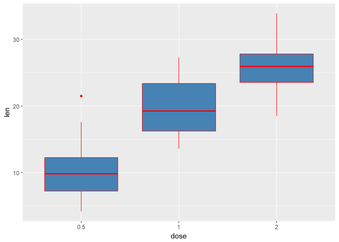
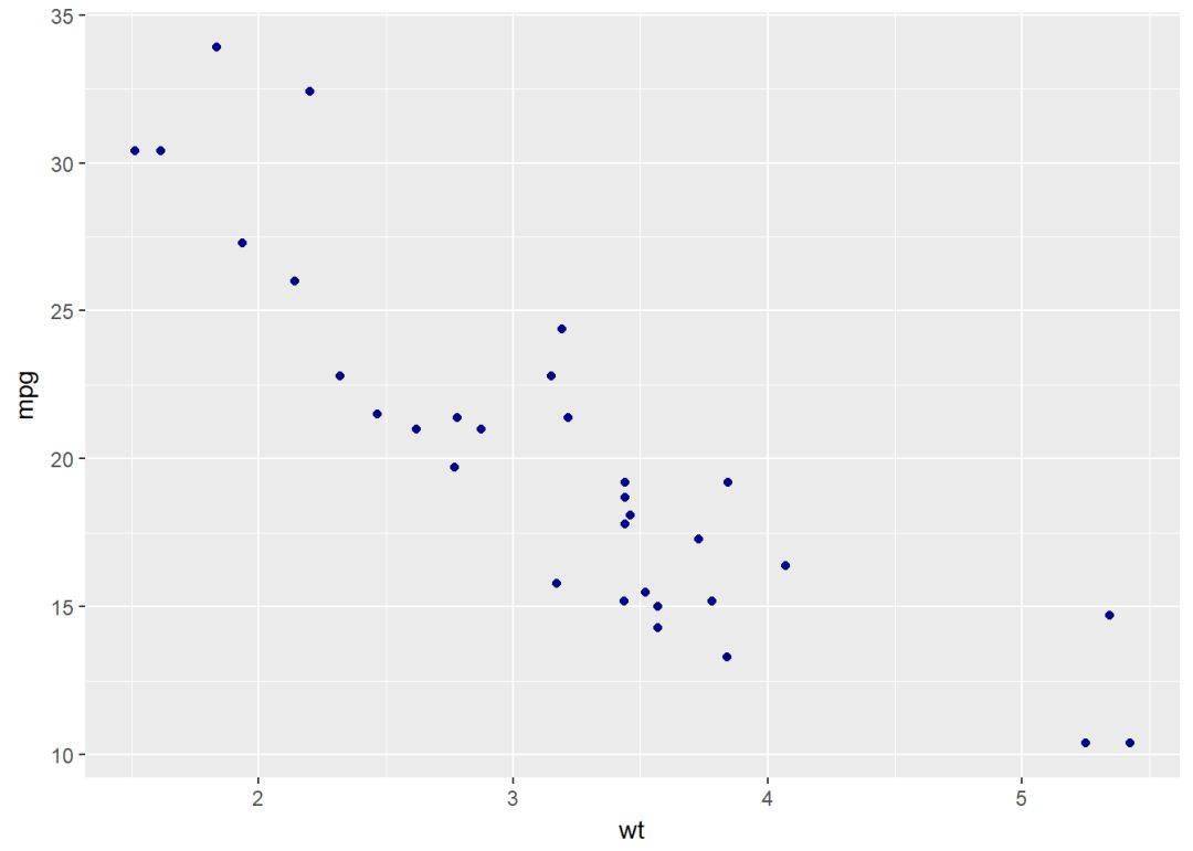
sp <- ggplot(mtcars, aes(x=wt, y=mpg)) 修改填充色、轮廓线颜色 bp+geom_boxplot(fill="steelblue", color="red")
sp+geom_point(color="darkblue")
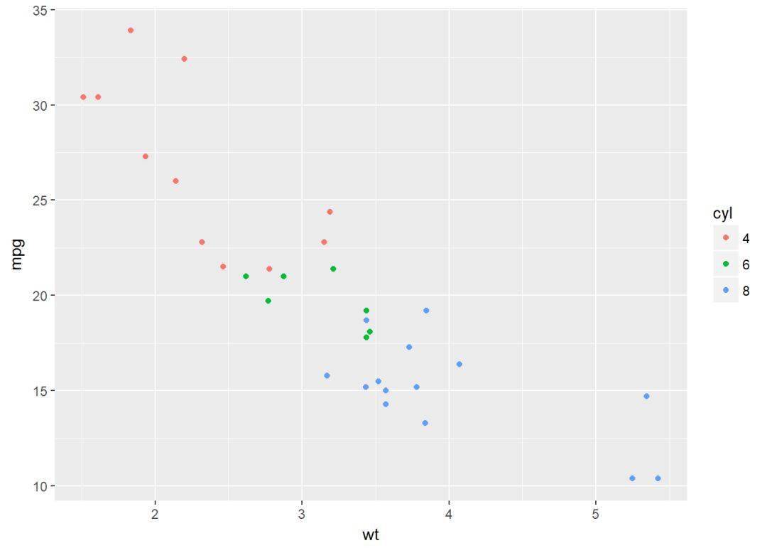
通过映射分组修改颜色 (bp <- bp+geom_boxplot(aes(fill=dose))) (sp <- sp+geom_point(aes(color=cyl)))
手动修改颜色
主要两个函数:
- scale_fill_manual: 填充色
- scale_color_manual:轮廓色,如点线
bp + scale_fill_manual(values=c("#999999", "#E69F00", "#56B4E9")) # Scatter plot
sp + scale_color_manual(values=c("#999999", "#E69F00", "#56B4E9"))
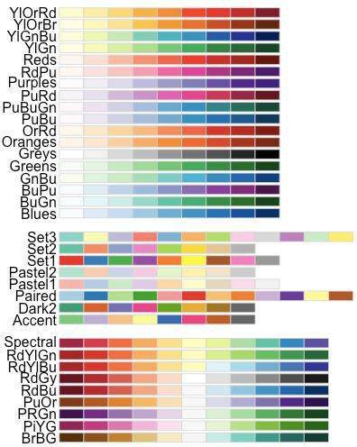
使用 RColorBrewer调色板
- scale_fill_brewer: 填充色
- scale_color_brewer:轮廓色,如点线
bp + scale_fill_brewer(palette="Dark2") # Scatter plot
sp + scale_color_brewer(palette="Dark2")
RColorBrewer包提供以下调色板
还专门有一个灰度调色板:
# Box plot
bp + scale_fill_grey + theme_classic
# Scatter plot
sp + scale_color_grey + theme_classic
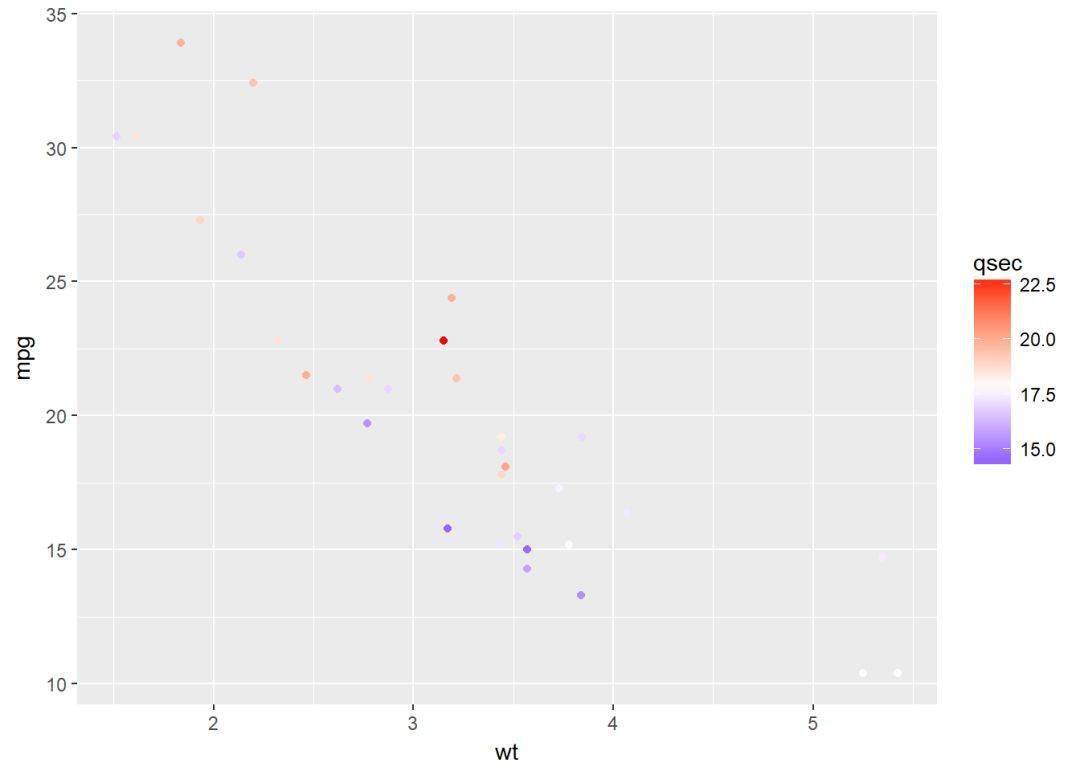
梯度或连续颜色
有时我们会将某个连续变量映射给颜色,这时修改这种梯度或连续型颜色就可以使用以下函数:
- scale_color_gradient, scale_fill_gradient:两种颜色的连续梯度
- scale_color_gradient2, scale_fill_gradient2:不同梯度
- scale_color_gradientn, scale_fill_gradientn:多种颜色梯度
sp2<-ggplot(mtcars, aes(x=wt, y=mpg)) +
geom_point(aes(color = qsec))
sp2
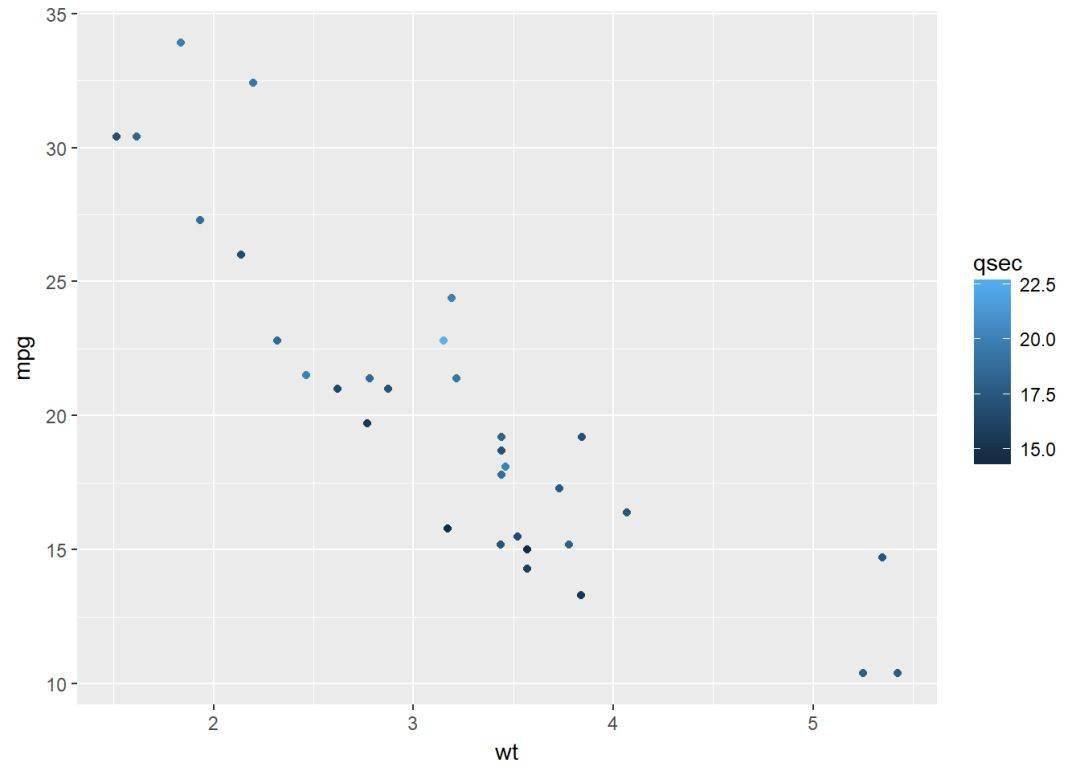
# Change the low and high colors
# Sequential color scheme
sp2+scale_color_gradient(low="blue", high="red")
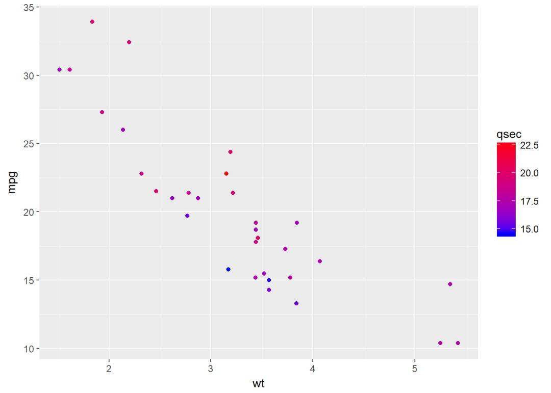
# Diverging color scheme
mid<-mean(mtcars$qsec)
sp2+scale_color_gradient2(midpoint=mid, low="blue", mid="white",
high="red", space = "Lab" )
点颜色、大小、形状
R提供的点形状是由数字表示的,具体如下:
# Basic scatter plot
ggplot(mtcars, aes(x=wt, y=mpg)) +
geom_point(shape = 18, color = "steelblue", size = 4)
# Change point shapes and colors by groups
ggplot(mtcars, aes(x=wt, y=mpg)) +
geom_point(aes(shape = cyl, color = cyl))
可通过以下方法对点的颜色、大小、形状进行修改:
- scale_shape_manual : to change point shapes
- scale_color_manual : to change point colors
- scale_size_manual : to change the size of points
ggplot(mtcars, aes(x=wt, y=mpg, group=cyl)) +
geom_point(aes(shape=cyl, color=cyl), size=2)+
scale_shape_manual(values=c(3, 16, 17))+
scale_color_manual(values=c('#999999','#E69F00', '#56B4E9'))+
theme(legend.position="top")
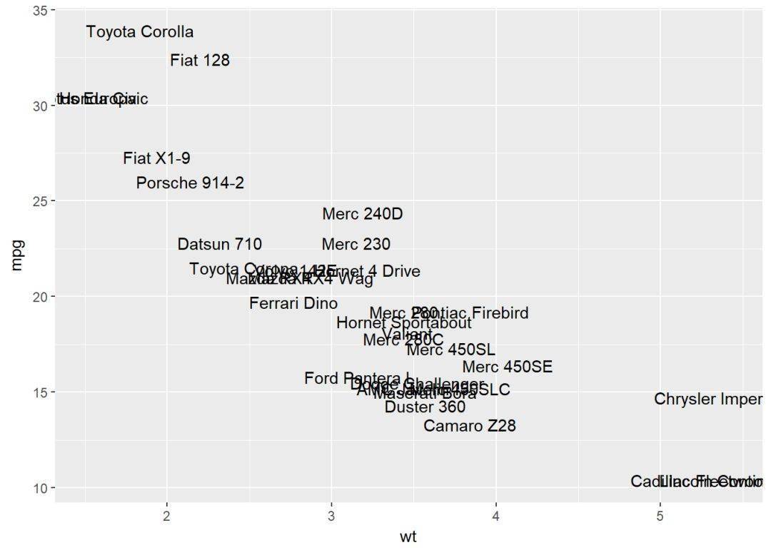
文本注释
对图形进行文本注释有以下方法:
- geom_text: 文本注释
- geom_label: 文本注释,类似于geom_text,只是多了个背景框
- annotate: 文本注释
- annotation_custom: 分面时可以在所有的面板进行文本注释
df <- mtcars[sample(1:nrow(mtcars), 10), ]
df$cyl <- as.factor(df$cyl)
散点图注释
# Scatter plot
sp <- ggplot(df, aes(x=wt, y=mpg))+ geom_point
# Add text, change colors by groups
sp + geom_text(aes(label = rownames(df), color = cyl),
size = 3, vjust = -1)
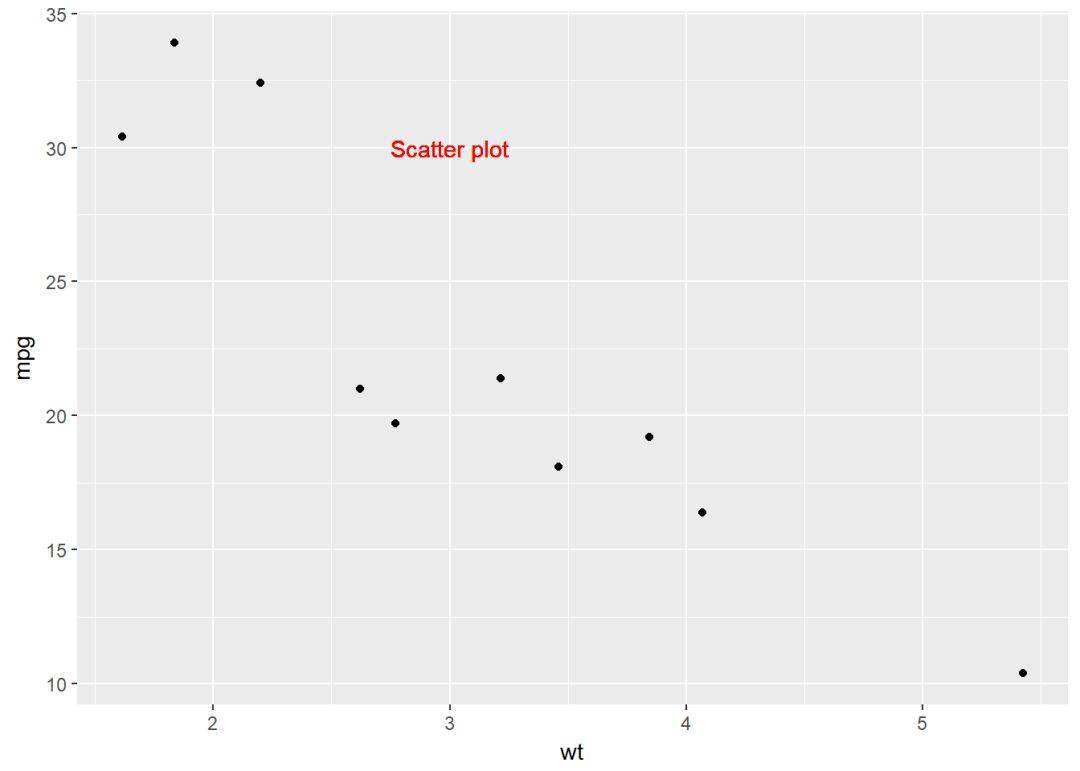
# Add text at a particular coordinate
sp + geom_text(x = 3, y = 30, label = "Scatter plot",
color="red")
# geom_label进行注释
sp + geom_label(aes(label=rownames(df)))
# annotation_custom,需要用到textGrob
library(grid)
# Create a text
grob <- grobTree(textGrob("Scatter plot", x=0.1, y=0.95, hjust=0,
gp=gpar(col="red", fontsize=13, fontface="italic")))
# Plot
sp + annotation_custom(grob) #分面注释
sp + annotation_custom(grob)+facet_wrap(~cyl, scales="free")
线型
R里的线型有七种:“blank”, “solid”, “dashed”, “dotted”, “dotdash”, “longdash”, “twodash”,对应数字0,1,2,3,4,5,6.
具体如下:
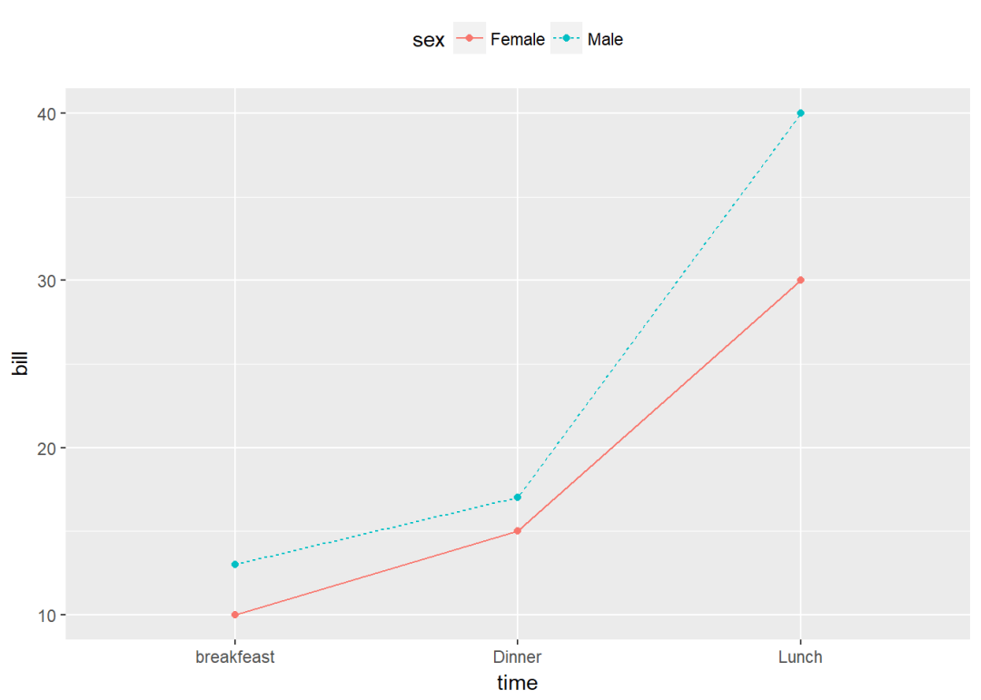
# Create some data
df2 <- data.frame(sex = rep(c("Female", "Male"), each=3),
time=c("breakfeast", "Lunch", "Dinner"),
bill=c(10, 30, 15, 13, 40, 17) )
head(df2) ## sex time bill
## 1 Female breakfeast 10
## 2 Female Lunch 30
## 3 Female Dinner 15
## 4 Male breakfeast 13
## 5 Male Lunch 40
## 6 Male Dinner 17 # Line plot with multiple groups
# Change line types and colors by groups (sex)
ggplot(df2, aes(x=time, y=bill, group=sex)) +
geom_line(aes(linetype = sex, color = sex))+
geom_point(aes(color=sex))+
theme(legend.position="top")
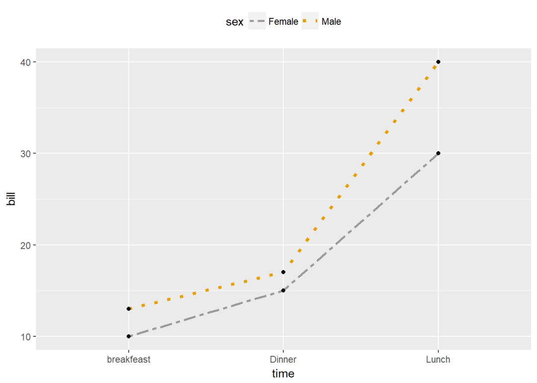
同点一样,线也可以类似修改:
- scale_linetype_manual : to change line types
- scale_color_manual : to change line colors
- scale_size_manual : to change the size of lines
ggplot(df2, aes(x=time, y=bill, group=sex)) +
geom_line(aes(linetype=sex, color=sex, size=sex))+
geom_point+
scale_linetype_manual(values=c("twodash", "dotted"))+
scale_color_manual(values=c('#999999','#E69F00'))+
scale_size_manual(values=c(1, 1.5))+
theme(legend.position="top")
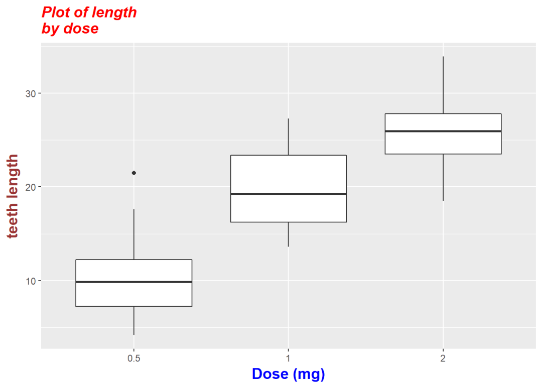
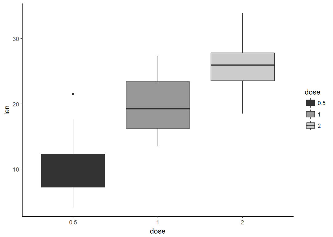
主题与背景颜色 # Convert the column dose from numeric to factor variable
ToothGrowth$dose <- as.factor(ToothGrowth$dose)
创建箱线图
p <- ggplot(ToothGrowth, aes(x=dose, y=len))+
geom_boxplot
修改主题
ggplot2提供了好几种主题,另外有一个扩展包 ggthemes专门提供了一主题,可以安装利用。
install.packages("ggthemes")
- theme_gray: gray background color and white grid lines
- theme_bw : white background and gray grid lines
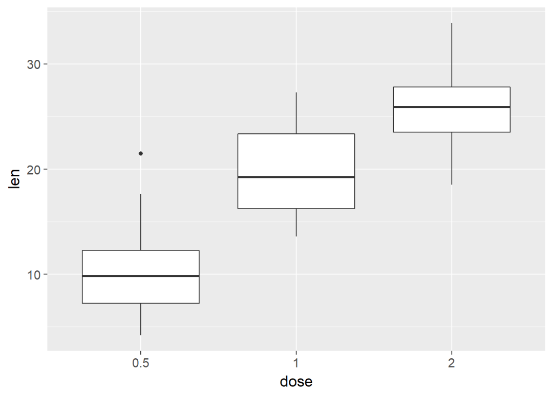
p+theme_bw
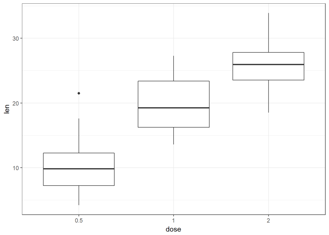
- theme_linedraw : black lines around the plot
- theme_light : light gray lines and axis (more attention towards the data)
p + theme_light
- theme_minimal: no background annotations
- theme_classic : theme with axis lines and no grid lines
p + theme_classic
ggthemes提供的主题
p+ggthemes::theme_economist
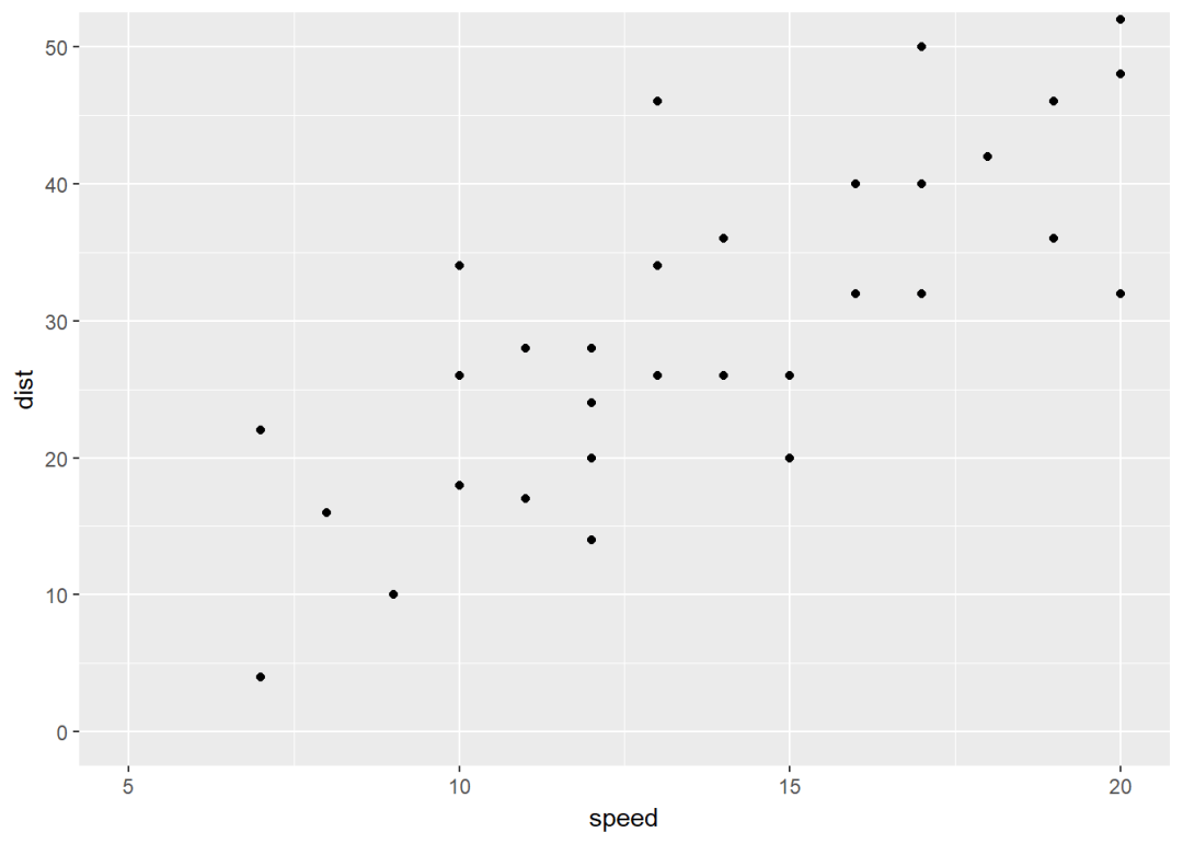
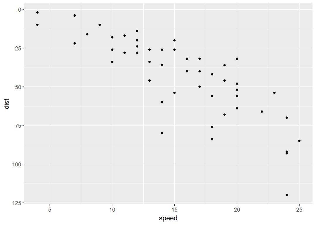
坐标轴:最大最小值 p <- ggplot(cars, aes(x=speed, y=dist))+geom_point
修改坐标轴范围有以下几种方式:
1、不删除数据
- p+coord_cartesian(xlim=c(5, 20), ylim=c(0, 50)):笛卡尔坐标系,这是设定修改不会删除数据
2、会删除部分数据:不在此范围内的数据都会被删除,因此在此基础上添加图层时数据是不完整的
- p+xlim(5, 20)+ylim(0, 50)
- p+scale_x_continuous(limits=c(5, 20))+scale_y_continuous(limits=c(0, 50))
3、扩展图形范围:expand函数,扩大范围
- p+expand_limits(x=0, y=0):设置截距为0,即过原点
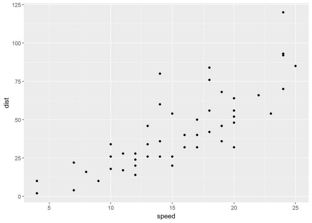
- p+expand_limits(x=c(5, 50), y=c(0, 150)):扩大坐标轴范围,这样图形显示就小了
下面通过图形演示
p

#通过coord_cartesian函数修改坐标轴范围
p+coord_cartesian(xlim =c (5, 20), ylim = c(0, 50))
#通过xlim和ylim函数修改
p+xlim(5, 20)+ylim(0, 50)

#expand limits
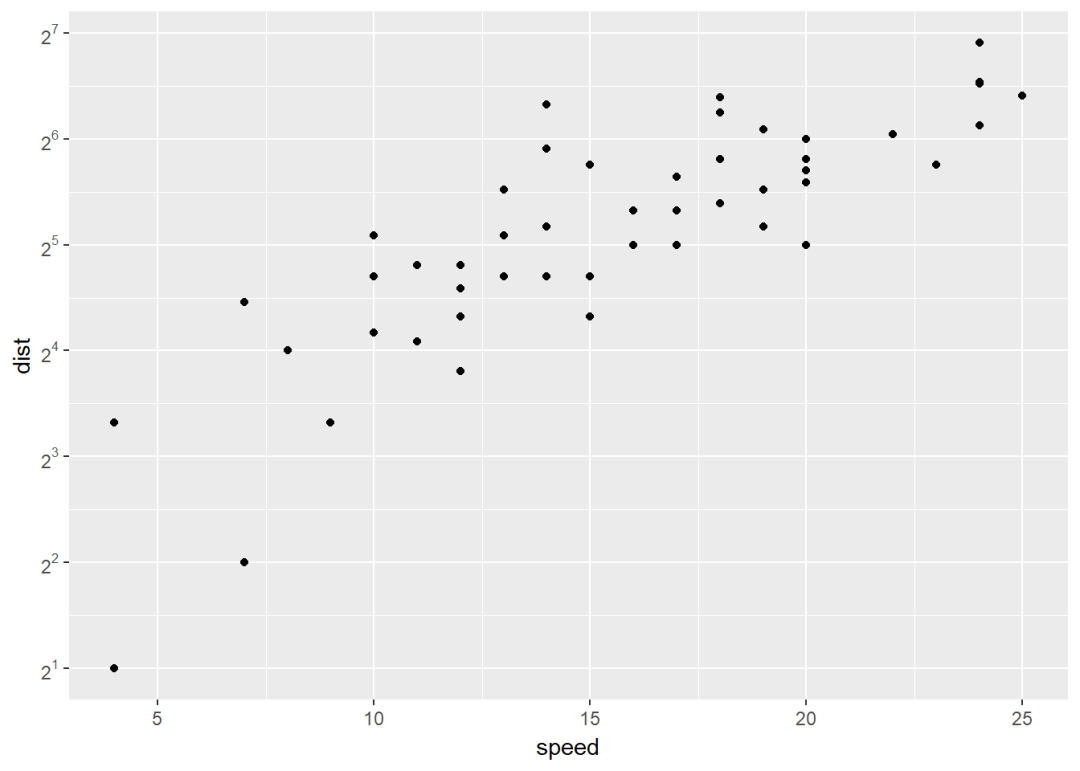
p+expand_limits(x=c(5, 50), y=c(0, 150)) 坐标变换 p <- ggplot(cars, aes(x=speed, y=dist))+geom_point
坐标变换有以下几种:
- p+scale_x_log10,p+scale_y_log10: 绘图时对x,y取10的对数
- p+scale_x_sqrt,p+scale_x_sqrt: 开根号
- p+scale_x_reverse,p+scale_x_reverse:坐标轴反向
- p+coord_trans(x =“log10”, y=“log10”): 同上,可以对坐标轴取对数、根号等
- p+scale_x_continuous(trans=”log2”),p+scale_x_continuous(trans=”log2”): 同上,取对数的另外一种方法
下面实例演示:
p
p+scale_x_continuous(trans = "log2")+
scale_y_continuous(trans = "log2")

#修改坐标刻度标签
require(scales)
p+scale_y_continuous(trans=log2_trans,
breaks = trans_breaks("log2", function(x) 2^x),
labels=trans_format("log2", math_format(2^.x)))
#坐标轴反向
p+scale_y_reverse
坐标刻度:刻度线、标签、顺序等
更改坐标轴刻度线标签等函数:
- element_text(face, color, size, angle): 修改文本风格
- element_blank: 隐藏文本

修改刻度标签等
p+theme(axis.text.x = element_text(face = "bold", color="#993333", size=14, angle = 45),
axis.text.y = element_text(face = "bold", size = 14, color = "blue", angle = 45))
移除刻度标签等
p + theme(
axis.text.x = element_blank, # Remove x axis tick labels
axis.text.y = element_blank, # Remove y axis tick labels
axis.ticks = element_blank) # Remove ticks
当然可以自定义坐标轴了
- 离散非连续坐标轴
- scale_x_discrete(name, breaks, labels, limits)
- scale_y_discrete(name, breaks, labels, limits)
- 连续型坐标轴
- scale_x_conyinuous(name, breaks, labels, limits)
- scale_y_continuous(name, breaks, labels, limits)
详细情况如下:
- name: x,y轴的标题
- breaks: 刻度,分成几段
- labels:坐标轴刻度线标签
- limits: 坐标轴范围
其中scale_xx函数可以修改坐标轴的如下参数:
- 坐标轴标题
- 坐标轴范围
- 刻度标签位置
- 手动设置刻度标签
具体演示:
- 离散坐标轴
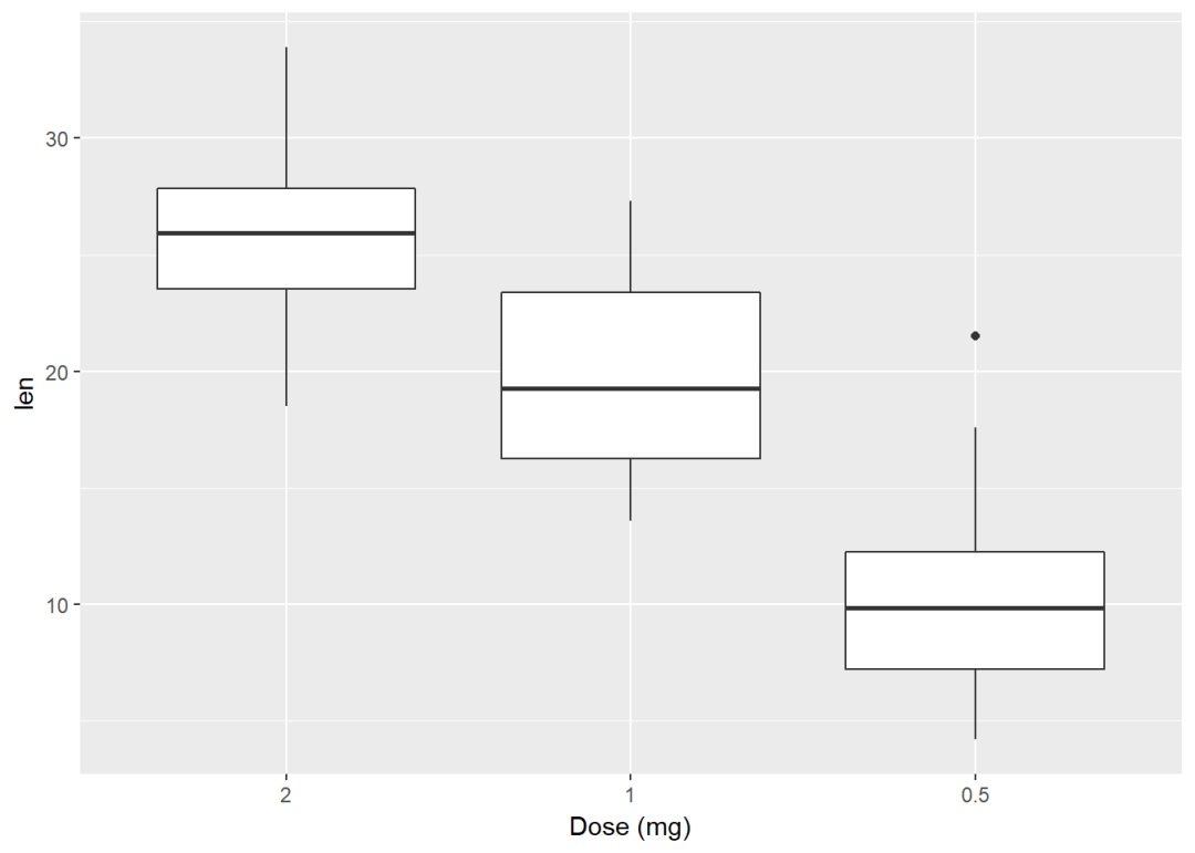
p+scale_x_discrete(name="Dose (mg)", limits=c("2", "1", "0.5"))
#修改刻度标签
p+scale_x_discrete(breaks=c("0.5", "1", "2"),labels=c("Dose 0.5", "Dose 1", "Dose 2")) #修改要显示的项
p+scale_x_discrete(limits=c("0.5", "2"))
- 连续型坐标轴 #散点图 (sp <- ggplot(cars, aes(x=speed, y=dist))+geom_point) 修改坐标轴标签以及范围 (sp <- sp+scale_x_continuous(name = "Speed of cars", limits = c(0, 30))+ scale_y_continuous(name = "Stopping distance", limits = c(0, 150))) 更改y轴刻度,间隔50 sp+scale_y_continuous(breaks = seq(0, 150, 50)) 修改y轴标签为百分数 require(scales) sp+scale_y_continuous(labels = percent) 添加直线:水平线、竖直线、回归线 ggplot2 提供以下方法为图形添加直线:
- geom_hline(yintercept, linetype, color, size): 添加水平线
- geom_vline(xintercept, linetype, color, size):添加竖直线
- geom_abline(intercept, slope, linetype, color, size):添加回归线
- geom_segment:添加线段
实例演示:
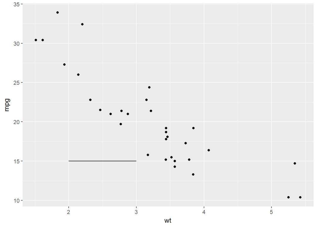
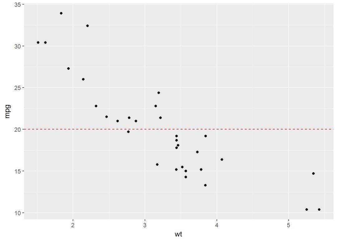
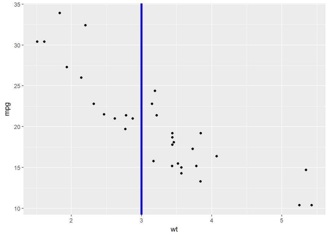
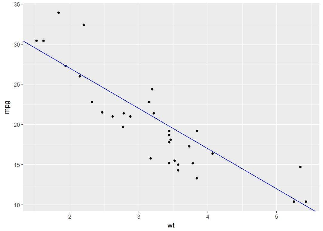
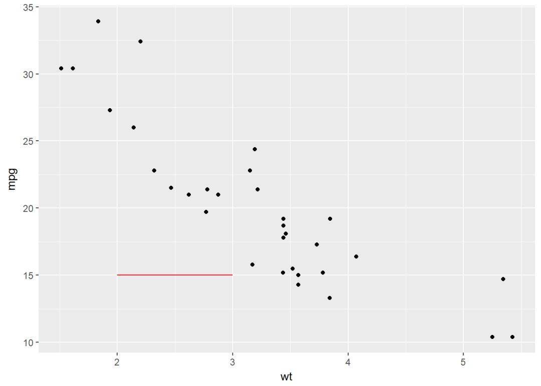
sp <- ggplot(data=mtcars, aes(x=wt, y=mpg))+ geom_point
添加直线:
#在y=20处添加一水平线,并设置颜色等
sp+geom_hline(yintercept = 20, linetype="dashed", color='red')
#在x=3处添加一竖直线,并设置颜色等
sp+geom_vline(xintercept = 3, color="blue", size=1.5)
#添加回归线
sp+geom_abline(intercept = 37, slope = -5, color="blue")
#添加水平线段
sp+geom_segment(aes(x=2, y=15, xend=3, yend=15), color="red")
图形旋转:旋转、反向
主要是下面两个函数:
- coord_flip:创建水平方向图
- scale_x_reverse,scale_y_reverse:坐标轴反向
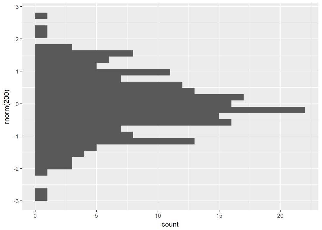
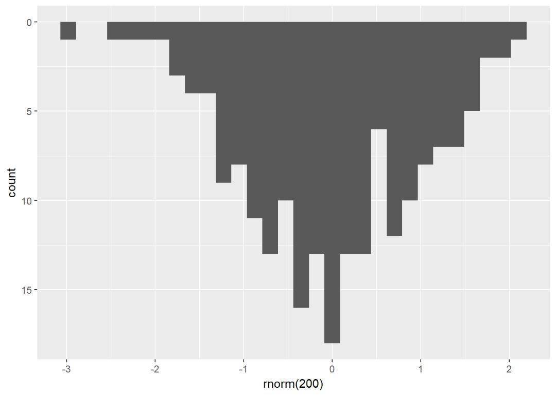
(hp <- qplot(x=rnorm(200), geom = "histogram"))
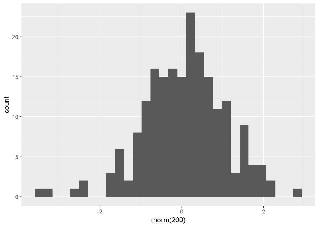
#水平柱形图
hp+coord_flip
#y轴反向
hp+scale_y_reverse
分面
分面就是根据一个或多个变量将图形分为几个图形以便于可视化,主要有两个方法实现:
- facet_grid
- facet_wrap
(p <- ggplot(ToothGrowth, aes(x=dose, y=len, group=dose))+
geom_boxplot(aes(fill=dose))) 针对上面图形进行分面:
- p+facet_grid(supp~.): 按变量supp进行竖直方向分面
- p+facet_grid(.~supp): 按变量supp进行水平方向分面
- p+facet_wrap(dose~supp):按双变量supp和dose进行水平竖直方向分面
- p+facet_wrap(~fl): 将分成的面板边靠边置于一个矩形框内
1、按一个离散变量进行分面:
#竖直方向进行分面
p+facet_grid(supp~.)
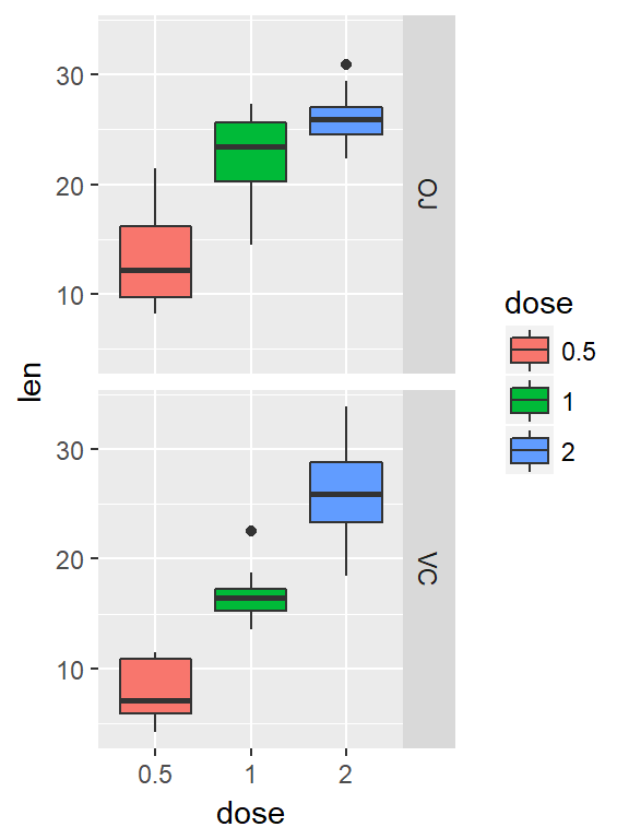
#水平方向分面
p+facet_grid(.~supp)
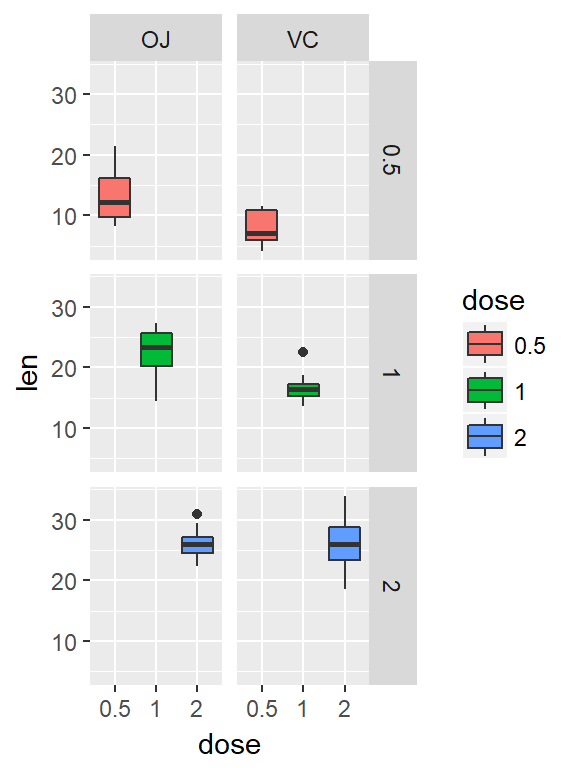
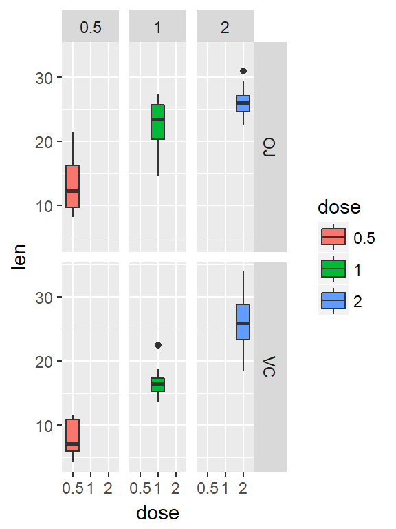
2、按两个离散变量进行分面
#行按dose分面,列按supp分面
p+facet_grid(dose~supp)

#行按supp,列按dose分面
p+facet_grid(supp~dose)
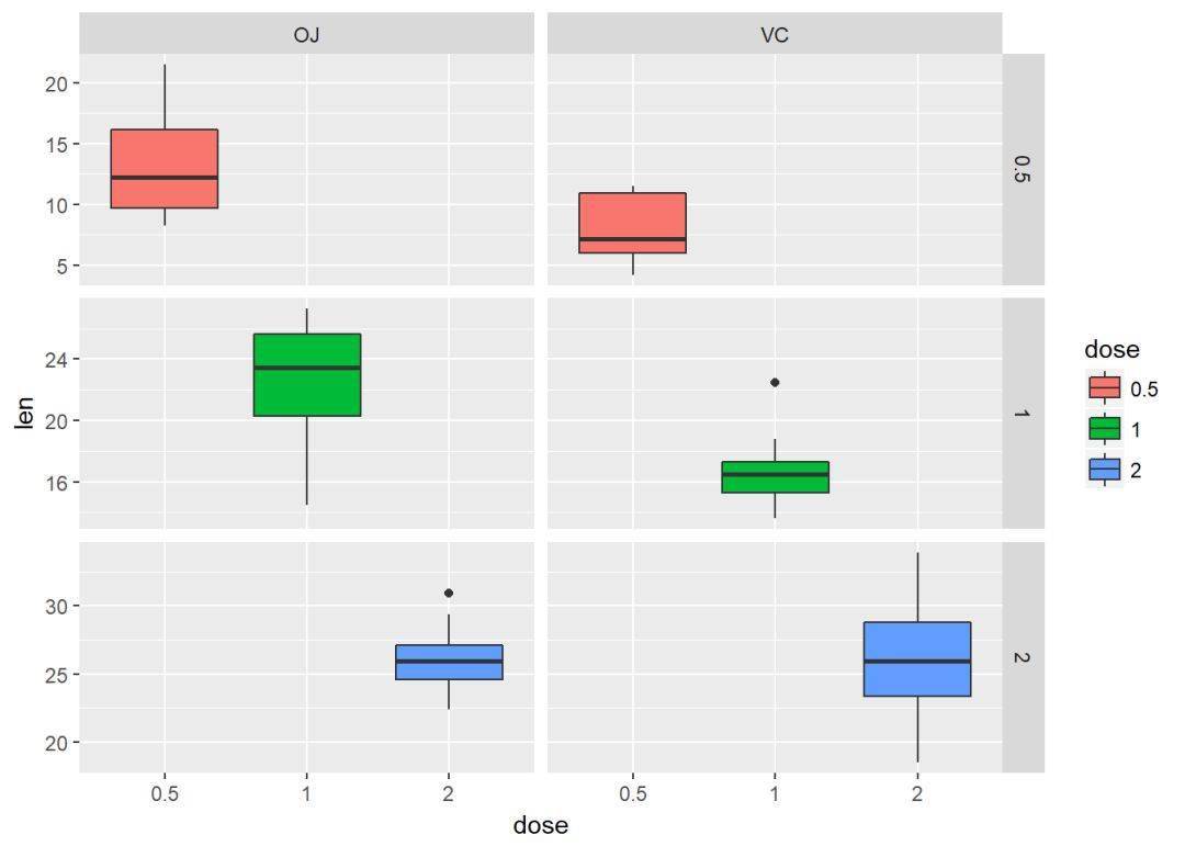
从上面图形可以看出,每个面板的坐标轴比例都是一样的,我们可以通过设置参数scales来控制坐标轴比例
p + facet_grid(dose ~ supp, scales='free')
位置调整
很多图形需要我们调整位置,比如直方图时,由堆叠式、百分式、分离式等,具体的要通过实例说明
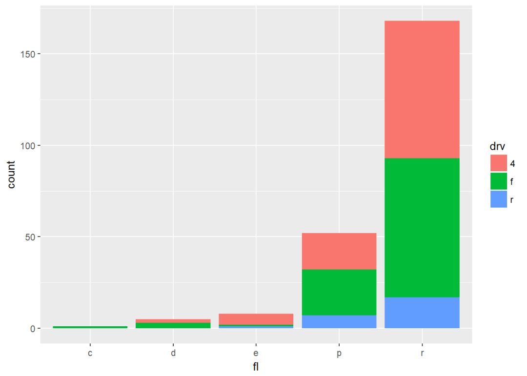
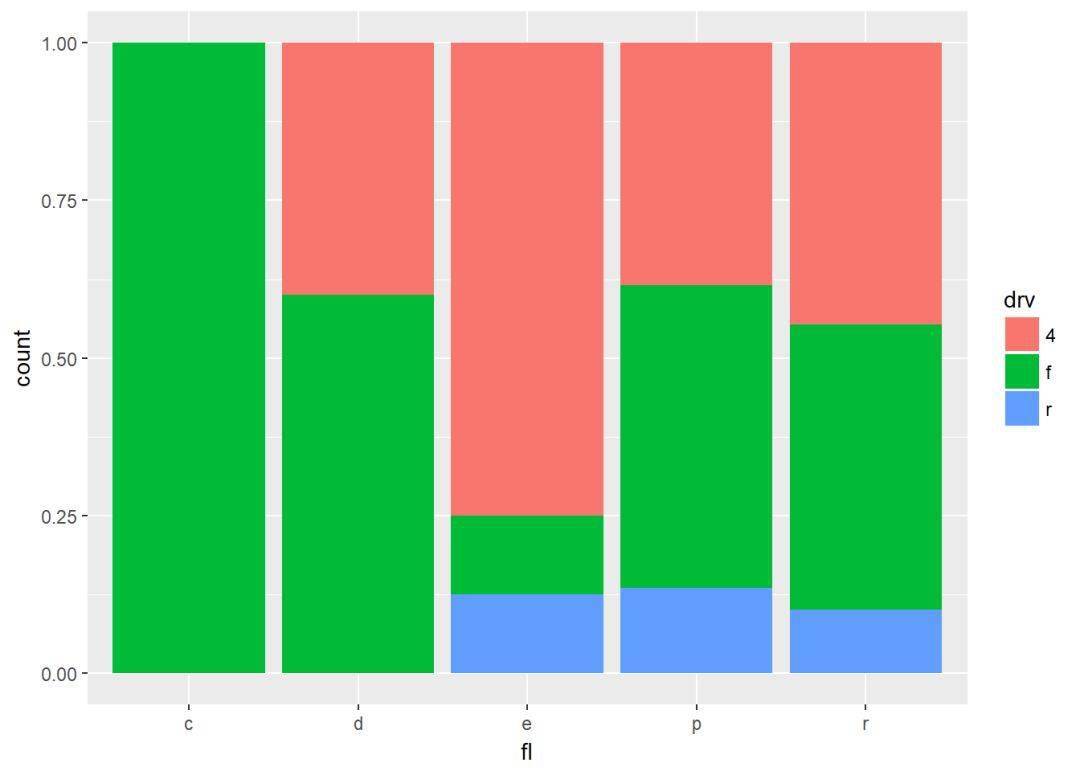
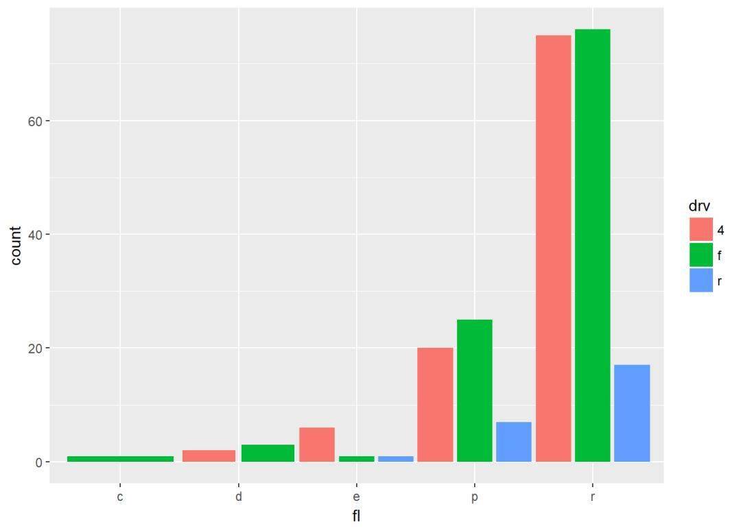
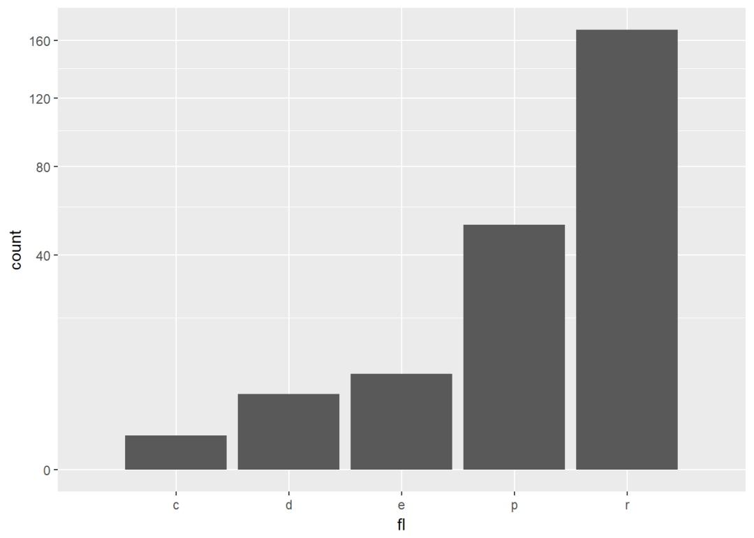
p <- ggplot(mpg, aes(fl, fill=drv))
#直方图边靠边排列,参数position="dodge"
p+geom_bar(position = "dodge")

堆叠式position=”stack”
p+geom_bar(position = "stack")
position=”fill”类似玉堆叠图,只不过按百分比排列,所有柱子都被标准化成同样高度
p+geom_bar(position = "fill")
position=”jitter”,(主要适用于散点图)增加扰动,避免重叠,前面讲的geom_jitter就是来源于此
ggplot(mpg, aes(cty, hwy))+
geom_point(position = "jitter") 上面几个函数有两个重要的参数:heigth、weight。
- position_dodge(width, height)
- position_fill(width, height)
- position_stack(width, height)
- position_jitter(width, height)
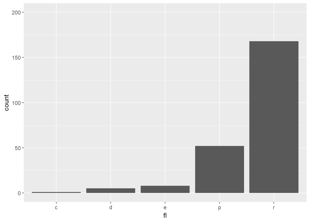
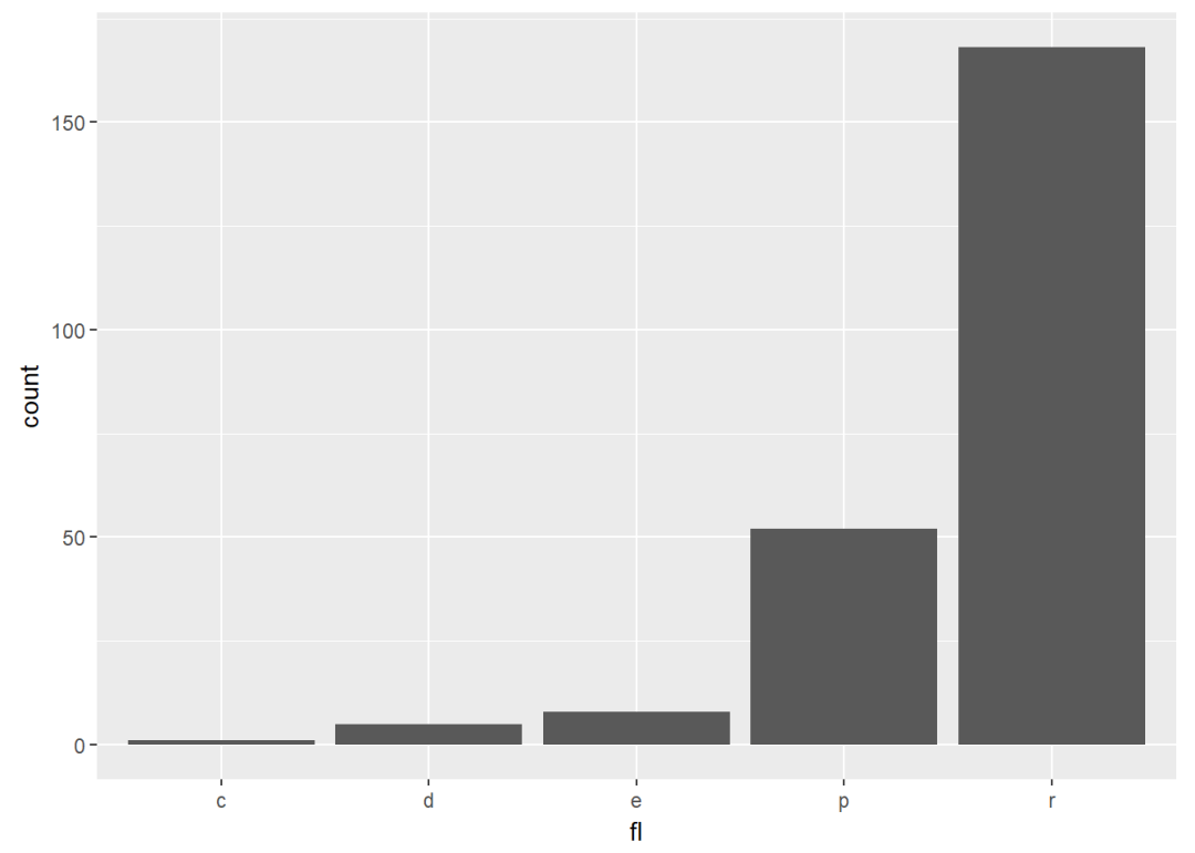
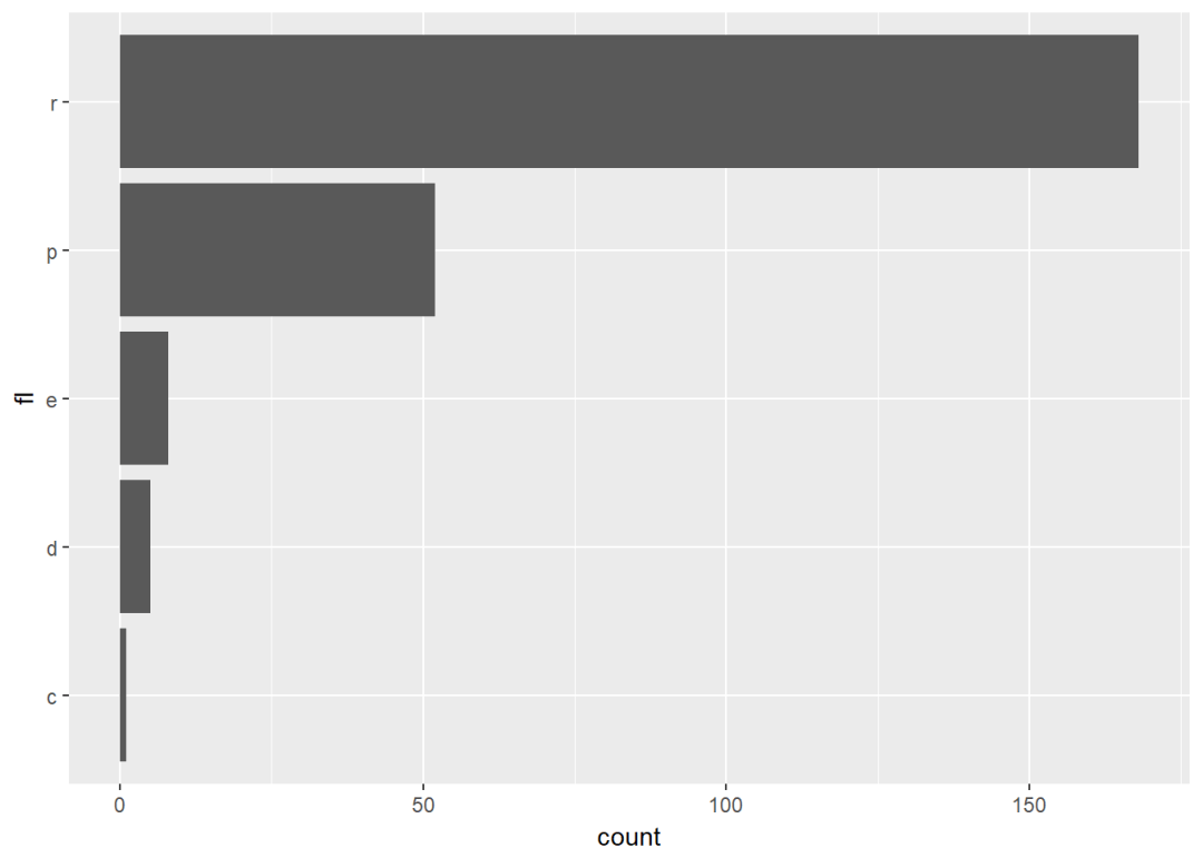
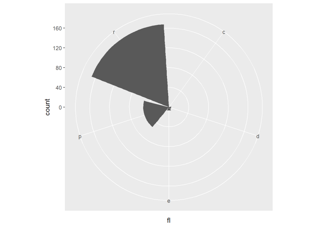
坐标系 p <- ggplot(mpg, aes(fl))+geom_bar
ggplot2中的坐标系主要有:
- p+coord_cartesian(xlim=NULL, ylim=NULL):笛卡尔坐标系(默认)
- p+coord_fixed(ratio=1, clim=NULL, ylim=NULL):固定了坐标轴比例的笛卡尔坐标系。默认比例为1
- p+coord_flip(…):旋转笛卡尔坐标系
- p+coord_polar(theta=”x”, start=0, direction=1):极坐标系
- p+coord_trans(x,y,limx,limy):变换笛卡尔坐标系
- coord_map:地图坐标系
各个坐标系参数如下:
1、笛卡尔坐标系:coord_cartesian, coord_fixed and coord_flip
- xlim:x轴范围
- ylim:y轴范围
- ratio:y/x
- …:其他参数
2、极坐标系:coord_polar
- theta:外延坐标,x或y
- start:坐标开始的位置,默认为12点钟
- direction:方向:顺时针(1),逆时针(-1)
3、变换坐标系:coord_trans
- x,y:变换的坐标轴
- limx,limy:坐标轴范围
实例演示:
p+coord_cartesian(ylim = c(0,200))
p+coord_fixed(ratio = 1/50)
p+coord_flip
p+coord_polar(theta = "x", direction = 1)
p+coord_trans(y="sqrt")
- 本文固定链接: https://maimengkong.com/image/1053.html
- 转载请注明: : 萌小白 2022年6月28日 于 卖萌控的博客 发表
- 百度已收录