-
1. 矩阵相关性计算方法
- base::cor/cor.test
- psych::corr.test
- Hmisc::rcorr
- 其他工具
- 2. 相关性矩阵转化为两两相关
-
3. 可视化
- corrplot
- gplots::heatmap.2
- pheatmap
1. 矩阵相关性计算方法
base::cor/cor.test
R基础函数cor或cor.test都可计算相关性系数,但cor可直接计算矩阵的相关性,而cor.test不可。
两者计算非矩阵时,cor仅得到相关系数,而cor.test还能得到pvalue。
library(ggplot2)cor(mtcars)cor.test(mtcars) #errorcor.test(mtcars,mtcars) #errorcor(mtcars$mpg,mtcars$cyl) #only corx=cor.test(mtcars$mpg,mtcars$cyl) #cor and pvaluex$estimatex$p.value
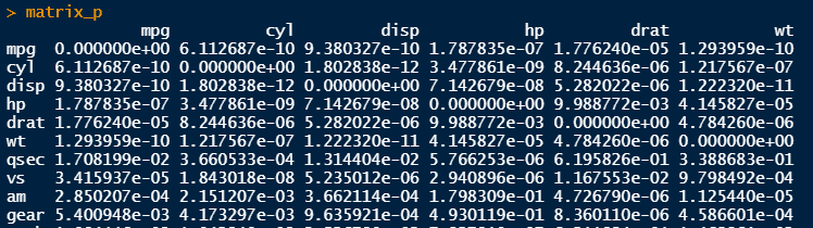
可以用基础函数cor得到相关性矩阵,再自己编写脚本获得pvalue矩阵。
M = cor(mtcars)#自编写函数得到pvalue矩阵cor.mtest <- function(mat, ...) {mat <- as.matrix(mat)n <- ncol(mat)p.mat<- matrix(NA, n, n)diag(p.mat) <- 0for (i in 1:(n - 1)) {for (j in (i + 1):n) {tmp <- cor.test(mat[, i], mat[, j], ...)p.mat[i, j] <- p.mat[j, i] <- tmp$p.value}}colnames(p.mat) <- rownames(p.mat) <- colnames(mat)p.mat}matrix_p=cor.mtest(mtcars)

psych::corr.test
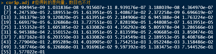
使用psych包中的corr.test函数,可直接获得矩阵相关性系数和pvalue(也可用于非矩阵),而且还可直接得到矫正后的pvalue。
library(psych)corr.test(mtcars)cor <- corr.test(mtcars,method = "pearson",adjust = "fdr") #同p.adjust函数cor$rcor$pcor$p.adj #但得到的是向量,数目也不对test <- p.adjust(cor$p,method = "fdr")identical(cor$p.adj,test) #不等


Hmisc::rcorr
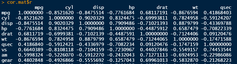
使用Hmisc包中的rcorr函数,直接得到相关性系数和pvalue矩阵。
library(Hmisc)#注意要将数据框转换为矩阵cor.mat <- rcorr(as.matrix(mtcars), type = "pearson")cor.mat$rcor.mat$P
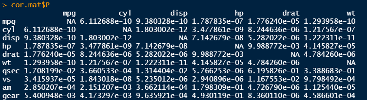
可视化时,pvalue矩阵对角线的显著性我们不必要展示,可以替换下。另外,如果后续不展示全部矩阵,只展示过了设置条件的部分,则可进行过滤。
# # only keep comparisons that have some abs. correlation >= .5 (optional)# keep <- rownames(cor.mat$r)[rowSums(abs(cor.mat$r)>=0.5) > 1]# cor.mat <- lapply(cor.mat, function(x) x[keep, keep])# set diagonal to 1, since it is not interesting and should not be markeddiag(cor.mat$P) <- 1
其他工具
其他还有工具,如ggcor + ggcorrplot, 但不建议使用,增加学习成本,以上方法足以成对所有情况。
另外统计和绘图R包rstatix也可计算相关矩阵,显示和标记显著性水平,而且可以gather和spread相关性矩阵,可tidyverse语法类似。这个包值得好好学习:https://rpkgs.datanovia.com/rstatix/index.html
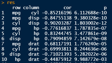
2. 相关性矩阵转化为两两相关
一般来说,我们得到的是相关性系数矩阵和pvalue矩阵,但输出数据时最好转换为两两之间的行列式格式。
这种转换以上的rstatix包可轻松解决。
请参考:https://rpkgs.datanovia.com/rstatix/reference/cor_reshape.html
另外,我们也可自己编写脚本得到:
flattenCorrMatrix <- function(cormat, pmat) {ut <- upper.tri(cormat)data.frame(row = rownames(cormat)[row(cormat)[ut]],column = rownames(cormat)[col(cormat)[ut]],cor =(cormat)[ut],p = pmat[ut])}res <- flattenCorrMatrix(cor.mat$r, cor.mat$P)res
3. 可视化
得到了相关性和pvalue两个矩阵,我们一般以热图展示为好。
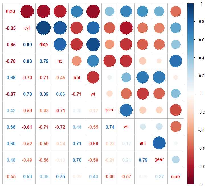
corrplot
经典的相关性展示工具。很多可选样式:https://cran.r-project.org/web/packages/corrplot/vignettes/corrplot-intro.html
我仅展示几个案例,更多参数自己调节。
#仅corcorrplot.mixed(M)#cor,仅0.05corrplot.mixed(M,insig = 'label_sig',p.mat=matrix_p,pch.cex = 0.9,pch.col = 'grey20')#细分corrplot(M,p.mat = matrix_p,tl.pos = 'd',order = 'hclust',type = "upper",#addrect = 2,insig = 'label_sig',sig.level = c(0.001, 0.01, 0.05),pch.cex = 0.9,pch.col = 'grey20')


gplots::heatmap.2
相对于上图,我更喜欢用热图来展示。
library(RColorBrewer)library(gplots)my_palette <- colorRampPalette(c("blue","white","red")) (100)# plot heatmap and mark cells with abs(r) >= .5 and p < 0.05heatmap.2(cor.mat$r,# cexRow = .35, cexCol = .35,trace = 'none',# key.title = 'Spearman correlation',# keysize = .5, key.par = list(cex=.4),notecol = 'black', srtCol = 30,col = my_palette,cellnote = ifelse(cor.mat$P < 0.05 & abs(cor.mat$r)>=0.5, "*", ""))
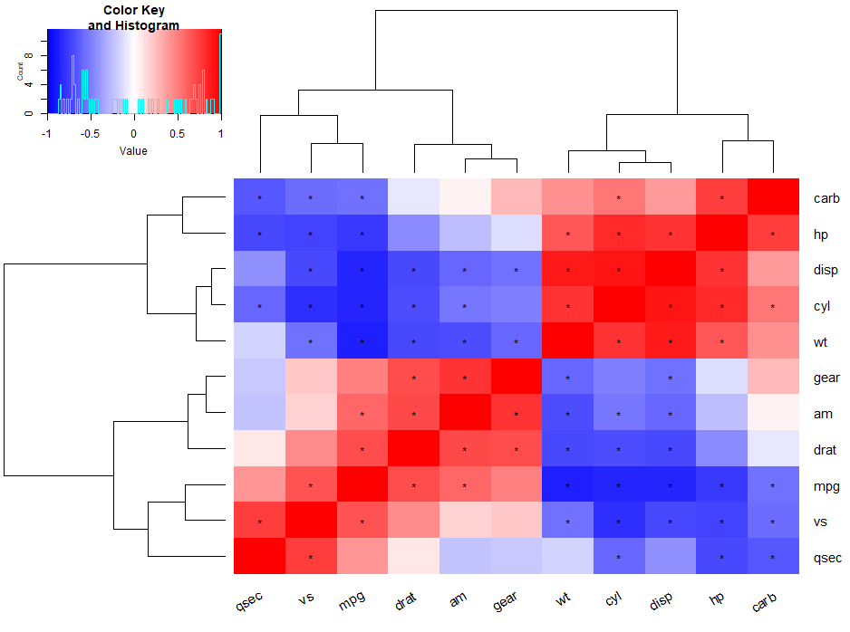
以上我仅标出相关性绝对值大于0.5,pvalue<0.05的数据。当然可以做更细致划分。
pheatmap
pheatmap参数更好调些,看个人喜好。
#pheatmappheatmap(cor.mat$r,color = my_palette,display_numbers = ifelse(cor.mat$P < 0.05 & abs(cor.mat$r)>=0.5, "*", ""))

Ref:
https://www.jianshu.com/p/b76f09aacd9c
https://chowdera.com/2020/12/20201218185101270B.html
https://stackoverflow.com/questions/66305232/r-how-to-plot-a-heatmap-that-shows-significant-correlations
http://www.sthda.com/english/wiki/correlation-matrix-an-r-function-to-do-all-you-need
http://www.sthda.com/english/wiki/correlation-matrix-a-quick-start-guide-to-analyze-format-and-visualize-a-correlation-matrix-using-r-software
- 本文固定链接: https://maimengkong.com/image/1224.html
- 转载请注明: : 萌小白 2022年10月3日 于 卖萌控的博客 发表
- 百度已收录