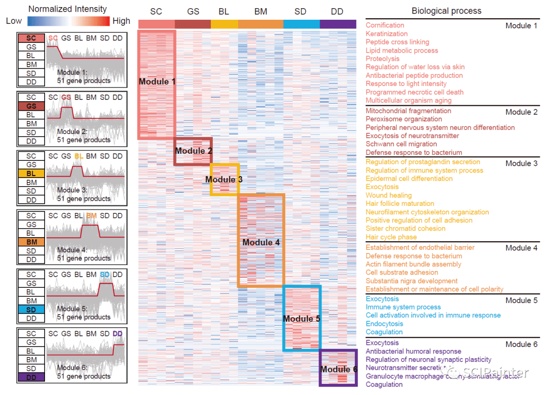
往期我们学习过一个表达趋势折线图+模块热图+GO富集注释的组合类图表绘制,详情可戳:《炫一个模块热图+GO功能富集组合图展示空间功能特征!》 ,后期图表美化主要使用AI完成,如下图。
这两天看到另一个比较有意思的R包ClusterGVis,可以同时完成聚类+富集,并生成发表级的组合图表,效果如下。非常方便省事,适合懒人。下面就来学习一番!

#相关R包下载与载入:
devtools::install_github( "jokergoo/ComplexHeatmap")
devtools::install_github( "junjunlab/ClusterGVis")
library(ClusterGVis)
library(ComplexHeatmap)
library(org.Mm.eg.db)
library(cols4all)
#使用该R包自带数据进行测试:
dt<- exps #输入数据:标准化的 tpm/fpkm/rpkm 表达矩阵
head(dt)
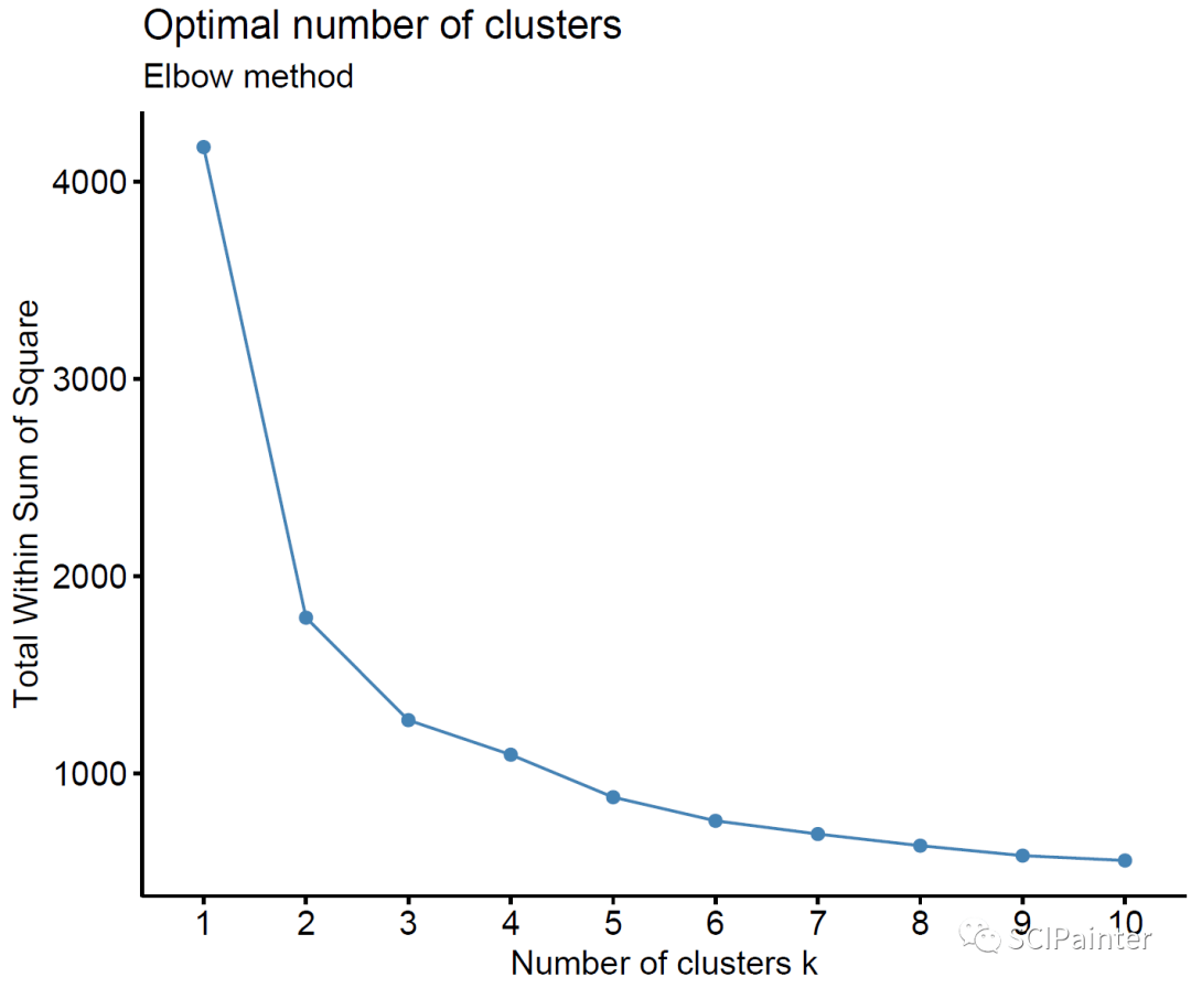
#可根据拐点选择最佳聚类数:
getClusters(exp = dt)
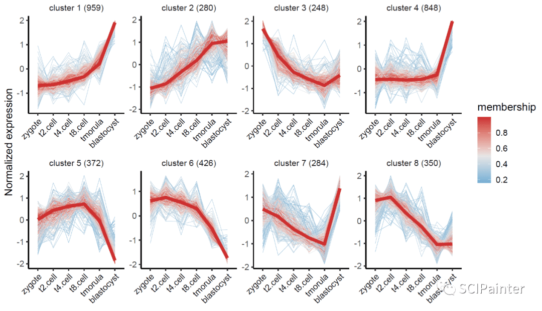
#可选择Mfuzz或Kmeans聚类:
##Mfuzz:
cm<- clusterData(exp = dt,
cluster.method = "mfuzz", #kmeans或mfuzz
cluster.num = 8, #以8个聚类为例
seed= 123) #随机数种子
str(cm)
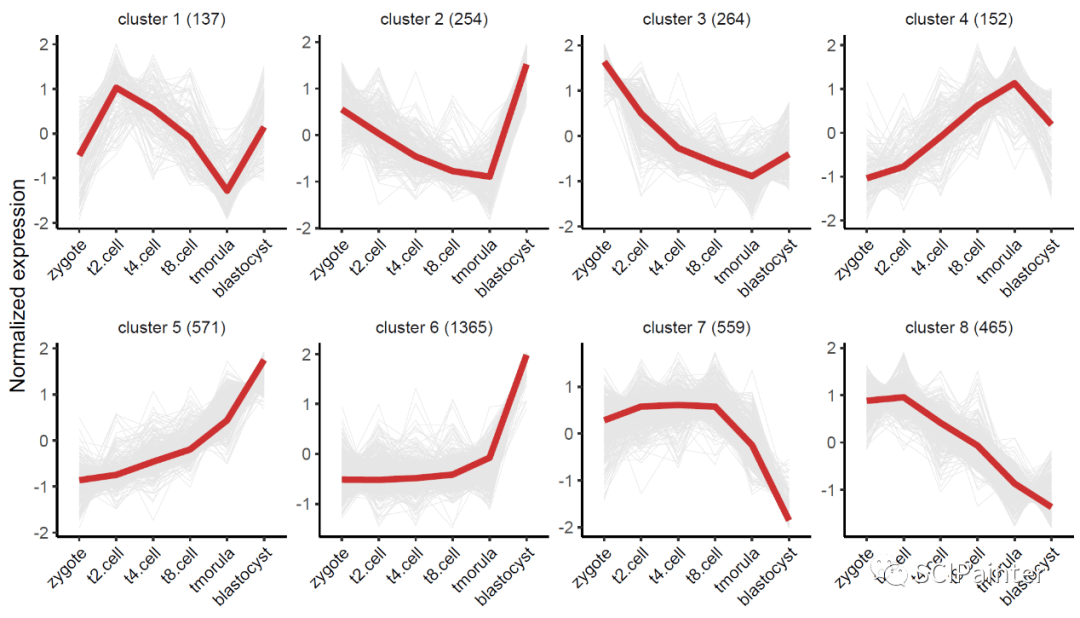
##kmeans:
ck<- clusterData(exp = dt,
cluster.method = "kmeans", #kmeans或mfuzz
cluster.num = 8,
seed= 123)
str(ck)

1. 表达趋势折线图绘制
visCluster(
object= cm,
plot.type = "line", #折线图
add.mline = TRUE #是否显示中位折线
)
visCluster(object = ck,
plot.type = "line",
add.mline = TRUE)
2. 热图绘制
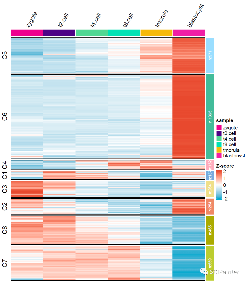
visCluster(object = ck,
plot.type = "heatmap") #热图

#自定义cluster注释条配色:
c4a_gui
mycol<- c4a('light',8)
#热图美化:
visCluster(
object= ck,
plot.type = "heatmap",
column_names_rot= 60, #列名60°显示
show_row_dend= F, #不显示聚类树
ht.col = c( "#0da9ce", "white", "#e74a32"), #热图颜色调整
ctAnno.col = mycol #修改注释条颜色
)
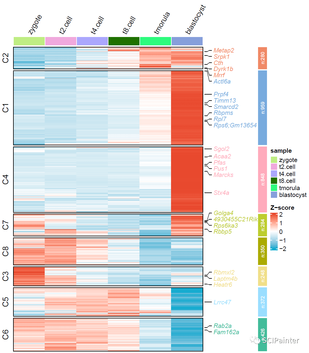
#标注mark基因:
mark<- rownames(dt)[sample(1:nrow(dt),28, replace = F)]
pdf('p1.pdf', height = 8, width = 7, onefile = F)
visCluster(
object= cm,
plot.type = "heatmap",
column_names_rot= 60,
show_row_dend= F,
ht.col = c( "#0da9ce", "white", "#e74a32"),
ctAnno.col = mycol,
markGenes= mark
)
dev. off
3. 富集分析
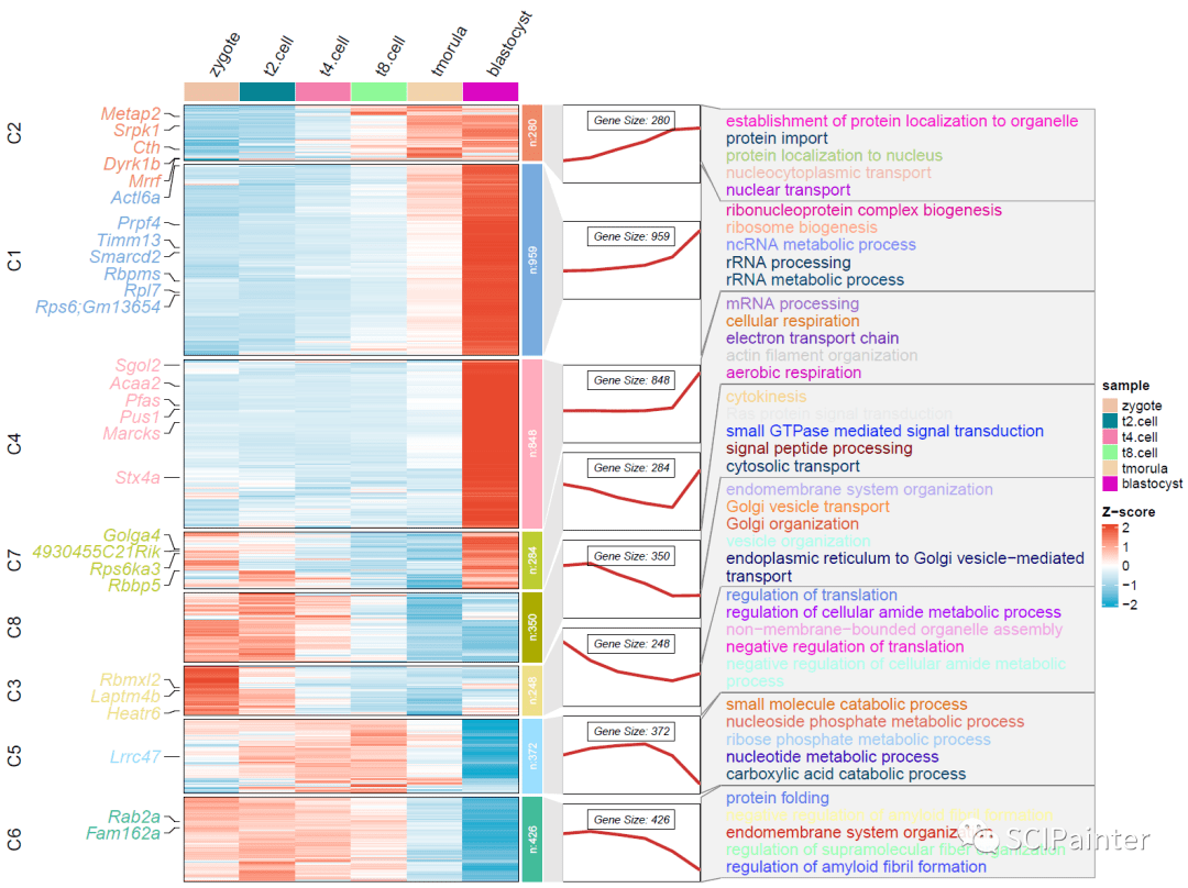
##以GO-BP为例:
enrich<- enrichCluster(object = cm,
OrgDb= org.Mm.eg.db,
type= "BP", # "BP", "MF", "CC"or "KEGG"
pvalueCutoff= 0.05,
topn= 5) #显示top5 GO term
head(enrich)
4. 组合热图绘制
pdf('p2.pdf', height = 9, width = 12, onefile = F)
visCluster(
object= cm,
plot.type = "both", #选both
column_names_rot= 60,
markGenes= mark,
markGenes.side = "left", #标签放到左侧
genes.gp = c('italic',fontsize = 13),
show_row_dend= F,
ht.col = c( "#0da9ce", "white", "#e74a32"),
ctAnno.col = mycol,
annoTerm.data = enrich #添加GO注释
)
dev. off
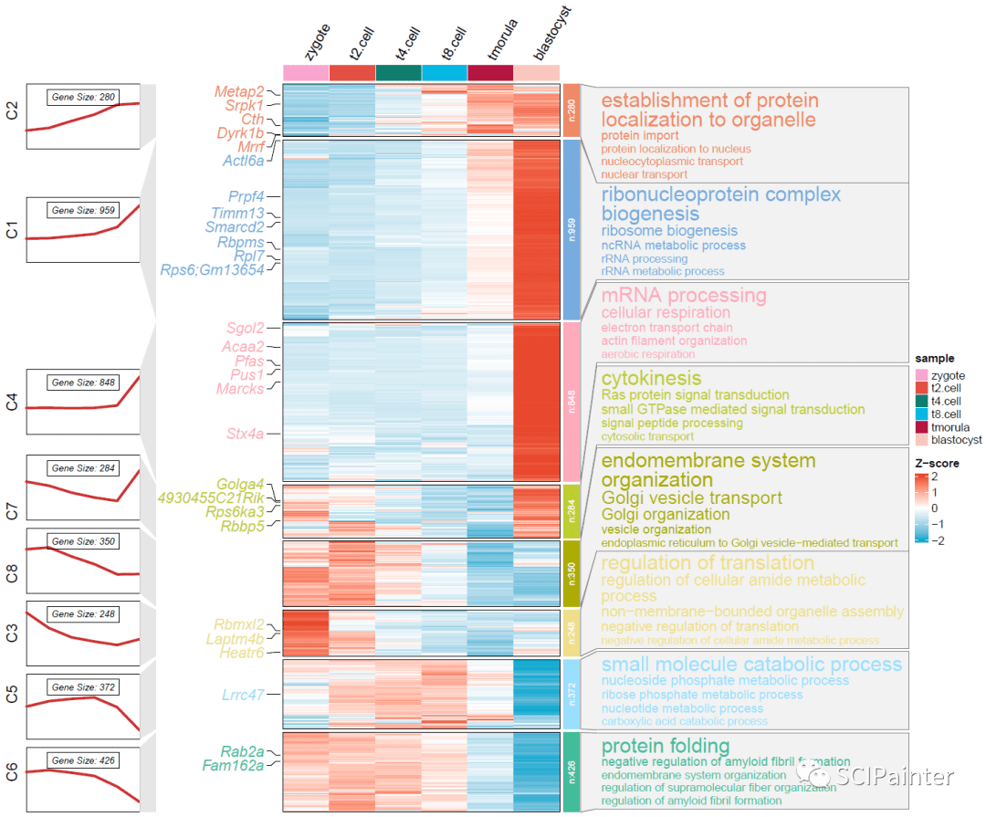
#细节美化:
pdf('p3.pdf', height = 10, width = 12, onefile = F)
visCluster(
object= cm,
plot.type = "both",
column_names_rot= 60,
markGenes= mark,
markGenes.side = "left",
genes.gp = c('italic',fontsize = 13),
show_row_dend= F,
ht.col = c( "#0da9ce", "white", "#e74a32"),
ctAnno.col = mycol,
annoTerm.data = enrich,
go.col = rep(mycol, each = 5), #将词云颜色修改为跟注释条一致
go.size = "pval", #按p值显示注释大小
line.side = "left"#将表达趋势折线图放到左侧
)
dev. off
使用下来的感受是确实很方便,但目前可能还不大稳定,有兴趣的可以试试。如果大家遇到bug可以尝试更新一下ClusterGVis或ComplexHeatmap开发版,以获取最新功能。更多的参数/功能详见作者的相关说明。
好啦,今天的分享就到这里!
参考资料
https://github.com/junjunlab/ClusterGVis
https://github.com/junjunlab/ClusterGVis/wiki/document
转自:https://www.sohu.com/a/620468850_121123706- 本文固定链接: https://maimengkong.com/image/1567.html
- 转载请注明: : 萌小白 2023年6月17日 于 卖萌控的博客 发表
- 百度已收录