实战项目背景介绍
当我们提到数据可视化,常常会想到众多的工具和库,如 Matplotlib、Seaborn 甚至于 D3.js 等。但是,有一个特定的组合正在快速走红:Streamlit 和 ECharts。Streamlit,作为一个轻量级的 Python 工具,允许数据科学家和工程师轻而易举地创建交互式的 web 应用。而 ECharts,一款来自百度的开源 Java 可视化工具,因其绚丽的效果和广泛的图表类型而广受欢迎。

那么,为何我们要将 Streamlit 和 ECharts 结合呢?首先,ECharts 提供了一种动态、生动的方式来展示数据,这种方式往往比传统的静态图表更具吸引力。而 Streamlit 的简洁性和灵活性确保了我们可以快速部署应用,无需深入的前端开发经验。将这两者结合,我们可以在短时间内制作出既美观又功能强大的数据可视化大屏。
在上篇文章当中,我们简单地介绍了将 Streamlit 与 ECharts 结合来简单地绘制一些图表。Streamlit+Echarts画出的图表,真的是太精湛了!!在本文中,我们将深入探讨如何通过上面两者来制作可视化大屏。无论您是一个经验丰富的开发者还是一个初学者,都能从这个结合中获得启示和灵感。
代码结构
我们先来看一下整个项目的代码结构,如下图所示
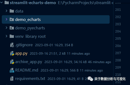
分为 ECharts 的演示 demo 以及 PyeCharts 的演示 demo。我们可根据下拉框来指定是选择用 ECharts 或者是 PyeCharts 来进行图表的绘制,然后我们在具体的图表例子中可以选择一个、例如是折线图、柱状图或者是饼图以及散点图等等,具体的代码如下
def main:
st.title("Streamlit ECharts 演示")
with st.sidebar:
st.header("配置")
api_options = ("echarts", "pyecharts")
selected_api = st.selectbox(
label="选择",
options=api_options,
)
page_options = (
list(ST_PY_DEMOS.keys)
ifselected_api == "pyecharts"
elselist(ST_DEMOS.keys)
)
selected_page = st.selectbox(
label="选择一个图表的例子",
options=page_options,
)
demo, url = (
ST_DEMOS[selected_page]
ifselected_api == "echarts"
elseST_PY_DEMOS[selected_page]
)
ifselected_api == "echarts":
st.caption(
"""ECharts demos are extracted from https://echarts.apache.org/examples/en/index.html,
by copying/formattting the 'option' json object into st_echarts.
Definitely check the echarts example page, convert the JSON specs to Python Dicts and you should get a nice viz."""
)
ifselected_api == "pyecharts":
st.caption(
"""Pyecharts demos are extracted from https://github.com/pyecharts/pyecharts-gallery,
by copying the pyecharts object into st_pyecharts.
Pyecharts is still using ECharts 4 underneath, which is why the theming between st_echarts and st_pyecharts is different."""
)
demo
sourcelines, _ = inspect.getsourcelines(demo)
with st.expander("源代码"):
st.code(textwrap.dedent("".join(sourcelines[1:])))
st.markdown(f"Credit: {url}")
output

例如我们指定用 ECharts 来绘制一张简单的折线图,代码就这么来写就行
def render_basic_line_chart:
option = {
"xAxis": {
"type": "category",
"data": ["Mon", "Tue", "Wed", "Thu", "Fri", "Sat", "Sun"],
},
"yAxis": {"type": "value"},
"series": [{"data": [820, 932, 901, 934, 1290, 1330, 1320], "type": "line"}],
}
st_echarts(
options=option, height="400px",
)
当然在此基础之上,我们可以进行一层衍生,例如在折线图的基础之上做一个面积图,又或者是绘制多条折线图等等,代码如下
def render_basic_area_chart:
options = {
"xAxis": {
"type": "category",
"boundaryGap": False,
"data": ["Mon", "Tue", "Wed", "Thu", "Fri", "Sat", "Sun"],
},
"yAxis": {"type": "value"},
"series": [
{
"data": [820, 932, 901, 934, 1290, 1330, 1320],
"type": "line",
"areaStyle": {},
}
],
}
st_echarts(options=options)
或者是多条折线图的图表绘制,我们也可以将其定义到一个函数当中去,代码如下
def render_stacked_line_chart:
options = {
"title": {"text": "折线图堆叠"},
"tooltip": {"trigger": "axis"},
"legend": {"data": ["邮件营销", "联盟广告", "视频广告", "直接访问", "搜索引擎"]},
"grid": {"left": "3%", "right": "4%", "bottom": "3%", "containLabel": True},
"toolbox": {"feature": {"saveAsImage": {}}},
"xAxis": {
"type": "category",
"boundaryGap": False,
"data": ["周一", "周二", "周三", "周四", "周五", "周六", "周日"],
},
"yAxis": {"type": "value"},
"series": [
{
"name": "邮件营销",
"type": "line",
"stack": "总量",
"data": [120, 132, 101, 134, 90, 230, 210],
},
{
"name": "联盟广告",
"type": "line",
"stack": "总量",
"data": [220, 182, 191, 234, 290, 330, 310],
},
{
"name": "视频广告",
"type": "line",
"stack": "总量",
"data": [150, 232, 201, 154, 190, 330, 410],
},
{
"name": "直接访问",
"type": "line",
"stack": "总量",
"data": [320, 332, 301, 334, 390, 330, 320],
},
{
"name": "搜索引擎",
"type": "line",
"stack": "总量",
"data": [820, 932, 901, 934, 1290, 1330, 1320],
},
],
}
st_echarts(options=options, height="400px")
然后我们将所有定义的函数集合到一个字典当中去,代码如下
ST_LINE_DEMOS = {
"Line: Basic Line Chart": (
render_basic_line_chart,
"https://echarts.apache.org/examples/en/editor.html?c=line-simple",
),
"Line: Basic Area Chart": (
render_basic_area_chart,
"https://echarts.apache.org/examples/en/editor.html?c=area-basic",
),
"Line: Stacked Line Chart": (
render_stacked_line_chart,
"https://echarts.apache.org/examples/en/editor.html?c=line-stack",
),
......
}
效果展示
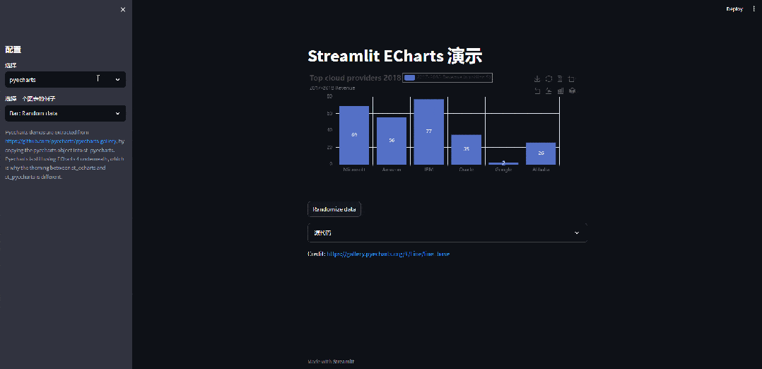
那么除了折线图的 demo ,还有例如饼图的 demo 及其衍生、散点图的 demo 以及衍生等等,在图表的下面,我们还附上了具体的源码,如下图所示
我们来看一下最后的效果,如下所示
总结
在探索 Streamlit 和 ECharts 的强大组合后,我们可以确信,交互式数据可视化的未来异常明亮。这种结合为我们提供了一种有效、简洁且引人入胜的方式来呈现数据,让我们能够更加直观地理解复杂的信息。更重要的是,这种方式打破了数据科学家与前端开发者之间的障碍,允许我们集中精力于真正的数据挖掘和故事叙述。
- 本文固定链接: https://maimengkong.com/chengxu/1744.html
- 转载请注明: : 萌小白 2024年5月30日 于 卖萌控的博客 发表
- 百度已收录